You don’t make money when you buy

You don’t make money when you buy

You don’t make money when you buy

INTRODUCTION

How many times have you heard someone say, “You make money when you buy?”

I’ve bought 16 investment properties and never made a single cent … when I bought. The only time I’ve ever made money is when time has passed.

You lose money when you buy – hand over fist over foot over wallet, you lose money when you buy.

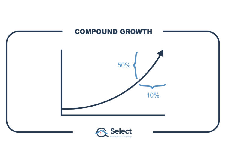
You make money in property investing when you H O L D.

ENTRY COST

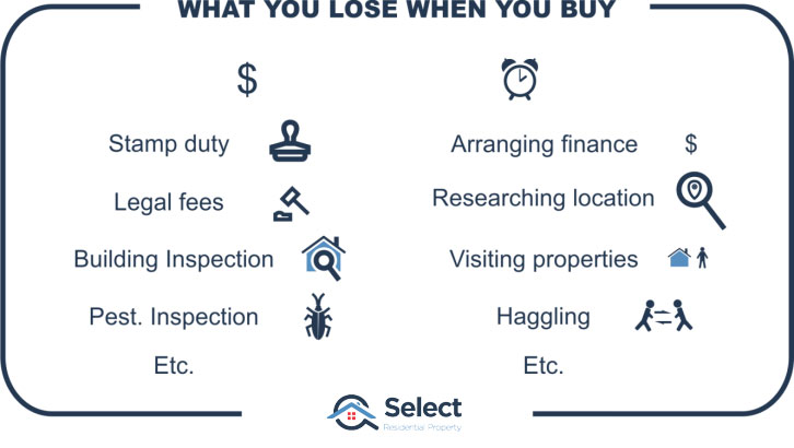
To buy a property you not only need a deposit, but you also need to pay stamp duty, building and pest inspections or maybe a strata report. Legal fees too. Then there’s all the time you spent researching, arranging finance, visiting open inspections, haggling, signing contracts.
There’s a colossal expense involved in buying a property. There is no way you can buy a property in Australia and make money when you buy.

The people who make money when you buy are real estate agents, property developers, sellers, conveyancers and so on.

YOU MAKE MONEY HOLDING

You make back all that money if you hold and let capital growth do its thing. If you’ve bought in a bad location, it can take many years for it to recover lost ground. But even if you’ve bought in a belter, you still have to wait at least 6 months to recoup the costs associated with entering the market.

WHO SAYS THIS?

I know what you’re thinking. I’m taking the expression too literally. What it really means Jeremy, is that if you buy a property for a good price, you’ve locked in some immediate equity at the time you buy.

But again, this is not only wrong, but bad advice.

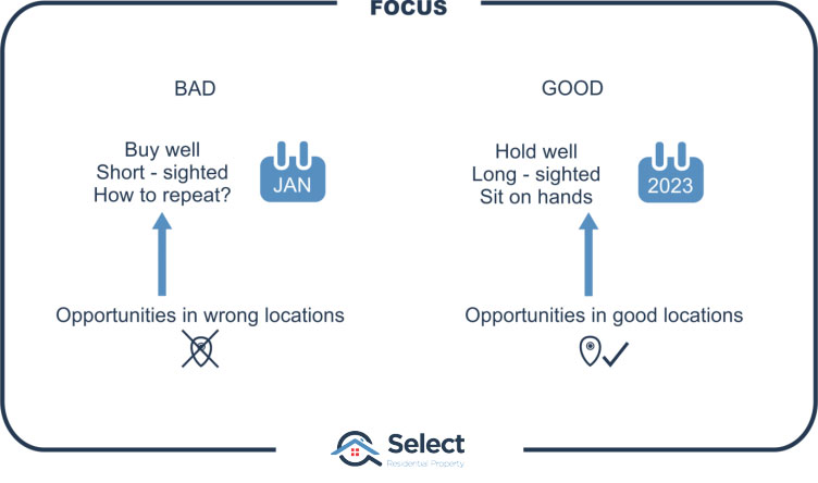
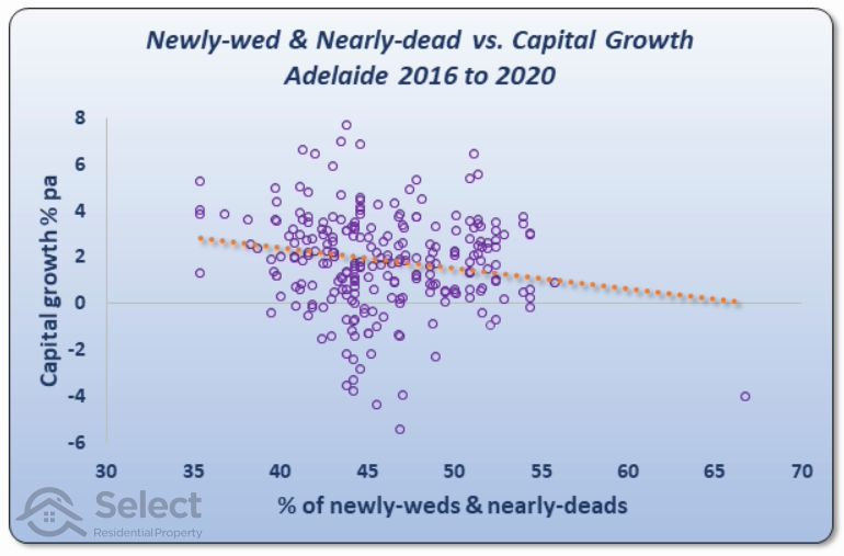
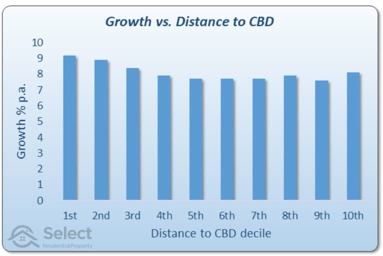
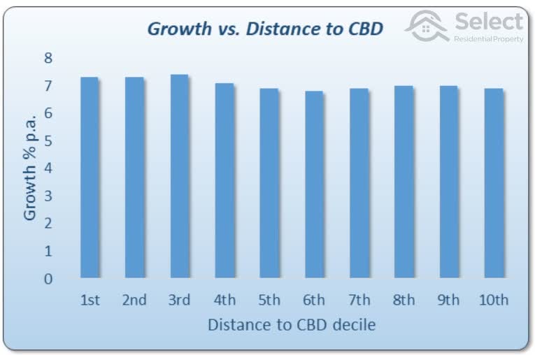
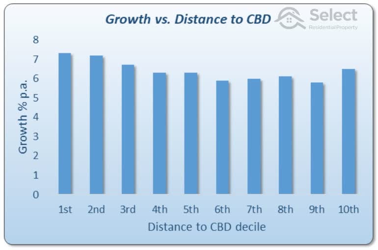
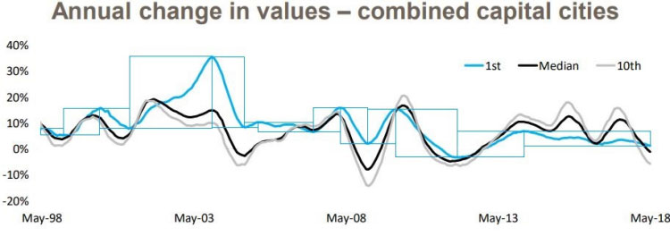
This advice makes an investor focus too much on buying under market value, chasing a good deal, getting a bargain. The easiest suburbs to buy under market value are the ones that are experiencing negative growth, that is, the very worst investment markets.

The best investment markets are the ones where buying under market value is virtually impossible

Don’t focus on buying cheaply – you haven’t made a profit. What you’ve probably done is bought in a dud location.

For more on this, check out another presentation in this series titled:

Aiming to buy under market value is bad

IRRELEVANT

Whatever saving you think you’re going to make buying cheaply will be comfortably and quickly overwhelmed by the movement in the market over the next 6 to 12 months. If you’ve bought in a market that hasn’t moved in that period, then you’ve just incurred an opportunity cost. And that opportunity cost will be so much more than the paltry gain you think you made buying cheaply.

I would much rather pay over market value for a property in a hot market than pay under market value for a property in a flat or falling market

STRATEGY

If your property investment strategy is based on achieving good capital growth, then every month after you’ve bought, is another month you’re moving forwards. If, however, the key to your investment success hangs on buying well, how can you do that every month?

CONCLUSION

Your focus as an investor should be on making money as you hold, not when you buy. Be aware of the high costs to enter the market and you’ll put a lot more effort into researching the right locations. Your research should be focussed on what is going to happen after you’ve bought. Don’t focus on buying well, focus on finding properties that will grow well as you hold onto them.

I’ve got a couple of other presentations on similar topics you might be interested in. Check these out:
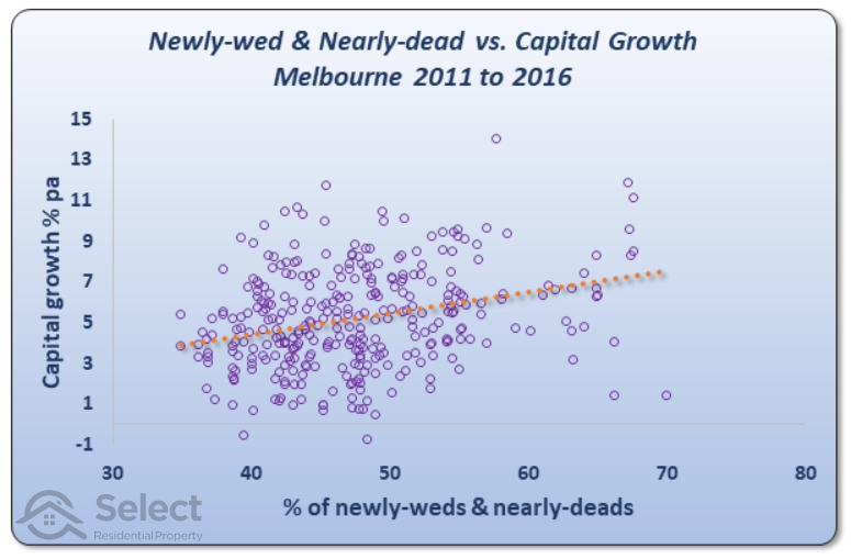
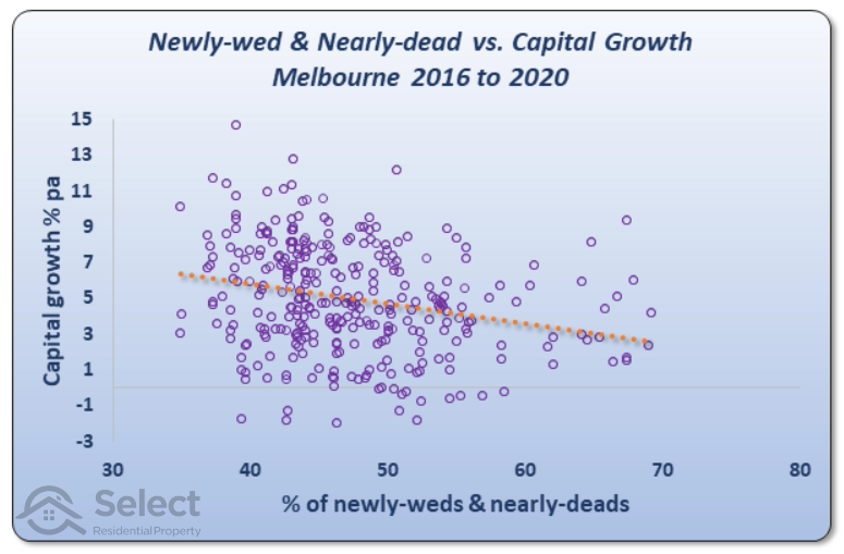
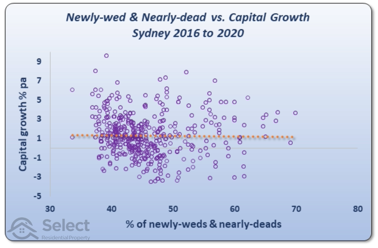
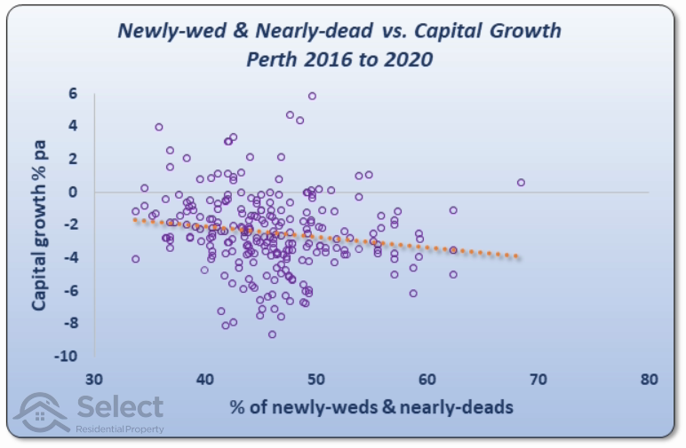
No advantage buying under median value

Aiming to buy under market value is bad

That 2nd one in particular is a beauty. It shows there’s no such thing as the discount-flip strategy. You don’t make money when you buy.

Tagged:

Ep. 33: How to Protect Yourself from Oversupply

Oversupply is one of the biggest risks in property investing 🏡 In this episode, we break down how to spot areas at risk of too much stock and what to look for before buying. We’ll show you why counting listings isn’t enough, how to use Google Maps to predict future...

Ep. 34: Nobody Told Me… The Realities of Property Investing

In this episode, we get real about the industry’s biggest red flags—misleading claims, flashy marketing tactics, and so-called “experts” who might not have your best interests at heart. From high-pressure sales tactics to the long-term excuse for bad investments,...

Ep. 33: How to Protect Yourself from Oversupply

Oversupply is one of the biggest risks in property investing 🏡 In this episode, we break down how to spot areas at risk of too much stock and what to look for before buying. We’ll show you why counting listings isn’t enough, how to use Google Maps to predict future...

Newly wed, nearly dead demographics

Newly wed, nearly dead demographics

Newly wed, nearly dead demographics

INTRODUCTION

Some experts believe that suburbs with a high concentration of a certain age range will deliver better growth than others. For example, people in the 20-44 age bracket or 70+. These are known as “Newly-weds or Nearly-deads”.

An analysis of the data suggests this age bracket is actually NOT the lead indicator of capital growth that some experts think it is.

THE THEORY

The theory is that those over 70 will downsize, selling off their homes to developers who would build townhouses to sell to the younger age bracket that would pay a premium for them. Rather than argue about that logic, let’s just see what the data has to say.

DATA

I read a blog on this exact topic. It was published in 2016, based on data from the 2011 census. So, I replicated the results (close enough) as seen in the following chart.

Chart explanation

Every purple circle on the chart represents a suburb in Melbourne. You’ll see a range from 30% to 80% along the axis at the bottom. This is the percentage of residents in each suburb that fit into one of those two age brackets: 20-44 or 70+. Over the right of the chart are suburbs with a high proportion of Newly-Weds or Nearly-Deads (NWNDs). Some suburbs have nearly 70% NWNDs. Over to the left are suburbs with a low proportion – less than 40% NWNDs in some cases.

The vertical axis on the left shows the percentage capital growth per annum for each suburb from 2011 to 2016. At the bottom of the chart are suburbs that had very low growth. Two of them had negative growth. At the top of the chart are suburbs that had excellent growth. A few of them had double-digit growth. One looks like it had about 14% growth.

Chart interpretation

The orange dotted line is the line of best fit. It’s been mathematically plotted to minimise the distance between itself and all the circles. The general relationship between NWND and future growth is shown by the line of best fit.

As you can see, there isn’t a very accurate relationship – i.e. there are many circles that are a long way from the orange dotted line. But there is an upward trend in the line. What this means is that as a general rule, suburbs with higher concentrations of NWNDs (right) outperformed suburbs with lower concentrations (left).

The suburb with the lowest proportion of NWNDs coincidentally sits right on the start of the orange line. It had about 4% capital growth each year for the 5 years from 2011 to 2016. At the other end of the dotted line, there are a couple of suburbs that had about 8% growth per annum. These suburbs had around 68% NWNDs.

At this point we could say there is an argument for the theory. However,

It’s only one city and only one time-frame

Using the tactic

Let’s say we believed in this theory and decided to target suburbs in Melbourne that had high concentrations of NWNDs as at 2016. If you followed this advice, the following chart shows how things would have played out for you.

The dotted line shows that you would have been worse off over the next 4 years. The trend line has switched direction. Over this period, the high NWND suburbs underperformed those with lower NWNDs.

Other cities

The prior chart was for Melbourne. But there’s no reason to believe the theory wouldn’t apply to other cities, ones that also have downsizers and also have younger people wishing to pay a premium for new townhouses. So, here’s the same chart except for Sydney suburbs.

If you had applied the tactic to Sydney from 2016, you would have been no worse off. The horizontal dotted line shows that there was no relationship between NWND and capital growth for the 4 years from 2016 to 2020.

What about Brisbane?

As with the prior chart, this chart also suggests there’s either no relationship between NWND and growth, or there’s a reverse one. So, applying the tactic would have failed to deliver a desirable result.

The story got a little worse for Perth…

In the case of Perth, you would have been better off targeting suburbs with lower proportions of NWNDs.

And it was the same story for Adelaide…

Conclusion

The NWND age bracket is NOT a lead indicator of above average capital growth. And this was confirmed by further analysis over different time-frames, e.g. 2006-2011. These cases also showed unreliable results.

Tagged:

Ep. 33: How to Protect Yourself from Oversupply

Oversupply is one of the biggest risks in property investing 🏡 In this episode, we break down how to spot areas at risk of too much stock and what to look for before buying. We’ll show you why counting listings isn’t enough, how to use Google Maps to predict future...

Ep. 34: Nobody Told Me… The Realities of Property Investing

In this episode, we get real about the industry’s biggest red flags—misleading claims, flashy marketing tactics, and so-called “experts” who might not have your best interests at heart. From high-pressure sales tactics to the long-term excuse for bad investments,...

Ep. 33: How to Protect Yourself from Oversupply

Oversupply is one of the biggest risks in property investing 🏡 In this episode, we break down how to spot areas at risk of too much stock and what to look for before buying. We’ll show you why counting listings isn’t enough, how to use Google Maps to predict future...

Why there’s no need to buy near the CBD

Why there’s no need to buy near the CBD

Why there’s no need to buy near the CBD

SUMMARY

There’s been a long-held belief among many experts in property investment that the closer a property is to the CBD, the better the growth over the long-term. But the data suggests the benefits might be BS. And there are plenty more problems investors need to be aware of.

In this presentation I’ll reveal flaws with prior research on this tactic. And I’ll highlight a few extra considerations which might have you wondering how it ever became a commonly held belief. It’s certainly not a consideration that investors need to bother with.

POOR PAST REASEARCH

Let me start by addressing some of the past research I’ve seen published in this area. In extreme cases it’s been biased in some kind of way by picking specific periods or suburbs that support a conclusion that wants to be drawn. But even in unbiased studies there’s been:

  • Short time-frames
  • Small sample sizes

AHURI

The Australian Housing and Urban Research Institute (AHURI) published a report back in 2010 which contained a section that I regularly see quoted by property investment professionals. The report suggested that owners of property further from the CBD might be severely disadvantaged in years to come because of much lower capital growth rates. Many experts may have based their “proximity to the CBD” strategy on this report.

AHURI broke Melbourne up into 5 distinct corridors as you can see on the map following.

Source: ahuri.edu.au

The report was flawed by a few simplifications:

  • The capital growth was examined in an end to end manner;
  • Over a single period;
  • And only examined a handful of suburbs;
  • And only involved one CBD (Melbourne).

west

Here’s one of their charts…

Source: ahuri.edu.au

The pale pinkish looking line at the bottom of the chart is for data observed in 1981. It shows the different median values for 4 specific suburbs as you head west further away from the Melbourne CBD. Following is a copy of the same chart but with green rectangles highlighting what I’m referring to.

Back in 1981, the further away from the CBD the higher prices were. This is somewhat at odds with their argument. But it’s a mostly flat line anyway.

The top curve is showing the same thing, that is, how the median differs the further you move away from the CBD. However, this was for 2008. I’ve highlighted this in blue…

The top curve is for medians twenty-seven years later. Footscray house prices have moved from about $75,000 in 1981 to $450,000 in 2008.

But on the right of the chart you can see that Melton house prices only moved from about $110,000 in 1981 up to $220,000 in 2008. See the purple rectangle…

The dotted line is the whole point to their argument. It’s the capital growth in percentage terms over the 27-year period. The dotted line’s axis is over to the right of the chart.

The dotted line shows the percentage increase in values for each of the 4 suburbs. Melton only had 100% capital growth in that 27-year period while Footscray had nearly 500% growth.

The dotted line shows that the capital growth over those 27 years was greatest the closer you were to the CBD. And that’s their point: the closer you are to the CBD, the more capital growth you’ll get.

USING THIS INTEL

Now imagine an investor, saw this report back in 2008 and decided to invest in Footscray on the belief that it would outperform Sunshine, Deer Park and Melton because Footscray is closer to the CBD. Well, here’s what happened over the next 10 years…

Source: ahuri.edu.au

This is the northern corridor. Apart from Carlton, there is the same trend where suburbs closer to the CBD had better growth (look at the dotted line). The worst performer was Mill Park. But again, this is only a handful of suburbs.


north

Source: ahuri.edu.au

This is the northern corridor. Apart from Carlton, there is the same trend where suburbs closer to the CBD had better growth (look at the dotted line). The worst performer was Mill Park. But again, this is only a handful of suburbs.

USING THIS INTEL

If you had used this knowledge in 2008, you would have steered clear of Mill Park. But here’s what happened in the following 10 years.

Source: SelectResidentialProperty.com.au

The grey dotted line is highest for Mill Park. The grey dotted line suggests that the further you were away from the CBD, the better the growth over that 10-year period.

east

Here’s the eastern corridor.

Source: ahuri.edu.au

Again, the dotted line suggests proximity to the CBD is a good strategy.

using this intel

But if you had applied that strategy in 2008, here’s what would have happened.

Source: SelectResidentialProperty.com.au

The worst 3 performing suburbs were actually the ones that were closer to the CBD. The best performing 3 suburbs were the furthest from the CBD.

south-east

Source: ahuri.edu.au

It’s the same story with the dotted line.

using this intel

But what if you had employed this strategy…

Source: SelectResidentialProperty.com.au

You’d get the same reversal of results over the following 10 years.

south

The last corridor was the southern corridor.

Source: ahuri.edu.au

It’s a bit higgeldy-piggeldy this one. But you can kind of see the general trend is there.

using this intel

What happened over the next decade?

Source: SelectResidentialProperty.com.au

Again, the trend virtually reversed. AHURI’s report would not have served investors well over the following decade in every corridor mentioned.

Why does it reverse?

After years of examining the long-term growth charts comparing two suburbs, I’ve seen that quite often the lead swaps over their history. And the longer the time-frame, the more times the lead swaps.

The winner depends on when you choose to put the start and finish lines

Analysing data in this end-to-end fashion doesn’t give reliable results. Combine with this the small sample size and you can see why the results were misleading.

  • Bad analysis methodology
    • Inconsistent distances from CBD
    • Specific suburbs
    • Too few suburbs considered
    • Too few CBDs considered
    • Short time-frame
    • Only 1 time-frame

But this was one of the first studies of its kind. We can’t be too harsh on the authors; they did the best they could with what they had available. We have a lot more data now and better analysis techniques. So, we need to at least acknowledge the effort they went to back then was actually pretty good.

RBA & REIA

Here’s a joint report from the Reserve Bank of Australia and the Real Estate Institute of Australia – two big names in data analysis and property.

The chart compares the median values of houses close to the CBD with the median values of houses further from the CBD for each of Australia’s 5 biggest cities. It calculates the “ratio” between inner and outer ring suburb median house prices.

Chart interpretation

Each bar is a ratio between median sale prices, not a median sale price itself. You can see this ratio on the left vertical axis.

For example, the leftmost red bar shows that inner suburbs in Sydney had twice the value of outer suburbs in 2006. You can see the left vertical axis has the number 2 right next to the red bar.

But in 2014 the ratio had increased to nearly 2.5 – see the blue bar for Sydney. That means inner suburbs of Sydney were nearly 2.5 times more expensive than outer suburbs in 2014. But in 2006 they were only 2.0 times more expensive. In other words, from 2006 to 2014, Sydney outer suburbs had less capital growth than Sydney inner suburbs.

If the blue bar is taller than the red bar for a city, then it means that inner suburbs had more growth than outer suburbs from 2006 to 2014.

On the far right the blue bar is just under 2. It shows that in 2014 Adelaide inner ring suburbs were nearly twice as expensive as outer ring suburbs. But in 2006, eight years earlier, the red bar shows that the inner suburbs had a slightly lower ratio compared to outer ring suburbs.

So, the height of the bar shows by how much inner suburbs were more expensive than outer suburbs.

The colour of the bar shows whether the data was for 2006 or 2014.

Chart PURPOSE

The idea is to compare ratios over time to see if the ratio has changed. The chart shows red bars next to blue bars to highlight the change in ratios.

As you can see, for every city its blue bar (2014) is taller than its red bar (2006). So, the chart is suggesting that there is a change in the ratio over time for every city. The argument put forward is that growth in values is faster in the inner rings than in outer rings.

But there are a couple of problems with this analysis. Firstly, focussing on the positives:

  • Good analysis
    • Multiple CBDs
    • Large cities
    • Many suburbs

The analysis covers 5 cities and these are the largest cities in the country. That’s much better than just focussing on Melbourne.

And instead of picking out a handful of suburbs, hundreds of suburbs in each city are considered. That makes the sample size much larger and the results far more reliable.

However, you’ll notice from the title, they only split the comparison into two groups – inner and outer rings.

  • Bad analysis methodology
    • Only 2 rings
    • Only 1 short growth period

We don’t know what method was used to classify a suburb as “inner” or “outer”. There may have been a set of “middle” suburbs that weren’t included.

But most importantly, there are only 2 years considered: 2006 and 2014. This is only one time-frame and a short one at that.

try again

Here’s the same kind of analysis performed for a different 8-year period. This period is for the 8-year period prior to the RBA-REIA report.

Source: SelectResidentialProperty.com.au

Sydney, Melbourne and Perth ratios actually declined across this 8-year period. This means in those cities over that time-frame the outer rings grew faster than the inner rings. However, Brisbane inner suburbs did grow faster than outer suburbs. And in Adelaide there was no real difference.

I can’t show a chart for the 8-year period following 2014, because at the time I’m writing this, it’s only 2020.

Using a different period shows that the winner is determined not so much by proximity to the CBD but when you set the start and finish lines of the comparison. This makes perfect sense given what we know about the ripple effect.

City growth spurts start in the centre and flow out towards the fringes. When inner suburbs have finished their most recent growth spurt, outer suburbs may only be starting theirs.

sgs economics & planning

The following chart is another one I’ve seen referred to. It’s from SGS Economics & Planning.

The chart shows prices of property versus distance from the Melbourne CBD for 3 different points in time shown by 3 lines. The lines show that suburbs are more expensive the closer they are to the CBD.

The green line shows the difference in prices across the city as they were back in 1990-1991. This was probably measured using median house prices of properties that sold during 1990 and 1991.

The blue line shows the same thing, but for a point in time 9 years later. You can see that across the city, prices have gone up regardless of how far a property was from the CBD. But the properties closer to the CBD (left side) went up by more than the properties far from the CBD (right side).

It was a similar story for the red line. This was measured ten years later using sales across 2009-2010.

Assessment

This is a better study because instead of cherry picking a handful of suburbs, we’re assuming they considered all suburbs within 80 kms from the Melbourne CBD. And secondly, instead of looking at only 1 timeframe, 2 timeframes are considered.

It looks like there are 3 timeframes because there are 3 lines on the chart. But the timeframe is represented by the gap between each line, so there are actually only 2.

  • Good analysis methodology
    • Large suburb count
    • 2 timeframes
  • Bad analysis methodology
    • Only 1 city
    • Not long enough periods

However, this is again only one city. And again, the timeframes are too short. We need longer timeframes and we need to include more cities while still examining a decent range of distances from the CBD.

MY METHODOLOGY

Here’s my own analysis which overcomes some of the prior studies’ shortcomings. I’m going to consider all cities around the country with a population of 1,000,000+. This gives us clear enough CBDs and loads of suburbs in each city – the vast majority of Australia’s properties, in fact.

Source: ABS 2018 Estimated Resident Population

The analysis must also cover multiple time-frames, especially long-term and multiple distances from the CBD.

what constitutes a ring?

Before going on I need to define what constitutes an inner ring? Past studies have assumed we all know what constitutes an “inner”, “middle” and “outer” ring.

But why choose 5km as a boundary and not 10, 7 or 3? So, to try and maintain a consistent and fair approach for each city, I’ve taken a slightly different approach.

  • What is “inner”?
    • Closest 10% 

Instead of coming up with arbitrary distances in km from the CBD for each city, I’ve categorised a suburb as being within the inner ring if it is one of the closest 10% of suburbs to the CBD. I’ll clarify that later. But there’s another point to address.

Why did past studies choose only 2 rings: inner and outer? Surely 3 rings would be better: inner, middle and outer.

But why stop at 3? A clearer relationship can be established with more rings.

It will also show if there is no clear relationship.

Or it might show a sweet-spot like rings 3, 4 and 5.

So, in my research I split the suburbs up into 10 rings rather than 2 or 3. This way, we can chart the growth rates of each ring to see more clearly if there is a correlation.

If we have too many rings, the sample size in each ring gets too small and the results become unreliable. 10 seemed like a good number to establish a trend but it’s not too many to make any one ring too small – so long as we choose cities with sufficient suburb numbers.

  • What is “inner”?
    • Closest 10%
  • How many rings?
    • 10

irregular shaped cities

And this approach easily handles cases where the shape of cities is not a perfect circle due to natural boundaries like mountains, rivers or the ocean.

This approach of using the closest 10%, works consistently for each city regardless of its size or shape and how that has changed over time.

Another benefit of this approach is that each ring will have roughly the same number of suburbs. This way it’s harder to argue that one ring’s growth calculations are less reliable than another’s. Although there is a bias, which I’ll cover later.

Also, because cities expand, what was considered outer ring decades ago, could now be considered middle ring. Using a decile approach means we can look at the same city across different time-frames and get a consistent result. We don’t have to guess where the “middle ring” was 30 years ago and shift the boundary for each ring for each time-frame.

RINGS AS DECILES

You’ve probably heard of the first 25% of a data set being referred to as the first quartile. And the second 25% is called the second quartile. Well, when we break into 10 groups, the word used for each group is called a decile.

The closest 10% of the city’s suburbs to the CBD are in the first “decile”. Those suburbs that are in the furthest 10% are in the last decile, the 10th.

For example, since Sydney has around 700 suburbs, there are roughly 70 suburbs in each decile.

  • 1stdecile
    • BARANGAROO 1 km from CBD
    • NORTH SYDNEY
    • ROSE BAY 5 km from CBD
    • …and many more
  • 2nddecile
    • BRONTE 6 km from CBD
    • SUMMER HILL
    • BALGOWLAH 9 km from CBD
    • …and many more
  • …more deciles
  • 5thdecile
    • DUNDAS 18 km from CBD
    • THORNLEIGH
    • CRONULLA 22 km from CBD
    • …and many more
  • 6thdecile
    • WESTMEAD 22 km from CBD
    • MENAI
    • FAIRFIELD WEST 26 km from CBD
    • …and many more
  • …more deciles
  • 9thdecile
    • EAGLE VALE 41 km from CBD
    • PITT TOWN
    • PENRITH 49 km from CBD
    • …and many more
  • 10thdecile
    • GLENMORE PARK 50 km from CBD
    • BLAXLAND
    • KATOOMBA 85 km from CBD
      • Yeah Katoomba is now considered part of Sydney!
    • …and many more

We can apply this decile approach to any city now and avoid arguments about the size of rings and what constitutes inner or outer.

I applied this approach to the top 5 largest cities in Australia. This list hasn’t changed a lot over the last few decades. Although Perth has been interesting.

All cities have a population of at least 1mil currently. By using more than one city, the discoveries will have wider applicability than just Melbourne for example.

RESEARCH RESULTS

Here’s what I found by examining growth data for the last 40 years.

The axis at the bottom is the distance decile I explained earlier. The 1st decile is the one closest to the CBD which appears on the left of the chart.

The 10th decile is the furthest from the CBD and appears to the right of the chart. Each decile contains 10% of all a city’s suburbs. The cities examined included: Sydney, Melbourne, Brisbane, Perth & Adelaide.

Assessment

The outermost decile clearly underperformed the inner most. So, at first glance it appears as though there may be something in this tactic of buying closer to the CBD.

However, there are a couple of issues. Firstly, notice the trend of diminishing growth the further you are from the CBD. It stops about half way through the deciles. It could be argued that this tactic might only work when choosing between the inner rings.

Also, notice that most of the deciles had growth between 8% and 9%. That seems very high by today’s standard, especially over 40 years. I’m using the Core Logic 12-month medians dating back to 1980. Could our data have included an outlier era of abnormally high growth that favoured certain rings?

And remember what I said about when you set the start and finish line. We should have a look at the last 20 and 30 years. Anyway, 40 years is too long to wait for above average growth, especially if you’re planning on retiring early.

20-year growth

Growth versus distance from the CBD for the last 20 years looks like this:

The 20-year comparison is a lot flatter. This is what we’d call a “statistically insignificant” correlation. The growth rates are all very similar. And more importantly, they’re all what we’d consider to be “normal” now days.

30-year growth

Growth versus distance from the CBD for the last 30 years looks like this:

This chart shows there is actually a trend towards higher growth the closer to the CBD. But given how evenly we distributed suburbs; we can’t assume the 10th decile is an outlier. It’s beaten 6 of the other 9 deciles but is the furthest from the CBD. There could be more to the story than is told by these charts.

10-year growth

For completeness, here’s the same chart but covering the last 10 years.

Again, the trend has reverted to being relatively flat and there are more inconsistencies like the middle ring being the best.

Changing the cities examined didn’t really alter the overall results. However, there may be some argument that specific cities have a closer relationship to CBD proximity and capital growth than others. It might come down to traffic congestion and the relative spread of amenities or jobs around the city. Some new infrastructure or jobs node might alter the course of growth.

But at this point examining different long-term periods, I have to admit that there might be a case for buying closer to the CBD. But there are some more issues that need to be addressed which places more doubt on the tactic.

PERFORMANCE BIAS

There’s a fundamental problem with the way in which capital growth was calculated for the prior section. And there are a couple of other issues to consider too:


SUBDIVISIONS

Outer ring suburbs are more likely to have blocks of land undergo subdivision. This will skew the growth calculations for outer rings unfairly lower than for rings in which subdivision is less common.

    Fictitious case

    Imagine an outer ring suburb 30 years ago where the average size per block was 4,000 square metres. This is enough space to fit half a dozen houses easily. Also, imagine the median for this outer ring suburb back then was $100,000.

    Now if over the next 5 years these 4,000 sqm blocks were split in half, there’d be a suburb full of 2,000 sqm blocks. They should be almost half the value they were 5 years ago since they’ve been split in half. But imagine each new block has been serviced with sewerage, power and curbing – adding to their value. And there’d also be some capital growth on the land value too.

    So it’s unlikely that splitting every $100k block in half would cause the median to drop to $50k. Assume each block is worth $120k five years later.

    It looks like there’s been 20% capital growth, from $100k to $120k. But really the growth has been a lot more. If two 2,000 sqm properties were re-combined into one 4,000 sqm property again, the value might be $240k (= 2 x $120k). That’s 140% capital growth – a lot more than 20%!

    Let’s say this process continues. Over the last 3 decades some blocks may have been subdivided a couple of times. The average block size may have come down to only 800 square metres and the median might now be $250,000.

    Although this appears to be a 2.5 times increase in value over 30 years, it’s actually much better. If the properties had been kept at 4,000 square metres instead of being subdivided, they may be worth well over a million now. But because there are none left that big, it looks like there’s been less growth if we calculate growth using change in medians.


    Subdivisions screw with median growth calcs

    If the majority of properties in the outer-most decile were split in half only once sometime in the last 30 years, the median would be half what it would be if the majority weren’t subdivided. That’s a 100% difference in true total capital growth.

    Assuming the outer-most ring was subdivided in this way, the true growth would be higher than every other decile.


    INNer vs outer subdivisions

    But what if inner ring suburbs underwent the same kind of subdivision?

    Analysis I conducted of changes in block sizes over the last few years shows that the inner most decile has a fairly static block size. Over the last 4 years the median block size has dropped by only about 1% per annum country wide in inner decile suburbs.

    Contrast this with the outer most decile which has had a block size reduction rate 5 times faster. Block sizes in the outer most ring were possibly 4 times larger 30 years ago. But the inner-most ring block sizes were only about 30% larger than what they are today.

    • Inner decile 1% pa block size drop
    • Outer decile 5% pa block size drop
    • Outer decile blocks possibly 4 times larger 30 years ago

    These are rough estimates, but show the extreme impact subdivision can have on value. Subdivisions artificially reduce the true median growth calculation. Areas with more subdivisions (i.e. outer areas) will have a falsely lower capital growth calculation.


    SQUARE METRE LAND VALUES

    The best means therefore of comparing growth profiles of inner rings to outers is by examining the change in square metre land values. That way it doesn’t matter how big a block is or how many times it’s been subdivided over the years.

    This chart is a scatter plot showing the growth in per square metre land values from 2001 to 2018. Each dot on the chart represents a suburb somewhere in Sydney.

    The higher the dot, the more growth land values had in that suburb over the time-frame. Remember this growth is in per square metre land value. I’ve used the median per square metre land value for each suburb and I’ve eliminated all cases where there were less than 100 land valuations for the suburb.

    If the dot was over to the left of the chart, it was for a suburb close to the CBD. Dots over to the right of the chart, represent a suburb far away from the CBD.

    If proximity to the CBD meant faster growth in land values, then we’d expect the dots to be higher on the left of the chart, closer to the CBD. And we’d expect suburbs further from the CBD to have dots in the bottom right corner of the chart. But it doesn’t look like that’s the trend.


    The overall trend

    Speaking of trends, I’ve added one to the chart. It’s the dashed amber line. This is the line of best fit which runs through the centre of the dots.

    As you can see the trend line looks pretty flat. This adds more weight against the argument that proximity to the CBD is a growth driver. It didn’t really work out for Sydney over this time-frame according to change in per square metre values.

    A closer look suggests there might be something we can use if we limit suburbs to the first 20km. But then why would it reverse for the next 20km? This kind of inconsistency hints at an unreliable trend.

    Also, this data was for only one city and a relatively short time-frame. Unfortunately, data isn’t available for a much longer time-frame or for other cities.

    BTW, land is the asset portion of a property while the dwelling/building is the liability. This is a very important concept for property investors. For more on that, check out these other topics in the series…

    New properties under-perform

    Aiming for lots of land misses the point

    Avoid properties with high depreciation

      Timing

      Another issue with the analysis is timing. Not all areas of a city grow at the same time.

      Booms usually start in the city centre and ripple outwards. It can take a few years for the growth in the city centre to make its way to the outskirts. If measurement of the capital growth of inner ring suburbs over the last 30 years was performed at the end of an inner ring boom but before that boom had rippled into the outer ring suburbs, the figures would appear more favourable to the inner ring. Completing the calculations another year or two later could have a decidedly different result.

      Some might argue that because the period of analysis is over a few decades, it covers multiple cycles and doesn’t matter. But that’s not true. It definitely does matter. This is because of the nature of compound growth:

      “The vast majority of growth happens in the recent past.”

      A 100-year-old property may double in value in the next 10 years.

      In other words, 50% of value comes from less than 10% of history. That’s why research on a single city may show completely different results. We need to cover a large number of cities in diverse stages of their cycles.


      YIELD

      Another thing to consider is yield. There’s an inverse relationship between yields and distance from the CBD.

      That is, the further away you are from the CBD, the higher the yields tend to be.

      You can see in this chart that the suburbs closer to the CBD, to the left, have lower yields than the suburbs further away to the right. In fact, there’s 1.1% more rental income per annum in the outer most ring than there is in the inner most ring.

      The relationship between yield and distance from the CBD is a lot clearer than the growth difference.

      Issue summary:

      • Subdivisions
        • Not considered
        • Unfair to outer rings
      • Timing
        • Measure growth at end of a full city cycle
        • Or at the start
        • But not in middle
      • Yield
        • Inner ring yields < outer ring yields


      other considerations

      Overall, performance might have appeared slightly in favour of inner rings until subdivisions and yields were considered. To further complicate the comparison there are some non-performance related factors to consider, like:


      risk

      Inner ring suburbs have more expensive properties than in the outer rings. More expensive properties have been shown to be more volatile than cheaper ones as this chart shows.

      This chart comes from Core Logic’s decile report. They’ve plotted the growth of the top 10% most expensive property markets in each capital city. That’s the grey line. They’ve also plotted the growth profile of the cheapest 10% of property markets in all the state capitals, that’s the blue line. The black line is the combined capitals median growth rate. The data covers a 20-year period.

      In the following copy of this chart, I’ve boxed each period from peak to trough for the expensive areas which are shown in grey.

      I’ve also boxed each period from peak to trough for the cheap areas which are shown in blue below.

      Although there are some exceptions, in most cases, you can see that the grey boxes are taller than the blue boxes. In most cycles, the grey line has had higher peaks and lower troughs than the blue line.

      This means that the more expensive property markets, closer to the CBD are more volatile. Volatility is a measure of risk. The more volatile a market is, the riskier it is considered to be.

      Also, the chart shows that negative growth is more common in expensive markets than in cheaper ones.

      Out of the 4 cases when prices went backwards, expensive markets had the worst growth. Cheaper markets actually missed negative growth in 3 of those 4 cases.


      diversification

      Diversification is another weapon an investor can use against risk. Instead of spending $2m on an inner ring property with all your eggs in that one basket, you could spread the eggs around into 2 properties in different suburbs of a middle ring. They could even be in different cities.

      • Risk
        • Inner rings are more volatile
        • They fall the most in recessions
        • And inner rings don’t allow for diversification


      flexibility

      There might be a case where you need to sell your property. You might not need all the sale proceeds, but you can’t sell half the property.

      A single expensive property prevents you from being able to sell down a portion. A couple of cheaper properties, gives you the option to offload just one.


      CAPITAL GAINS TAX (CGT)

      If the occasion arose to sell your property, you would have to pay CGT. The CGT would be based on your marginal tax rate for the year in which you sold the property.

      If you had instead bought 2 properties at half the price, you could sell one on June 30 of one financial year and the other a day later in the next financial year. This might significantly reduce the overall CGT paid for owners not in the top tax bracket.


      stamp duty

      Stamp duty is based on property price. Most states have bracketed stamp duties – the more expensive properties have higher stamp duty rates than cheaper ones.

      Buying closer to the CBD, you’d pay more in stamp duty than buying 2 cheaper properties further from the CBD. Long-term though, stamp duty is virtually inconsequential.


      TIMING ENTRY

      Ideally, you want to buy just before prices start their next growth phase. When a city-wide boom happens, it starts from the centre and ripples outwards. You have the recent 6 to 24 months of inner ring price growth history to view. You can use it to time entry into a middle ring suburb. But there’s no such cue for when inner rings start booming.

      • Timing entry
        • Easier for middle and outer rings
        • Harder for inner rings


      suitability

      An investor’s ideal market is:

      • Low risk
      • High growth
      • High yield

      Usually, an investor must pick what is most important for them at a certain stage in their life. For those nearing retirement, for example, low risk will be a high priority. Similarly, a high yield will be important to cash-flow their retirement lifestyle.

      • Low risk
      • High growth
      • High yield

      At the other end of the spectrum, younger investors that are building equity will consider growth to be more important.

      • Low risk
      • High growth
      • High yield

       Ironically, older investors are more capable of buying in the more expensive inner rings because they usually have so much more equity. But they’re the investors more likely to want cash-flow to fund their retirement. And inner rings have the lowest yields.

      Younger investors on the other hand will not be able to afford inner ring suburbs, but they might be in a better position to cope well with cash-flow losses and with more time to recover from periods of worse negative growth.

      For the majority of property investors, inner rings will be a less suitable choice for their current stage of life.


      OPPORTUNITY

      Inner ring markets lack the ability to change rapidly. Inner ring markets have everything they need already: transport nodes, shops, work centres, etc. They have already fully gentrified. They are unlikely to go through a significant change that spikes their growth rate.

      Outer ring suburbs may have nothing to begin with. But the extension of a train line, for example, may dramatically improve growth prospects.

      Other considerations summary:

      • Risk
        • Inner rings are more volatile
        • They fall more during recessions
        • And inner rings are more expensive, making diversification harder
      • Flexibility
        • You can’t sell half an expensive property like you can sell 1 of 2 cheaper properties
      • CGT
        • Two cheaper properties allow an investor to time exit for lower CGT liability
      • Stamp duty
        • Stamp duty is charged at higher rates for more expensive properties
      • Timing
        • Inner rings start the boom, cueing middle and outer rings
        • No cue to time entry into inner rings
      • Suitability
        • Inner rings too expensive for young investors
        • Inner rings have poor yields
        • Risk is no good for retirees
      • Opportunity
        • Outer rings can gentrify
        • Inner rings already have


      will past performance be repeated?

      Just because a location had outstanding prior capital growth doesn’t mean it will continue to have such growth into the future. In fact, the more years of above average growth a property market experiences, the more likely the next years will be below average. See the Apples & Oranges presentation in this series for an explanation.


      how come inner ring markets are more expensive

      Ok, so if inner ring suburb performance is not so good, then how did the inner rings get so expensive?

      There are two simple explanations:

      • Started expensive
      • Longer history

      Inner ring suburbs have always been more expensive. It wasn’t because of superior growth. Over the years, they have simply maintained the same percentage difference in values compared to suburbs further away.

      The other option is they started growing sooner. 50 years ago, there weren’t suburbs in the outer ring. It was farmland. Their capital growth started when land was cleared and a new estate was created and it was given a suburb name.

      Just because inner ring suburbs are more expensive, doesn’t mean they have had superior historical growth. 


      FILTERS AND CALCULATIONS

      I’ve added this section for those interested in the calculations and filters I’ve applied. Skip ahead to the conclusion if that doesn’t interest you.

      All data for suburb price growth calcs was based on Core Logic 12-month medians (sales over a 12-month period). And there had to be at least 24 sales over that period.

      I only considered suburbs with at least 500 houses and only those within significant urban areas with a population of 1 mil or more.

      I excluded suburbs whose growth rates were unrealistic. Over a 40-year period negative growth is highly unrealistic as is 15%pa.

      The growth for unit markets was excluded from consideration on the assumption that unit markets are not a good representation of price in most middle and outer ring suburbs. Interestingly though, when I threw units into the mix, the trend line was almost dead flat.

      For the growth in Sydney land values I used Valuer General data. I based growth calcs on change in per square metre values over that period using land valuations and parcel sizes.

      I also ignored properties with block sizes smaller than 100 square metres and those greater than 100,000 square metres. And I excluded land values less than $10,000 or more than $10 mil.


      CONCLUSIONS

      Past reports suggesting properties closer to the CBD outperform those further away have been flawed. The data hints there might be something in it, but there are issues with growth calculations caused by subdivisions. There are other negatives with the strategy – like volatility, diversification and yield. Overall, there are more important tactics investors should focus on to beat the averages. CBD proximity is largely over-rated.

      In summary,

      • Past reports flawed
      • Tenuous claims
      • Mild relationship
      • Better decisions to focus on
      • Unsuitable strategy for majority

      Thanks for reading this far. For more supporting info, check out some of the other topics in this series I mentioned earlier. Another one that might interest you is:

      You shouldn’t focus on long-term growth


      Tagged:

      Ep. 33: How to Protect Yourself from Oversupply

      Oversupply is one of the biggest risks in property investing 🏡 In this episode, we break down how to spot areas at risk of too much stock and what to look for before buying. We’ll show you why counting listings isn’t enough, how to use Google Maps to predict future...

      Ep. 34: Nobody Told Me… The Realities of Property Investing

      In this episode, we get real about the industry’s biggest red flags—misleading claims, flashy marketing tactics, and so-called “experts” who might not have your best interests at heart. From high-pressure sales tactics to the long-term excuse for bad investments,...

      Ep. 33: How to Protect Yourself from Oversupply

      Oversupply is one of the biggest risks in property investing 🏡 In this episode, we break down how to spot areas at risk of too much stock and what to look for before buying. We’ll show you why counting listings isn’t enough, how to use Google Maps to predict future...

      Jeremy Sheppard’s worst mistakes

      Jeremy Sheppard’s worst mistakes

      Jeremy Sheppard’s worst mistakes

      INTRODUCTION

      This series might make me sound like a bit of a “know-it-all”. Hopefully this topic will restore some perspective and help someone avoid making the same mistakes I have made.

      We all make mistakes, so long as we learn from them, they’re not so embarrassing. They can be tremendously beneficial.

      “I pride myself on never making the same mistake more than… half a dozen times”

      MISTAKE 1 – NEVER SELL

      This was probably my biggest mistake. It put me on the edge of bankruptcy. All the experts whose advice I’d swallowed when I was a noob said you should buy and never sell. Following this advice, I had accumulated 16 investment properties. And then the GFC hit.

      The problem is I took my eye off the markets I had invested in. I was always looking forward, aiming for the next purchase. Some of the markets I’d bought in, had dramatic capital growth. But as with many tremendous booms, they’re often followed by busts.

      There was no bust bigger than the GFC. Almost every property I owned went backwards. If I had been well-prepared, I could have weathered the storm. But I would have been much better off selling rather than weathering. There’s another presentation on that exact topic. Check it out here…

      Never say never sell

      MISTAKE 2 – TOO FEW REFINANCE OPTIONS

      I’d sought out the best finance for my unique ownership structure and my specific employment situation. That meant borrowing funds from alternate lenders who were prepared to look at non-standard cases.

      My mistake here was I was too reliant on highly specialised and unique finance. Because the source of their funds wasn’t from deposit-taking institutions, some even came from offshore, the interest rates went up dramatically during the GFC. I had one mortgage climb to over 11%.

      I couldn’t refinance at that time because every lender was scared. So, I had no option but to sell – at the worst possible time, when prices were low.

      Pick a loan you can easily replace if your lender turns ugly

      Mistake 3 –fancy finance

      I made another mistake with fancy finance. I negotiated a deal with the seller of a property. They would effectively lend me the deposit. It’s called vendor finance. But I had another lender from which I borrowed 80% of the value of the property and the vendor would lend me the remaining 20%. All I had to pay was stamp duty and legal fees. Massive leverage.

      Assume there are 400 renters in a suburb and 600 owner-occupiers. In this case, there would be 1,000 residents in the suburb and 40% of them would be renters. 

      I calculated that I only needed 4% growth for this property to deliver about a 100% return on investment every year. What suburb is only going to grow at 4% – easy right? It went backwards by 14%. I got lazy in my research. I thought the cleverness was all in the finance.

      Finance is how you leverage more out of a good investment or dig a deeper grave

      Mistake 4 – not researching the tenant

      The first property I bought already had a tenant. I researched the property well enough, but not the tenant.

      The previous owner self-managed the property. The tenant was a nightmare. They never paid a single dollar in rent. They played every trick with the tenancy board to delay their eviction. I think they’ve done this before, like pros.

      It took nearly 6 months to get them out. They moved out just before the sheriff was called.

      They were so angry about being evicted; they blocked the drains up and left taps running overnight to flood the house.

      Don’t forget to research the tenant if your investment property comes with one already fitted

      Mistake 5 – buying overseas

      I bought property in New Zealand and I tried in the USA just before the GFC. It was hard to get access to relevant information for those markets.

      I was taking a big risk buying in property markets I realise now I knew very little about. Not only are the laws different, but the data is different and the way in which property managers operate is very different.

      If it took years to become a decent investor in Australia, I should not expect to be an expert in only a few months for an overseas market.

      If you’re going to invest O/S, start your learning all over again before making a purchase

      Mistake 6 – more creative finance

      When one lender said “no”, I’d look for an alternative. I refused to take “no” for an answer. It led to some creative financing which led to increased risk. Not worth the hassle.

      When one lender says “no”, maybe get a second opinion. But if your second opinion is another “no”, perhaps it’s time to sort out your budget rather than try a third lender.

      When the banks say no, take the hint

      Reduced vacancies

      Let’s look at the 2nd case, reduced vacancies.


      About 30% of properties in a typical Australian suburb are rentals. If 3% of those rentals are currently vacant, then the population can grow by about 1% without any new dwellings being built.

      Remember, the vacancy rate is a measure of how many rental properties are vacant, not how many properties in total are vacant.

      In order for the population to grow by 1% via decreasing vacancies, we’d need the vacancy rate to come down from 3% to zero percent. In other words, you would need the lowest vacancy rates in history just to increase the population 1% by this method.

      Mistake 7 – renovations

      After my second renovation, I never wanted to do another one again. I said the same after the 2nd, 3rd and 4th. After both the 5th and 6th, I promised myself I’d never do another one ever again. I’ve done about 10 now. Admittedly, the last half a dozen or so weren’t hands-on. I didn’t lift a finger. But they were still annoying.

      DIY renovations are like having a second job. But project delays are now your financial problem rather than your boss’s. If the project is a failure, you bear the brunt of it.

      I found them to be extremely time-consuming and yet not delivering enough in value gain. Now days a little effort researching growth markets delivers much bigger gains for a lot less effort even if those gains do take some time to play out.

      The idea of passive wealth creation is to sit on your hands, not soil them

      Mistake 8 – joint ventures

      I wasted 3 years of my life working for free on a joint venture in a property investment business. It wasn’t until money started rolling in that I discovered I had no ownership, no say in the dodgy practices and a pittance share in any earnings. I left and started DSR Data on my own.

      There was no formal written agreement and no clear exit strategy. That was one mistake. But I think my greater mistake was partnering with a “snake charming talker”. Their weapon is their tongue, while it’s wagging, they’re in control.

      Some ‘do’. Some ‘talk’. Talk to the doers and walk from the talkers.

      Mistake 9 – cross collateralising

      I already heard of this problem.

      I was well aware of the issues. But I thought I had found a unique case in which it made perfect sense. And it did – at the time. But in the long run it burned me.

      Don’t cross collateralise. Except when … no, just don’t cross collateralise.

      Mistake 10 – showing leniency towards tenants

      I don’t consider myself to be a truly caring soul. But there are times when my heart goes out to complete strangers and I want to help. Unfortunately, there are plenty of these strangers that are just stringing you along.

      A tenant had fallen on hard times and they knew the property manager personally. The property manager recommended I give them a little more time to pay their rent. I did. And I did again, and again. Eventually the tenant did the fly by night with big arrears and damage to my property thrown in.

      The insurer refused to pay. It was not my call to show leniency at the insurer’s expense. Lesson learned. Now I just execute programmatically like the insurer would. No more dodgy tenants or property managers will take me for a ride.

      Be like your insurer – show tenants fine-print, not mercy

      Mistake 11 – low cash reserves

      For every property you acquire, there needs to be some cash reserves held aside for emergencies. The longer you hold the property, the more likely something will go bung. You need to be ready for it. Eventually, you’ll have a renovation opportunity. That’s great since you can add value. But you need the funds set aside. This gets harder and harder as your portfolio grows.

      I’ve always tried to get everything fixed as soon as a tenant complains. But there were some cases where I was so low on cash, I had to put off major rectifications. I didn’t deserve to be a landlord. Make sure you can easily afford to maintain your property and keep plenty of cash in reserve.

      Tenants are your customers; give them the service you’d expect as a customer

      Mistake 12 – job security

      You need to factor in a period of time where you may be without work. Businesses can fold; jobs can be lost; contracts broken; and pay cuts implemented. You must have sufficient cash reserves for a prolonged period of unemployment.

      I was doing contract work as a computer programmer once when a project I was working on was cut short and my contract was terminated.

      At the time there was a slump in the I.T. sector and it wasn’t as easy as I thought to find another contract. During that time of desperately seeking, I was burning cash very quickly via a negatively geared portfolio.

      The larger your portfolio, the bigger your cash buffer needs to be”

      Summary

      1. Never say “never sell”, there may be a time when you’ll be better off
      2. Pick a loan you can easily replace if your lender turns ugly
      3. Good finance doesn’t make for a good investment, it’s only a lever
      4. Research the tenant if the property you’re buying comes with one fitted
      5. If buying O/S, re-learn everything & make sure you’ll have excellent intel
      6. When the banks so “no”, take the hint
      7. Renos may deliver bigger gains than a part-time job, but come with higher risk
      8. Don’t JV with “talkers”, have very clear terms, especially the exit
      9. Don’t cross-collateralise. Unless … no, just don’t cross-collateralise
      10. Contribute to the charity of your choice, but act like your insurer would to tenants
      11. Always have repairs & maintenance money ready for when things go bung
      12. Ensure you have cash reserves that match your portfolio size, jobs don’t last forever

      Conclusion

      Don’t get too aggressive with your wealth accumulation. Have fall backs and margins-for-error. Life here in the lucky country doesn’t throw daggers at us frequently enough, so we get complacent in good times. Be prepared for bad times, if you can endure them, you’re bound to be a successful property investor eventually.

      Tagged:

      Ep. 33: How to Protect Yourself from Oversupply

      Oversupply is one of the biggest risks in property investing 🏡 In this episode, we break down how to spot areas at risk of too much stock and what to look for before buying. We’ll show you why counting listings isn’t enough, how to use Google Maps to predict future...

      Ep. 34: Nobody Told Me… The Realities of Property Investing

      In this episode, we get real about the industry’s biggest red flags—misleading claims, flashy marketing tactics, and so-called “experts” who might not have your best interests at heart. From high-pressure sales tactics to the long-term excuse for bad investments,...

      Ep. 33: How to Protect Yourself from Oversupply

      Oversupply is one of the biggest risks in property investing 🏡 In this episode, we break down how to spot areas at risk of too much stock and what to look for before buying. We’ll show you why counting listings isn’t enough, how to use Google Maps to predict future...

      No need to inspect 100+ props to buy one

      No need to inspect 100+ props to buy one

      No need to inspect 100+ props to buy one

      INTRODUCTION

      I’ve heard plenty of property investment educators say you should really get to know the market you plan to buy in very well. You should understand what good value for money is so you can spot a bargain instantly. I’ve heard some say you should inspect 100 properties before you’re first offer.

      It’s total nonsense. Any suburb that has so many properties available for sale is obviously over-supplied. Steer clear of such areas.

      SPRUIKERS

      The line is used to convey extreme dedication to research. But it’s just a gimmick. I bet you they don’t inspect 100 properties before buying one for themselves. And if they’re buying a property with your money, they might not even get around to inspecting 10.

      HOW LONG DOES IT TAKE?

      If you can inspect 10 properties each week, which is a very busy week, it’s going to take you two and a half months to get through 100.

      That will occupy well over 100 hours of your time. You won’t even remember what the first property you visited looked like. In a fast-moving market prices may have changed in that time.

      Over-supply

      The amazing thing is that there shouldn’t even be 100 properties on the market to inspect anyway unless it’s an over-supplied market. Buying into an over-supplied market is one of the worst things investors can do. Nothing kills capital growth like over-supply.

      Some big some small

      Now I just need to mention that some suburbs are large and have a lot of properties. Some suburbs are small.

      There are a little more than 1,500 houses on average in the typical suburbs found in our state capitals. But some suburbs have over 10,000 houses while other suburbs don’t even have 1,000.

      So, you can’t have a rule that 100 properties for sale always means that the market is in over-supply. But for the vast majority of suburbs, if you see 100 properties for sale, it’s over-supply.

      SOM%

      Your true ruler for this supply side of the equation is the percentage of stock on market. It should be under 1%. That means if there are 1,000 properties in the location, there should only be 10 for sale. If there are 5,000 properties in the suburb, then there should only be 50 for sale.

      The lower the percentage stock on market, the lower the supply. And as you’re well aware,

      Supply is the enemy of capital growth

      My Story

      The idea of inspecting 100 properties is to get really good at spotting good value for money. But in fast moving markets, whatever you inspected 10 weeks ago isn’t the same price now.

      I remember teeing up some property inspections with some real estate agents for a suburb I had identified years ago as being a growth market. But it was interstate. By the time I was on a flight to view them, they’d sold. There were only about half a dozen properties listed for sale and half of them turned over in a week.

      And nabbing a bargain is only possible in markets in which prices are flat or falling. In truly hot markets, there are no bargains. Everyone is paying above market value – that’s what capital growth is.

      For more on this, check out these presentations…

      So how many should you inspect?

      If you’re a cautious investor, then you should inspect as many properties as it takes to become confident of what represents good value.

      If, however, you’re an impulsive over-confident type, then you should try something other than property investing. Inspect at least 10. 30 is excellent, but 20 will probably do.

      Conclusion

      If you’ve got your research right and picked a winning suburb, the choice of property won’t matter too much so long as you don’t buy an absolute lemon. Inspecting 20 properties in that market over the next month or so should do the job. Don’t go insane on your inspections, go insane on your suburb selection research.

      Check out more presentations in this series so the wool isn’t pulled over your eyes by spruikers.

      Tagged:

      Ep. 33: How to Protect Yourself from Oversupply

      Oversupply is one of the biggest risks in property investing 🏡 In this episode, we break down how to spot areas at risk of too much stock and what to look for before buying. We’ll show you why counting listings isn’t enough, how to use Google Maps to predict future...

      Ep. 34: Nobody Told Me… The Realities of Property Investing

      In this episode, we get real about the industry’s biggest red flags—misleading claims, flashy marketing tactics, and so-called “experts” who might not have your best interests at heart. From high-pressure sales tactics to the long-term excuse for bad investments,...

      Ep. 33: How to Protect Yourself from Oversupply

      Oversupply is one of the biggest risks in property investing 🏡 In this episode, we break down how to spot areas at risk of too much stock and what to look for before buying. We’ll show you why counting listings isn’t enough, how to use Google Maps to predict future...

      Rent money is not dead money – rentvest

      Rent money is not dead money – rentvest

      Rent money is not dead money – rentvest

      INTRODUCTION

      For decades it’s been said that “rent money is dead money”. Some of the follow up catch-cries include:

      • Why would you waste all that money when you’ll have nothing to show for it?
      • Why would you pay all that money so your landlord can pay off their mortgage?

      The idea has been to own your home rather than rent it. But that doesn’t make sense from a financial perspective. It is actually far more likely that:

      Home mortgage money is dead money, not rent money

      It is more beneficial from a financial perspective to rent where you live than to own.

      THE PROBLEM

      The problem with owning your home is that it’s highly unlikely it’s the best asset your money could buy at any point in time. Out of the thousands of suburbs around Australia, what chances are there that the suburb you want or need to live in, is also the best suburb for your investment dollars?

      And once that property market falls out of favour, perhaps goes through a slump, will you offload it like any other underperforming asset? Or will you be tempted to hang onto it since you live in it?

      TAX

      What’s more, there are numerous tax benefits for investors that home owners cannot claim:

      • Mortgage interest
      • Depreciation
      • Repairs and maintenance
      • Insurance
      • Council rates

      These all make owning a rental property tax efficient compared to owning your home.

      Rent vesting

      Owning an investment property while renting where you live is called “rent-vesting” because you’re renting while you’re investing.

      I first started rent-vesting in 2004. I had 6 investment properties back then, but I didn’t own my principle place of residence. I realised that it was better to own in a growing market and rent close to work, family & friends.

      Also, I prefer living in a unit because of the ease of maintenance. But houses make for better investments.

      I was able to claim a tax deduction on all the expenses these investment houses incurred which was very tax efficient. But more importantly, they grew in value at a faster rate than the value of the unit I was living in.

      Also, the yield on the houses I owned as investment properties was actually better than the yield my landlord was getting, even though it was a unit.

      Not all roses

      But rent-vesting isn’t all smiles and roses. Occasionally, as a renter you’ll get a notice to vacate. I’ve only had one in my life at this time. And although it was a nuisance, it was the easiest move I’ve ever had. I found another apartment in the same unit complex, same floor even! Moving was relatively easy. I used a shopping trolley to cart my stuff down the hallway. I didn’t need boxes or a removal van, just some mates to help with big furniture.

      There are some other problems with rent-vesting though – you can’t renovate to taste. Not a problem for me, since I have no taste. But you might be a bit more particular about the state of your digs.

      Anyway, from a financial angle, rent-vesting has great advantages.

      How good is it?

      But just how good is it? Well, the difference in growth over the next 5 years between a carefully chosen investment property and the value of the property I’m renting as a tenant, could literally be hundreds of thousands of dollars.

      Some markets will be flat while others are booming. I don’t need to live in the booming suburbs, I just need to invest there.

      But that period of accelerated growth doesn’t last forever. I’ll offload if I don’t think future growth prospects are as good as I can get elsewhere. It’s easier to sell an investment property than it is to move.

      And a good investment location has got nothing to do with where I work or where my family and friends live. I don’t want those things to bias my decision of whether to sell or hold. I’m free to objectively and ruthlessly assess a location based purely on supply and demand.

      Conclusion

      OK, so, rent money is not dead money. On the contrary, home mortgage money is dead money because it’s unlikely to be the best investment you could own for your money.

      If you’re struggling to get into the property market, especially because you’re in pricey spots like Sydney, you can own an investment property elsewhere in the country for half the price. And depending on your timing, you could end up with twice the growth.

      Owning your own home is actually holding you back financially.

      Home may be where the heart is, but you should own where the ROI is

      Tagged:

      Ep. 33: How to Protect Yourself from Oversupply

      Oversupply is one of the biggest risks in property investing 🏡 In this episode, we break down how to spot areas at risk of too much stock and what to look for before buying. We’ll show you why counting listings isn’t enough, how to use Google Maps to predict future...

      Ep. 34: Nobody Told Me… The Realities of Property Investing

      In this episode, we get real about the industry’s biggest red flags—misleading claims, flashy marketing tactics, and so-called “experts” who might not have your best interests at heart. From high-pressure sales tactics to the long-term excuse for bad investments,...

      Ep. 33: How to Protect Yourself from Oversupply

      Oversupply is one of the biggest risks in property investing 🏡 In this episode, we break down how to spot areas at risk of too much stock and what to look for before buying. We’ll show you why counting listings isn’t enough, how to use Google Maps to predict future...