context ruler TUTORIAL
context ruler TUTORIAL
Compare a suburb with the rest of the country
See how many suburbs have what you're after
Compare suburbs with neighbouring areas
See how rare your suburb is
Compare a suburb with the rest of the country
See how many suburbs have what you're after
Compare suburbs with neighbouring areas
See how rare your suburb is
Video Transcript
Video Transcript content
FREQUENTLY ASKED QUESTIONS
What does a context ruler diagram look like?
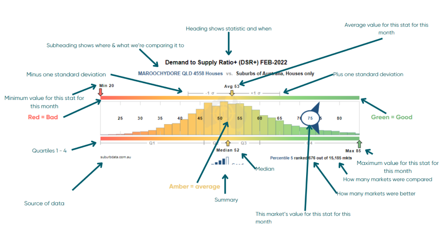
What is the title?
The heading defines the what and when:
What: The property statistic we are measuring, e.g. Demand to Supply Ratio.
When: At what time the data is from, e.g. the data available as at the end of Feb 2022.

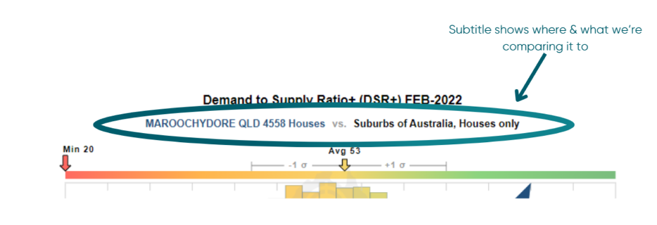
What is the subtitle?
The subtitle defines the where, the what, and what we’re comparing it to.
Where: A suburb, state and postcode, e.g. Maroochydore, QLD 4558.
What: The property type (Houses/Units), e.g. Houses.
Compared to: The market and property type we are comparing it to, e.g. Suburbs of Australia, Houses only.
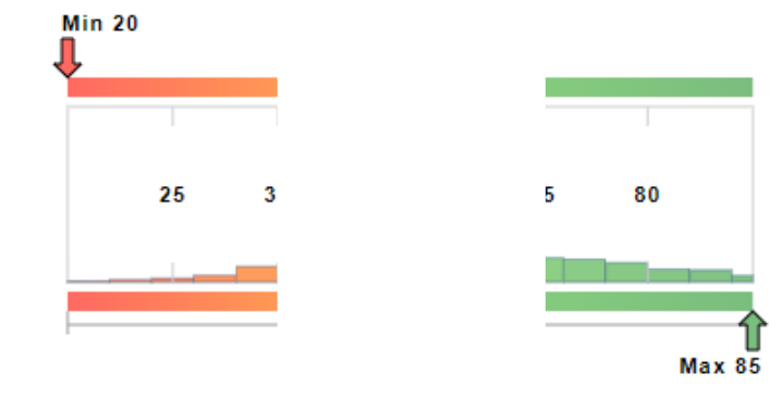
What is the min and max?
The ruler shows the entire range of values a statistic had across the entire country for the month mentioned in the heading. The left of the ruler shows the minimum value and the right shows the maximum.
What is the average and standard deviation?
The top middle of the ruler is roughly where the average sits:
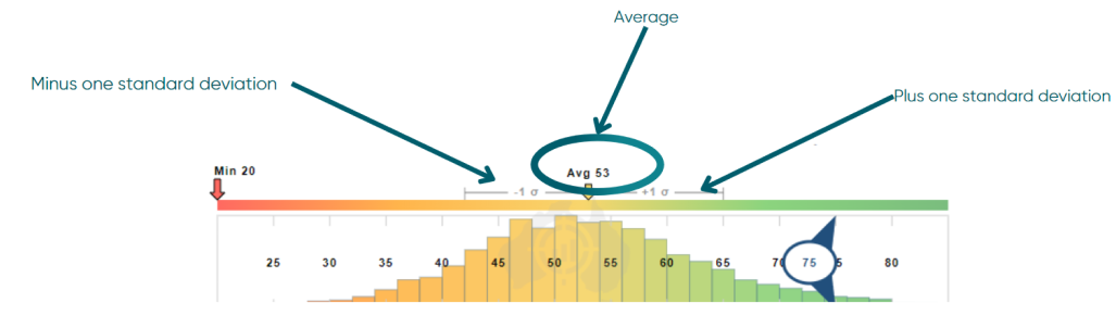
The yellow arrow on the top edge of the ruler points down to the place on the ruler where the average was for the statistic for all property markets for the year and month.
If your suburb of interest has a value better than the average for most stats, then you know you have a better than average property market for capital growth.
The grey lines to the left and right of the average are the minus one and plus one standard deviation points. The lower case Greek sigma character is used by statisticians to represent the standard deviation.
The standard deviation is a measure of how much variance there was in the figures across the entire Australian market. If the grey lines are short, it means most property markets had a score close to the average for this stat. The wider the range, the more unique each property market?s value for this statistic is, the more wildly they vary.
What is the median and what are quartiles?
The median and quartiles are shown along the bottom edge of the ruler:
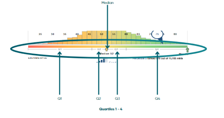
The median is the middle figure in a set when ordered numerically. The upward pointing yellow arrow shows the place along the ruler where the median value lies.
“Q1” is the range of values within the first quartile. The lowest 25% of all markets for this stat lie in this range. “Q2” is where the 2nd 25% of all markets lie. The junction between Q2 and Q3 is always the median since 50% of all markets lie above and below this value. “Q3” is where the 3rd 25% of all markets lie and “Q4” is where the last 25% lie.
If Q2 and Q3 are close to the median, it means that most markets had a figure for this stat that was close to the median. Like the standard deviation, if Q2 and Q3 are wide, it means the stats varied significantly between markets.
What is percentile, rank and count?
The percentile, the rank, and the number of property markets considered in creating the context ruler appear in the bottom right.

The black section shows the total count of markets for the month that had a value for this stat. This tells you how many markets there are that your market is competing against. (In this example it’s 15,185.)
To give you an example of how the percentile works – if there are 30,000 property markets, then the 1st 300 are in the top 1 percent. This is called the “1st percentile”. All property markets across the country are compared to see what percentile they fit in.
For the example above, the 5th percentile means that this statistic for the market was better than most of the other suburbs around the country. 95% of all property markets had a worse value for this statistic.
Ideally, you want your property market of interest to be in the 1st percentile.
What is the market's statistical value?
A blue circled marker is used to point out where the statistic for the property market under examination lies along the ruler:
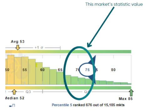
Inside the blue circle is a number for the value of this statistic for the market appearing in the heading.
Ideally, you want this blue market to be in the green section.
What does the shading mean?
You’ll notice that the context ruler is shaded from red to green:
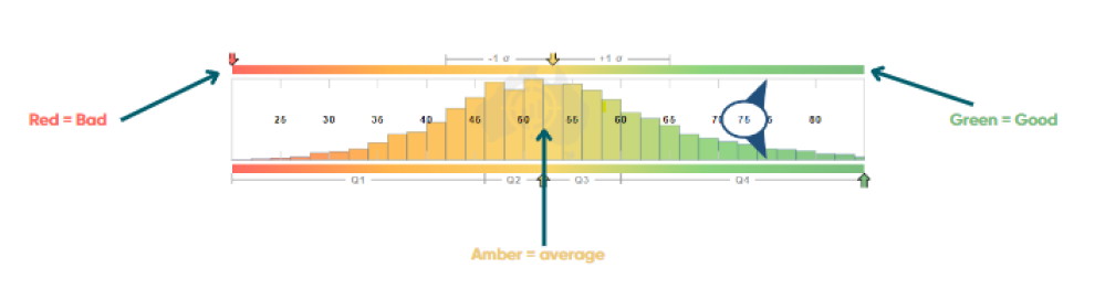
Red represents “bad” and green, “good”. Somewhere in the middle, where it’s amber, is the “benchmark” for the statistic.
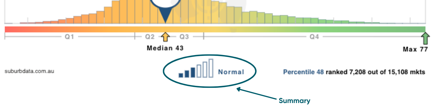
What is the summary?
The summary provides a quick phrase to place the statistic for this market in context. It is found at the bottom of the ruler, in the middle:
Why should I view context rulers?
You may already know that a property market with a 10% vacancy rate is a landlord’s disaster area. But do you know what a good value is for percentage of Stock on Market (SOM%)? Do you know what a good value is for Neighbour Price Balancing (NPB)?
Here at Suburb Data we publish statistics that aren’t published by any other data provider. And there are more to come. The context ruler helps you gain familiarity with the stat before it becomes widely known like vacancy rates.
A context ruler helps to gauge the value of a statistic with respect to other markets. But it also gauges the value of the statistic with respect to a benchmark. The context ruler is a great graphic to examine for a statistic you’re net entirely familiar with.
What's the big deal with context rulers?
If ever you’re wondering if a certain value is good or bad for a particular statistic, the context ruler answers that question.
You might see a suburb with a DSR of 60 and wonder if it is good or if it is merely OK. The context ruler can show you how many other suburbs have better values than 60 and how many are worse. It will show you the average for the DSR and the median. It will show the best value for any statistic and the worst from all suburbs around the country. It will effectively place any value for any statistic in context by comparing it with the broader market.
The context ruler becomes tremendously important when searching for the best suburbs that suit your criteria. To find such suburbs, you will need to set a filter that eliminates suburbs if they do not meet your criteria. Suburbs that do not have a good enough value for a certain statistic will be eliminated.
But how do you know what a good value is? How do you know if the threshold you set for that statistic was too tough for any suburb to pass. The context ruler shows how likely it is you will find suburbs with certain values for your chosen statistic.
What is the wider/broader market?
The context ruler compares a suburb’s value for a certain statistic to the value for the same statistic of other suburbs. The “other suburbs” are the wider market.
By default, the wider market is the rest of the country. But you can choose to limit the wider market to any large geography like a state, city or local government area (LGA). For example, you may want to know if 1% is above average for the Percentage Stock on Market for Brisbane. Or you may want to know if a yield of 5% is typical for a certain local government area (LGA).
How does the context ruler tell me if a statistic is good?
Red is bad and green is good. One end of the ruler will be green. If your suburb’s statistic is in the green, it’s a good sign.
You will never find a suburb that has a value for every statistic in the green area. Even the very hottest markets have at least a couple of statistics that are not so good.
How do I know if my suburb's statistic is better than average?
The average value of the statistic for the wider market is shown at the top of the ruler. If your suburb’s value for the statistic is on the greener side of average, then it is a good sign.
How can the bars along the ruler help me?
The bars along the ruler show how common certain values of the chosen statistic are. The width of the bars cover a small range of values for the chosen statistic. The height of a bar represents how many suburbs had a value for the chosen statistic within the range that bar covers.
For example, assume the statistic is the demand to supply ratio. And assume a certain bar’s width covered the range of DSRvalues from 50 to 52. If the bar was one of the tallest, then it means that many suburbs had a DSR between 50 and 52. But if there was a bar covering DSR values of 80 to 82, the bar will probably be short. This means there were not many suburbs with a DSR between 80 and 82.
The bars show how likely it is you will find suburbs with values for a certain statistic within a certain range. The short bars show rare values for the statistic.
Hover your mouse over a bar to read more about that range of values.
What does it mean if the ruler has no colour, if it is grey?
Some statistics have no consequence regarding investment potential, that is, they are neither good nor bad regardless of their value. For example, distance to the CBD has no influence on capital growth rates. Neither does the Typical Value. If these metrics are chosen, the context ruler will not be coloured.
Why would I want to set the period to a month in the past?
The broader market is always moving. What might have been a good figure for a statistic during a national recession, might be commonplace in a country-wide boom.
It is possible to see how older values for certain metrics compared to the broader market in the past. But most of the time, users accept the default period – the latest month.
Video Transcript
Video Transcript content
FREQUENTLY ASKED QUESTIONS
What does a context ruler diagram look like?
What is the title?
The heading defines the what and when:
What: The property statistic we are measuring, e.g. Demand to Supply Ratio.
When: At what time the data is from, e.g. the data available as at the end of Feb 2022.
What is the subtitle?
The subtitle defines the where, the what, and what we’re comparing it to.
Where: A suburb, state and postcode, e.g. Maroochydore, QLD 4558.
What: The property type (Houses/Units), e.g. Houses.
Compared to: The market and property type we are comparing it to, e.g. Suburbs of Australia, Houses only.
What is the min and max?
The ruler shows the entire range of values a statistic had across the entire country for the month mentioned in the heading. The left of the ruler shows the minimum value and the right shows the maximum.
What is the average and standard deviation?
The top middle of the ruler is roughly where the average sits:
The yellow arrow on the top edge of the ruler points down to the place on the ruler where the average was for the statistic for all property markets for the year and month.
If your suburb of interest has a value better than the average for most stats, then you know you have a better than average property market for capital growth.
The grey lines to the left and right of the average are the minus one and plus one standard deviation points. The lower case Greek sigma character is used by statisticians to represent the standard deviation.
The standard deviation is a measure of how much variance there was in the figures across the entire Australian market. If the grey lines are short, it means most property markets had a score close to the average for this stat. The wider the range, the more unique each property market?s value for this statistic is, the more wildly they vary.
What is the median and what are quartiles?
The median and quartiles are shown along the bottom edge of the ruler:
The median is the middle figure in a set when ordered numerically. The upward pointing yellow arrow shows the place along the ruler where the median value lies.
“Q1” is the range of values within the first quartile. The lowest 25% of all markets for this stat lie in this range. “Q2” is where the 2nd 25% of all markets lie. The junction between Q2 and Q3 is always the median since 50% of all markets lie above and below this value. “Q3” is where the 3rd 25% of all markets lie and “Q4” is where the last 25% lie.
If Q2 and Q3 are close to the median, it means that most markets had a figure for this stat that was close to the median. Like the standard deviation, if Q2 and Q3 are wide, it means the stats varied significantly between markets.
What is percentile, rank and count?
The percentile, the rank, and the number of property markets considered in creating the context ruler appear in the bottom right.
The black section shows the total count of markets for the month that had a value for this stat. This tells you how many markets there are that your market is competing against. (In this example it’s 15,185.)
To give you an example of how the percentile works – if there are 30,000 property markets, then the 1st 300 are in the top 1 percent. This is called the “1st percentile”. All property markets across the country are compared to see what percentile they fit in.
For the example above, the 5th percentile means that this statistic for the market was better than most of the other suburbs around the country. 95% of all property markets had a worse value for this statistic.
Ideally, you want your property market of interest to be in the 1st percentile.
What is the market's statistical value?
A blue circled marker is used to point out where the statistic for the property market under examination lies along the ruler:
Inside the blue circle is a number for the value of this statistic for the market appearing in the heading.
Ideally, you want this blue market to be in the green section.
What does the shading mean?
You’ll notice that the context ruler is shaded from red to green:
Red represents “bad” and green, “good”. Somewhere in the middle, where it’s amber, is the “benchmark” for the statistic.
What is the summary?
The summary provides a quick phrase to place the statistic for this market in context. It is found at the bottom of the ruler, in the middle:
Why should I view context rulers?
You may already know that a property market with a 10% vacancy rate is a landlord’s disaster area. But do you know what a good value is for percentage of Stock on Market (SOM%)? Do you know what a good value is for Neighbour Price Balancing (NPB)?
Here at Suburb Data we publish statistics that aren’t published by any other data provider. And there are more to come. The context ruler helps you gain familiarity with the stat before it becomes widely known like vacancy rates.
A context ruler helps to gauge the value of a statistic with respect to other markets. But it also gauges the value of the statistic with respect to a benchmark. The context ruler is a great graphic to examine for a statistic you’re net entirely familiar with.
What's the big deal with context rulers?
If ever you’re wondering if a certain value is good or bad for a particular statistic, the context ruler answers that question.
You might see a suburb with a DSR of 60 and wonder if it is good or if it is merely OK. The context ruler can show you how many other suburbs have better values than 60 and how many are worse. It will show you the average for the DSR and the median. It will show the best value for any statistic and the worst from all suburbs around the country. It will effectively place any value for any statistic in context by comparing it with the broader market.
The context ruler becomes tremendously important when searching for the best suburbs that suit your criteria. To find such suburbs, you will need to set a filter that eliminates suburbs if they do not meet your criteria. Suburbs that do not have a good enough value for a certain statistic will be eliminated.
But how do you know what a good value is? How do you know if the threshold you set for that statistic was too tough for any suburb to pass. The context ruler shows how likely it is you will find suburbs with certain values for your chosen statistic.
What is the wider/broader market?
The context ruler compares a suburb’s value for a certain statistic to the value for the same statistic of other suburbs. The “other suburbs” are the wider market.
By default, the wider market is the rest of the country. But you can choose to limit the wider market to any large geography like a state, city or local government area (LGA). For example, you may want to know if 1% is above average for the Percentage Stock on Market for Brisbane. Or you may want to know if a yield of 5% is typical for a certain local government area (LGA).
How does the context ruler tell me if a statistic is good?
Red is bad and green is good. One end of the ruler will be green. If your suburb’s statistic is in the green, it’s a good sign.
You will never find a suburb that has a value for every statistic in the green area. Even the very hottest markets have at least a couple of statistics that are not so good.
How do I know if my suburb's statistic is better than average?
The average value of the statistic for the wider market is shown at the top of the ruler. If your suburb’s value for the statistic is on the greener side of average, then it is a good sign.
How can the bars along the ruler help me?
The bars along the ruler show how common certain values of the chosen statistic are. The width of the bars cover a small range of values for the chosen statistic. The height of a bar represents how many suburbs had a value for the chosen statistic within the range that bar covers.
For example, assume the statistic is the demand to supply ratio. And assume a certain bar’s width covered the range of DSR values from 50 to 52. If the bar was one of the tallest, then it means that many suburbs had a DSR between 50 and 52. But if there was a bar covering DSR values of 80 to 82, the bar will probably be short. This means there were not many suburbs with a DSR between 80 and 82.
The bars show how likely it is you will find suburbs with values for a certain statistic within a certain range. The short bars show rare values for the statistic.
Hover your mouse over a bar to read more about that range of values.
What does it mean if the ruler has no colour, if it is grey?
Some statistics have no consequence regarding investment potential, that is, they are neither good nor bad regardless of their value. For example, distance to the CBD has no influence on capital growth rates. Neither does the Typical Value. If these metrics are chosen, the context ruler will not be coloured.
Why would I want to set the period to a month in the past?
The broader market is always moving. What might have been a good figure for a statistic during a national recession, might be commonplace in a country-wide boom.
It is possible to see how older values for certain metrics compared to the broader market in the past. But most of the time, users accept the default period – the latest month.