historical chart TUTORIAL
Check past performance
Check for volatility
Check for trends
Video Transcript
Video Transcript content
FREQUENTLY ASKED QUESTIONS
How far back does the data go?
Most of our data goes back to 2010, a portion to 1990, and some to 1980!
That’s a lot of years of accurate, historical information on many suburbs across Australia – something that’s very hard to find elsewhere on the market.
What statistics can I chart?
You can chart any property statistic you like, as well as compare its performance side-by-side with another one (for example, if you’re keen to track both the vacancy rates and yield for a specific location).
These property statistics include: typical value, rental yield, vacancy rates, average vendor discount, auction clearance rates, percentage of stock on market, neighbour price balancing, online search interest, statistical reliability, median scores, proportion of renters, market cycle timing, long term growth indications, ripple effect potential, percentage sales growth, percentage rental growth, percentage of sales by auction, percentage of sales listings with open inspections, unit to house value comparison, demand to supply ratio, and more.
Can I compare multiple markets against other markets?
Yes. This is one of our most favourite features of the tool – you can plot the historical performance of up to 10 geographical areas (suburbs, significant urban areas, local government areas, etc.), and have the charts run side-by-side so you can easily compare their differences.
This is amazing if you want to compare one suburb against another suburb, and even better, you also get to chart one suburb and its local government area – so you can confirm any uptick in growth is happening across neighboring suburbs as well (helps reduce risk).
If you’re a borderless buyer, this also means you can compare markets across different states to discover the best opportunity for capital growth (and spot any red flags without wasting time and money physically inspecting a suburb).
Is historical performance a guarantee for future performance?
Historical performance is great at “leaving clues” for future performance, in particular assessing the opportunities, risks and trends of a particular property market – but it is not a guarantee of its future performance.
In a nutshell: historical data provides valuable insights into the past behaviour and success of a particular area, however it’s important to note that past performance does not guarantee future results.
External factors, market conditions and economic environments can change, impacting the future performance of investments. For this reason, property investors should use historical performance as one of several tools in their decision-making process.
What is volatility?
Volatility in the data means that market trends are up and down – they are fluctuating in values, and you might even see clear peaks and dips in the chart.
This happens for two possible reasons: i) there is less data available; ii) the market is inherently volatile. Both come with risks to a property investor.
As rule of thumb, highly volatile markets are risky because you can’t adequately predict or assess the market’s performance – which makes it tough to make an informed decision. For this reason, we typically like to steer clear of markets that are showing signs of volatility or unpredictability.
Obviously, it will come down to your risk appetite – regardless, its always a great idea to assess the level of volatility in historical charts.
What if I want to see the historical vacancy rates of a suburb AND its rent growth?
Great news. You can run each metric side-by-side so you can see both!
With this particular example, there should be a correlation with both – for example: higher vacancy rates at a particular time may have contributed to lower rent soon after.
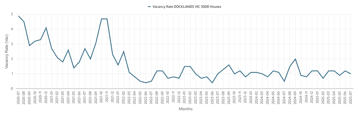
A tangible example could be the Docklands in Melbourne when Covid-19 hit – many tenants started leaving their properties, which saw a big rise in vacancy rates. Because of this, rents took a hit to try and attract tenants back in. (Supply and Demand clearly evident.)
By plotting multiple statistics like this, you can assess the suburb from different angles and determine genuine trends in the data. This way, you can best predict future opportunities and risks.
If you want to do this, simply enter the primary statistic you would like to see and then a secondary statistic. Once you click “get data” both statistics will appear on the chart.
What do we mean by "plot"?
A plot is a line or bar on the chart. It is a single series of data points. You can have multiple plots on the chart.
For example: you can “plot” the Typical Value of a suburb for the last 12 months (to measure its growth or decline) and you can also “plot” another area or property statistic as well.
What does the "primary" and "secondary" statistic mean?
Sometimes supply and demand in a suburb can shift independently from their neighbours or the broader market, like the local government area (LGA). But if the whole LGA is moving, then it lends more weight to the argument that something is happening in the area. A single suburb moving while its LGA is static, may not be so convincing.
Why would I want to see a chart for a big area instead of a suburb?
Sometimes supply and demand in a suburb can shift independently from their neighbours or the broader market, like the local government area (LGA). But if the whole LGA is moving, then it lends more weight to the argument that something is happening in the area. A single suburb moving while its LGA is static, may not be so convincing.
Why would I want to plot multiple markets on the one chart?
You might like to see which of 2 or 3 markets has grown the most over a certain timeframe. Or you might like to see how the DSR for a suburb has changed relative to its local government area, or its city, or even versus the nation.
Why would I want to plot both a primary & secondary Statistic?
You might want to see how two different metrics have been changing together over the same timeframe. For example, you may want to see how an increasing DSR has led to price growth. Or maybe how low vacancy rates have led to rental growth.
Why would I want some plots to be bars instead of lines?
Using bars instead of lines helps distinguish between the different data series. If you have more than a couple of plots on the chart, using a combination of lines and bars can make the chart easier to read.
What is a Trend line?
A trend line is sometimes called a “line of best fit”. It approximates the direction the data series is heading.
Trend lines are mathematically fitted to a set of data points to miss those points by the smallest margin.
The simplest trend line is a straight line. But sometimes data doesn’t move in straight lines, so other trend lines might be more suitable.
Why would I want to plot a trend line?
Trend lines are handy in two situations. Firstly, they show the general direction the data is heading. It might not be obvious using the naked eye.
Secondly, they help with volatile data. For example, vacancy rates may suddenly drop from 4% one month to 0.4% the next and then back up again. So, how do we know the approximate vacancy rate at any point in time? Plot a trend line through it.
Why would I change the end month, so the chart finishes earlier than the most recent month?
You might like to know how a certain suburb finished the financial year when it is November right now.
Or you might like to zoom in to an era in the past for a closer look without paying for all the recent data.
Why would I change the default 12-month period?
You may only be interested in getting a rough idea of what vacancy rates are now. The past 6 months should be more than enough for that.
At the other extreme, you may want to know how growth has been tracking for a certain suburb over the last decade or two.
Or you may want to see how supply and demand has been trending over the last 2 or 3 years.
You can choose different periods depending on what you are researching.