

Some professionals advise investors to buy at the bottom. Get in before the rise. Capture the full growth cycle.
It sounds reasonable. Buy when prices are lowest. Ride the wave up.
The historical data tells a different story. Bottoms are only obvious in hindsight. They can drag on for years longer than anticipated. The opportunity cost is massive.
When reduced to a tested formula, buying at the bottom usually underperforms buying in a boom.
What Buying at the Bottom Means
Markets do not always go up. They can peak, retract, and level off before resuming growth.
The theory of buying at the bottom is straightforward. Identify the trough. Buy before the next surge.
The problem is identifying the trough.
The Sydney Case Study
The chart below shows the median Sydney house price from January 2000 to September 2005. Prices rose from around $330,000 to around $560,000, then started flattening.
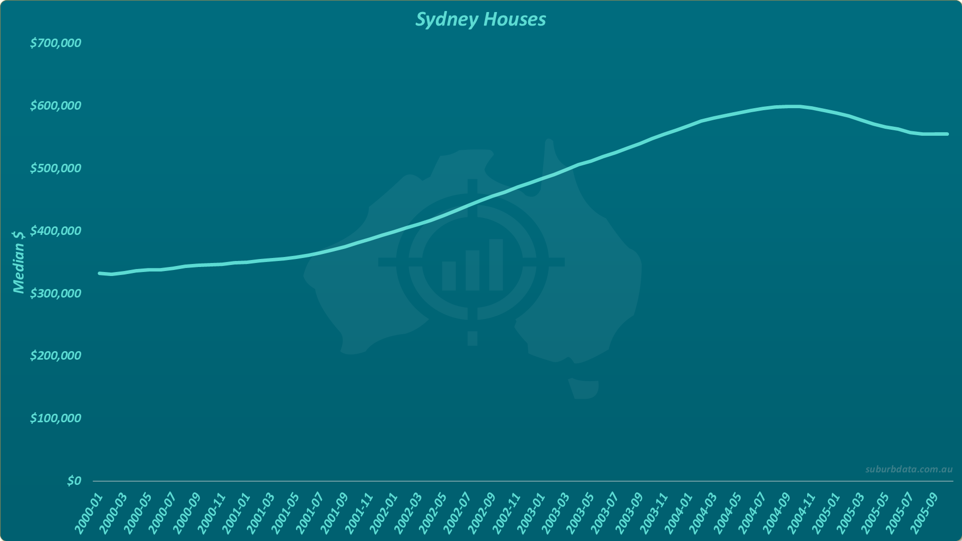
An investor at the end of 2005 sees prices have flattened. The market looks bottomed. Time to buy?
Bottoms Drag On
The chart below extends the same Sydney data by another 18 months.
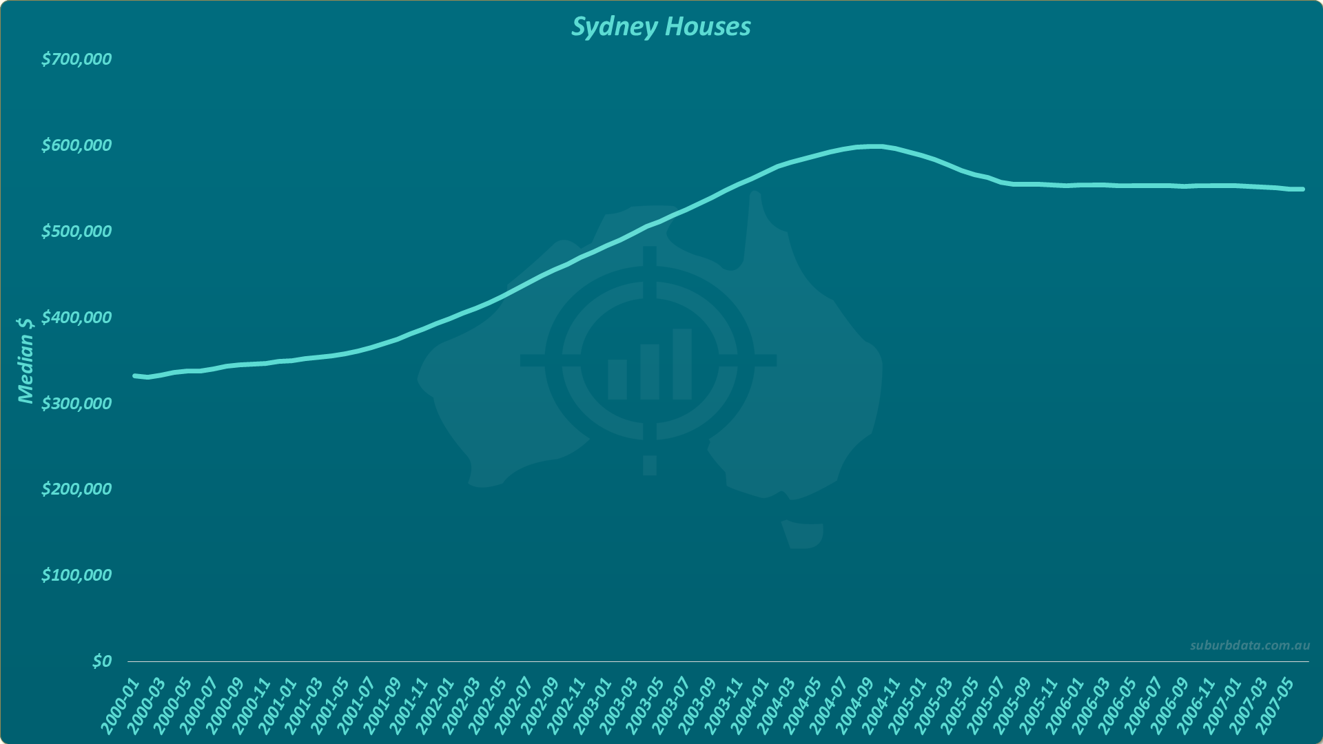
Sydney houses stayed at the bottom for nearly three years. Prices did not bounce. They flatlined.
That is the first problem with picking the bottom. The bottom can drag for longer than expected. Just because the market has stopped falling does not necessarily mean it will start rising.
The Opportunity Cost Is Massive
While Sydney stayed flat, other markets boomed. The table below shows total growth in selected Australian markets to the end of 2007.
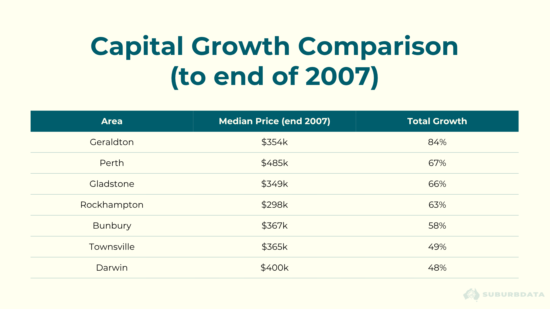
For a $500,000 property:
- Sydney: 0% growth, $0 gain
- Perth: 67% growth, $335,000 gain
- The rest of the country: average 20% growth, $100,000 gain
An investor that mistakenly picked the Sydney bottom missed a quarter of a million dollars. In 2007 dollars. In today's terms, the cost would be considerably higher.
Patience does not reward you in this case. Depending on what is happening elsewhere, you could be falling behind the rest of the market.
The First False Recovery
The chart below extends the Sydney data to April 2008. The curve has started to turn upward.
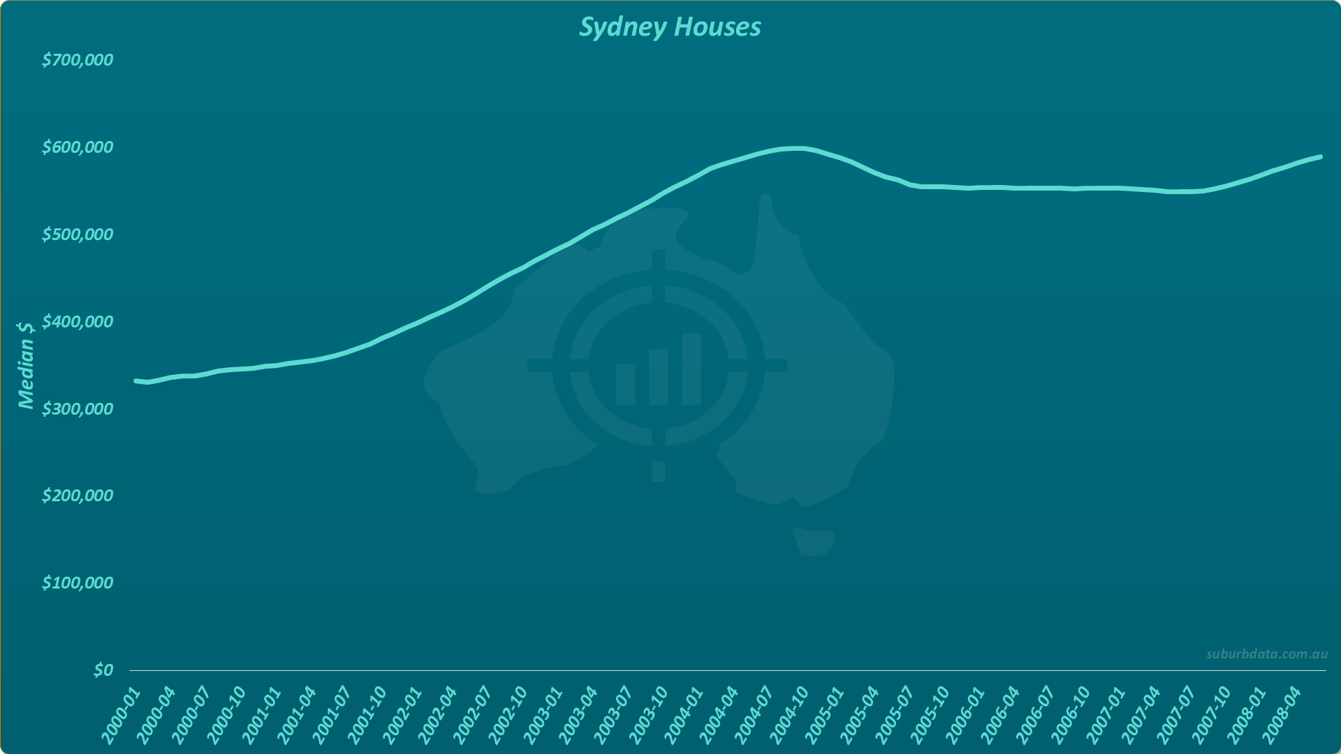
The long flat bottom looks over. Recovery has started. By waiting a bit longer, the investor has avoided going in too early.
Is this the buy signal?
The False Recovery Reverses
The chart below extends the data to early 2010.
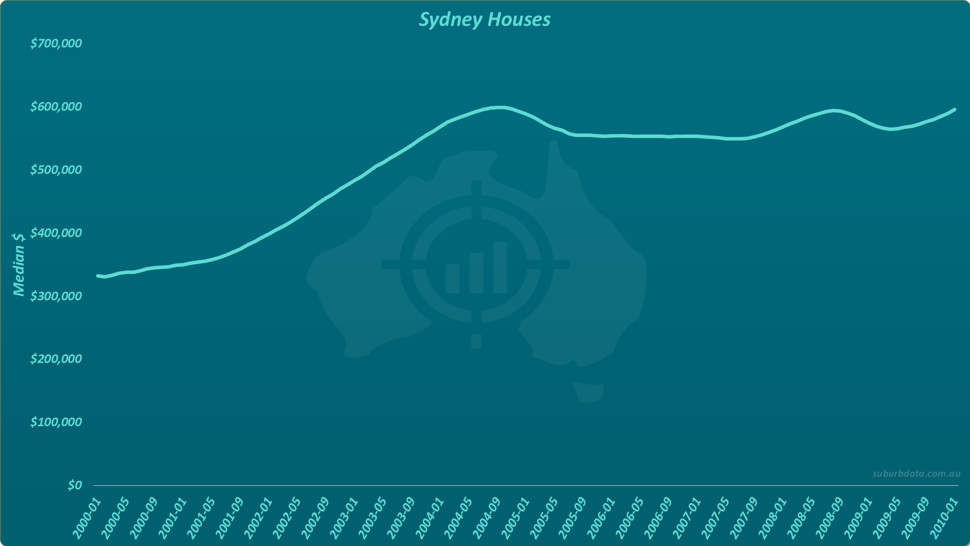
The late-2007 upturn was a false positive. Prices went backward and took 18 months to return to where they started.
This is the second problem with picking the bottom. Recoveries can be false positives. The market shows signs of life, then retracts again.
The Solid Uptrend
The chart below extends the data to November 2010. The curve has now broken into new territory.
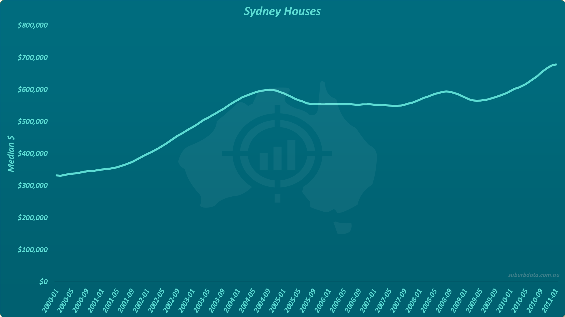
This does not look like a mild upturn. It is a solid uptrend.
Is this now the buy signal?
We Got It Wrong Again
The chart below extends the data another three years.
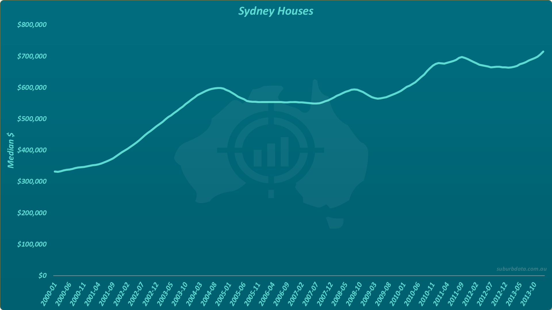
Another three years passed with almost no improvement in price. The solid uptrend was another false positive.
How is this point in time any different from the previous mistakes? The investor has been fooled twice.
The Boom Finally Arrives
The chart below extends the data to July 2017.
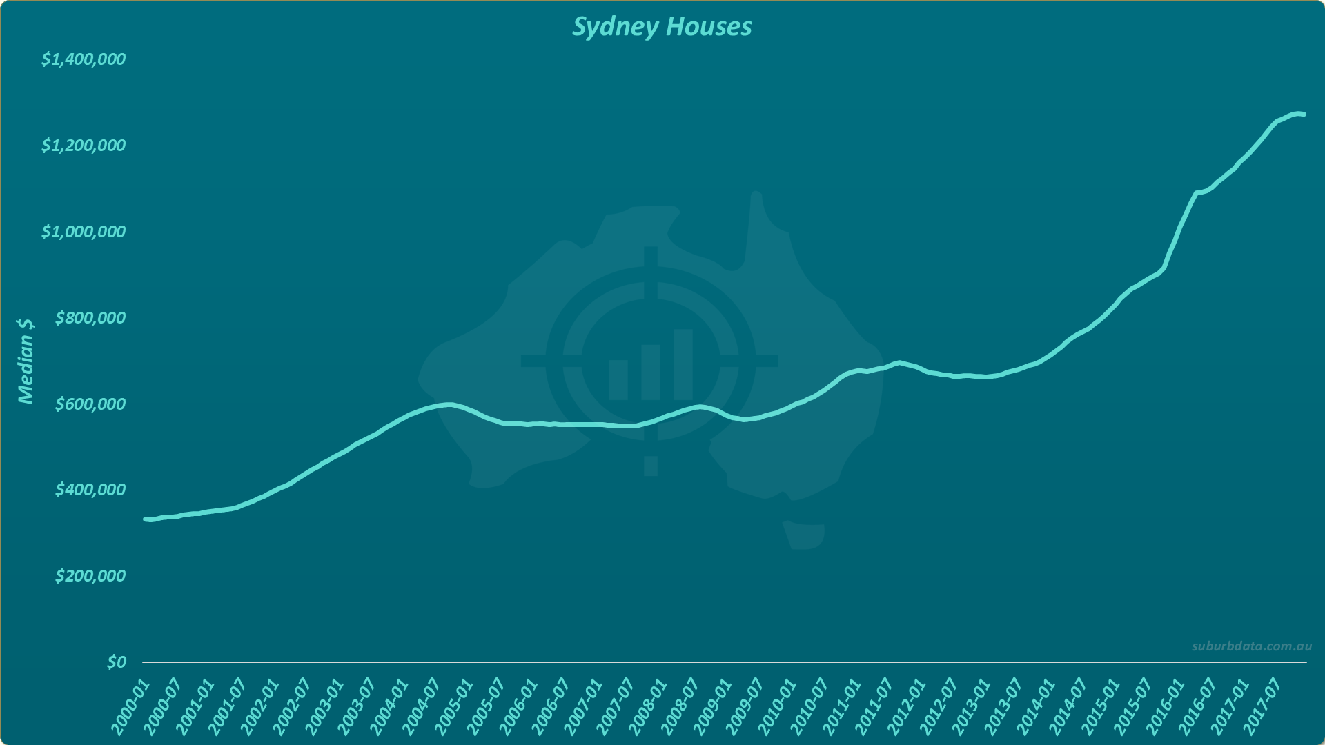
The boom arrived in 2013. Sydney was the right place to buy in early 2013.
But there was nothing in the price movements beforehand to distinguish this signal from the previous false positives. Small year-to-year movements are not a reliable means of timing entry.
And Another Apparent Bottom
The chart below extends the data to November 2019.
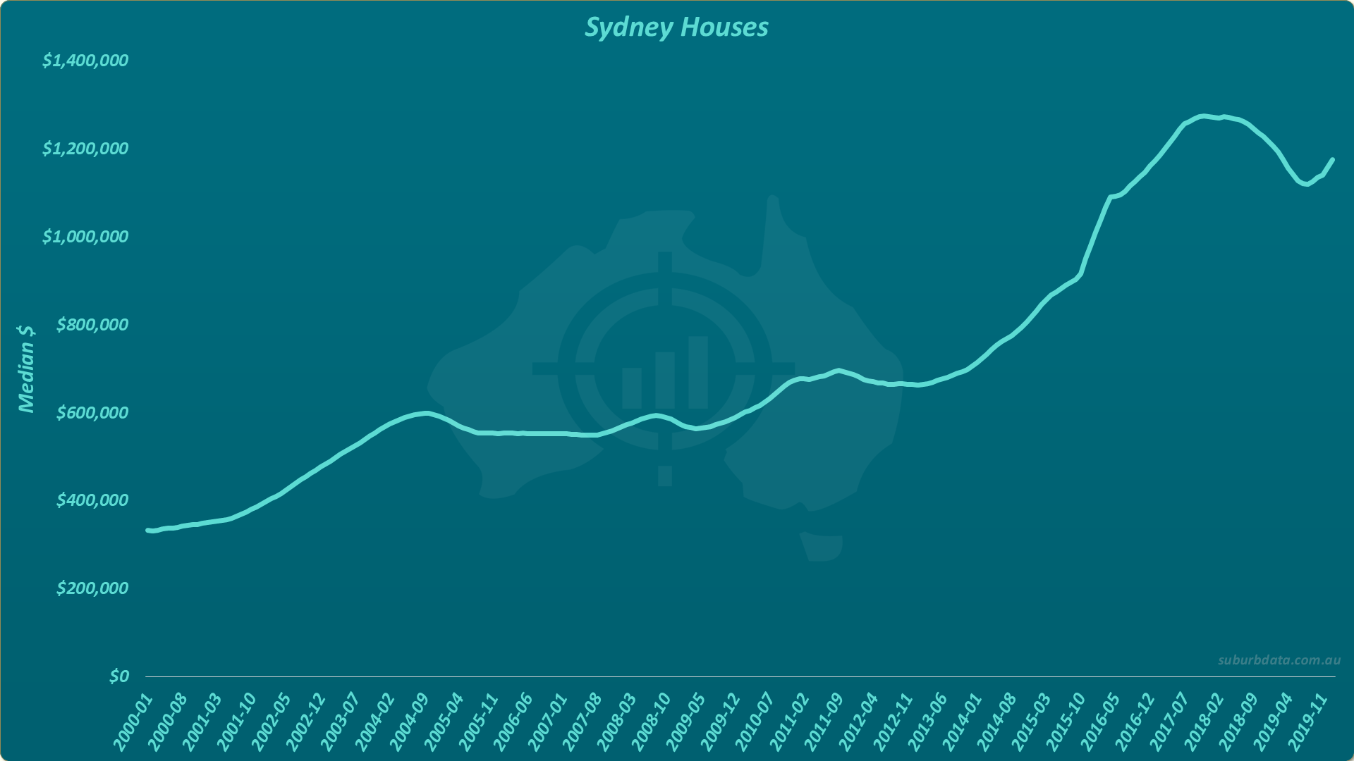
Prices peaked and retracted. Is this the next time to buy? Has the bottom passed?
The investor knows not to jump in too early. Two years since the last peak feels too short.
The Cycle Refuses to Be Predicted
The chart below extends to August 2021.
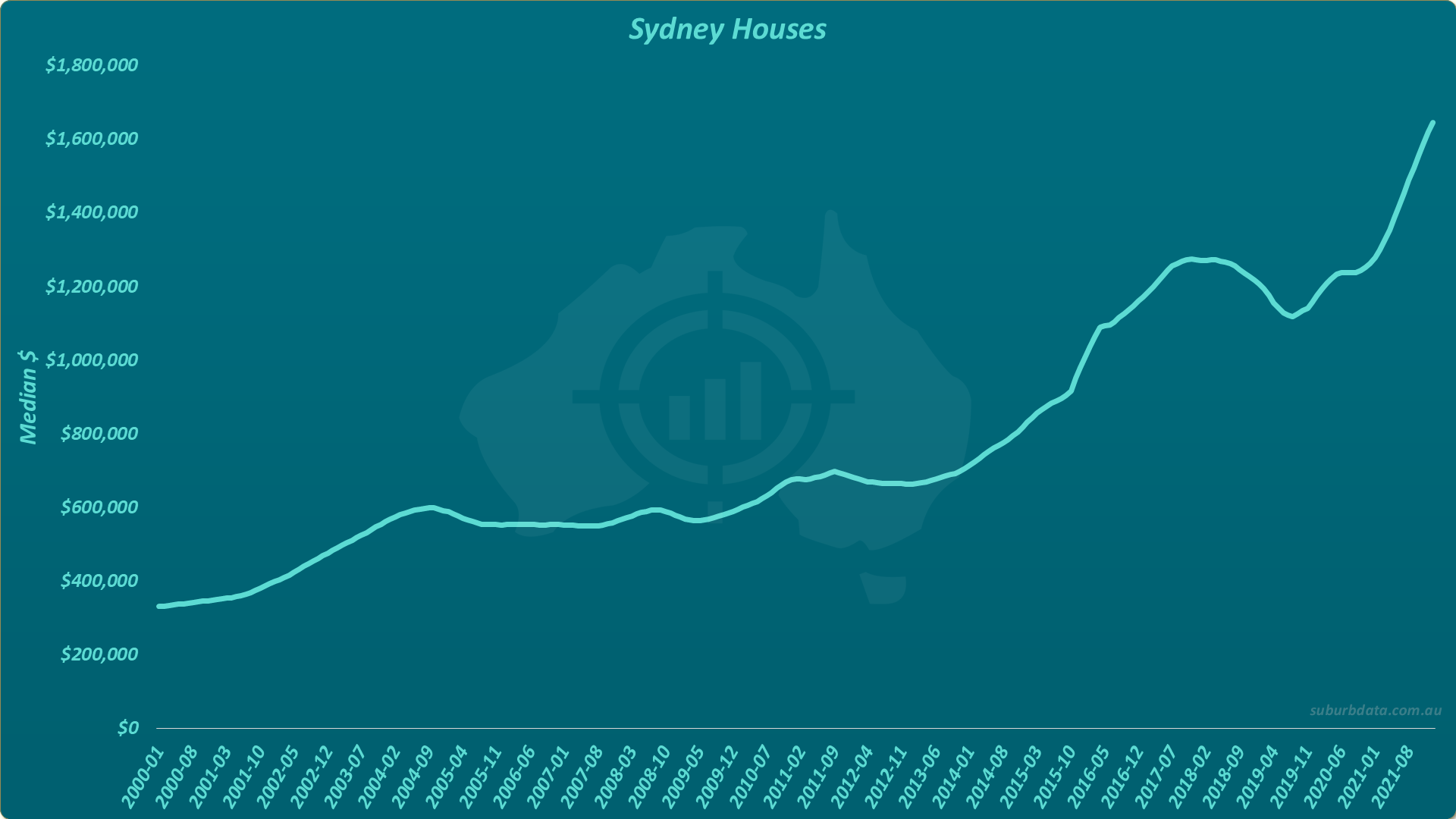
Despite only two years since the last peak, the bottom was brief. The market took off again.
Waiting for more correction would have meant missing the boom.
The 2005-2009 bottom dragged four years. The 2019 bottom lasted months. No two cycles are the same. Picking the bottom is not easy, except in hindsight.
Hindsight Versus Real Time
The chart below marks three perfect buy points: 2001, 2014, and 2019.
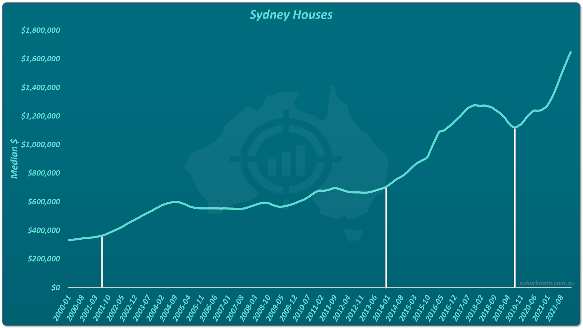
Marking these in hindsight takes seconds. Picking them in real time takes luck.
A single market is one example. To test whether the strategy works, a formula has to be applied across many markets and many cycles.
The Buy Bottom Formula
We tested the bottom-buying strategy across 330 SA3s (Statistical Area Level 3) over 40 years of historical data. SA3s are groups of suburbs a bit larger than a typical local government area, defined by the Australian Bureau of Statistics.
The buy trigger:
- Decline of 10% or more
- Over the last 12 months
We measured the next 5 years of growth for each SA3 that triggered.
- Next 5 years growth: 7.5% per annum
- Benchmark (rest of nation): 6.5% per annum
- Outperformance: 1% per annum
- Observations: 586 in 40 years
Buying at the bottom beat random suburb selection by 1% per annum. The strategy delivers a small advantage. But can buying in a boom deliver more?
Buying in a Boom Outperforms
We applied the same testing to a buy-in-a-boom strategy. The trigger:
- Increase of 20% or more
- Over the last 2 years
Results:
- Next 5 years growth: 9.9% per annum
- Benchmark (rest of nation): 8.2% per annum
- Outperformance: 1.7% per annum
- Observations: 937 in 40 years
Buying in a boom beat the benchmark by nearly 2% per annum. There were also 60% more opportunities than the bottom-buying strategy.
Why Late Beats Early
Five possible explanations:
- Booms and bottoms last longer than expected. Both phases tend to drag, but missing some early growth in a boom is less costly than waiting through a long flat bottom.
- Booms are easier to identify. A 20% rise over 2 years is unmistakable. A bottom can disguise continued decline.
- Property is not the share market. The dead-cat bounce that fools share traders is rare in property. Once a market bottoms, it tends to stay flat rather than reverse.
- Investor psychology. Buying at the bottom feels safe. Buying in a boom feels late. The data flips that intuition.
- Easier to commit. Buyers do not want to compete in hot markets. It is frustrating to miss out. But avoiding hot markets means missing the strongest performers.
How Long Are Cycles?
There is no typical cycle length. Cycles play out in 5 years or 15. Every market and every cycle is different.
Rough estimates of how a market spends its time:
- Booming: 30%
- Flat or declining: 30%
- Moderate growth: 40%
Bottoms make up around 30% of the cycle. The opportunity cost is high while other markets boom.
Conclusion
Buying at the bottom does work. Just not as well as the alternative.
- Buy at the bottom: 7.5% per annum, 1% above benchmark, 586 opportunities
- Buy in a boom: 9.9% per annum, 8.2% above benchmark, 937 opportunities
Bottoms drag. Recoveries are often false. Picking the trough is easy in hindsight and a guess in real time. Even when the strategy is reduced to a tested formula, the result is marginal.
A critical caveat. Buying in a boom is not the same as buying at the peak. A market that has grown 20% over the last year probably has plenty more growth to come. But a market that has grown 100% over the last 5 years is more likely near its peak.
It is poor advice to buy at the bottom. It is better to buy in a boom. They are not only more profitable, they are also easier to pick.