

Fake experts warn investors away from cheap markets. The claim is that when times get tough, cheap markets fall the hardest.
Investors avoid affordable suburbs on this basis. They pay more for markets they believe are safer.
Historical data was examined across 45 years of Australian property history. Five market corrections. One consistent result.
Cheap markets do not fall the most. Expensive ones do.
Finding the Tough Times
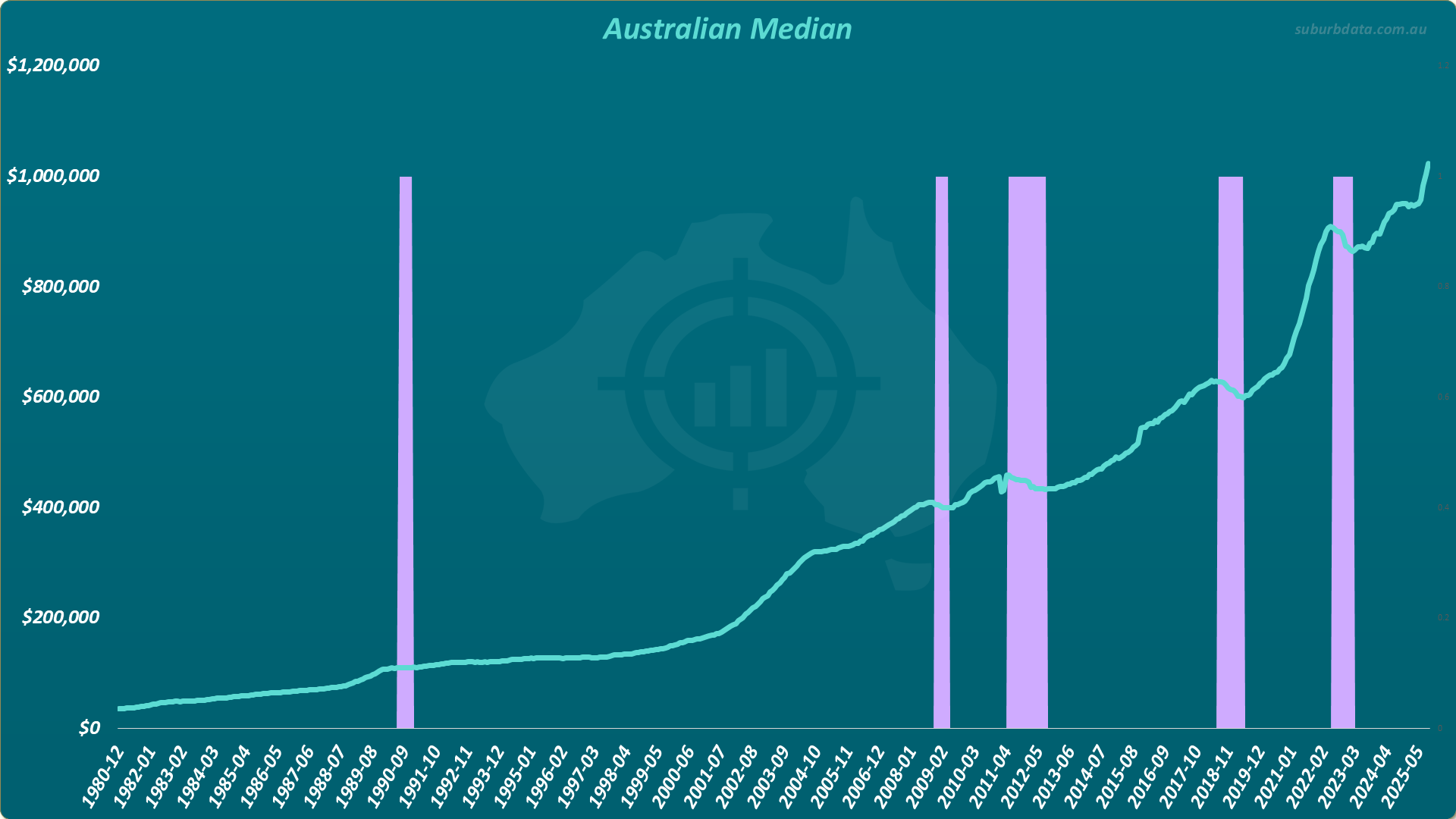
The chart below shows the Australian median house price across significant urban areas from 1980 to 2025. Purple bars mark the five periods where the national median stopped growing or went backwards.
How the Analysis Works
All suburbs were grouped into SA3s (Statistical Area Level 3). Each SA3 is roughly the size of a local government area. There are about 330 SA3s across the country.
SA3s were then split into 10 deciles by typical property value:
- Decile 1: cheapest 10% of SA3s
- Decile 2 to 9: mid-range
- Decile 10: most expensive 10% of SA3s
For each correction, growth was calculated per decile. Cheap deciles on the left. Expensive on the right. A trend line shows the general pattern.
Correction 1: July 1990 to December 1990
The chart below shows growth by value decile during the first correction.
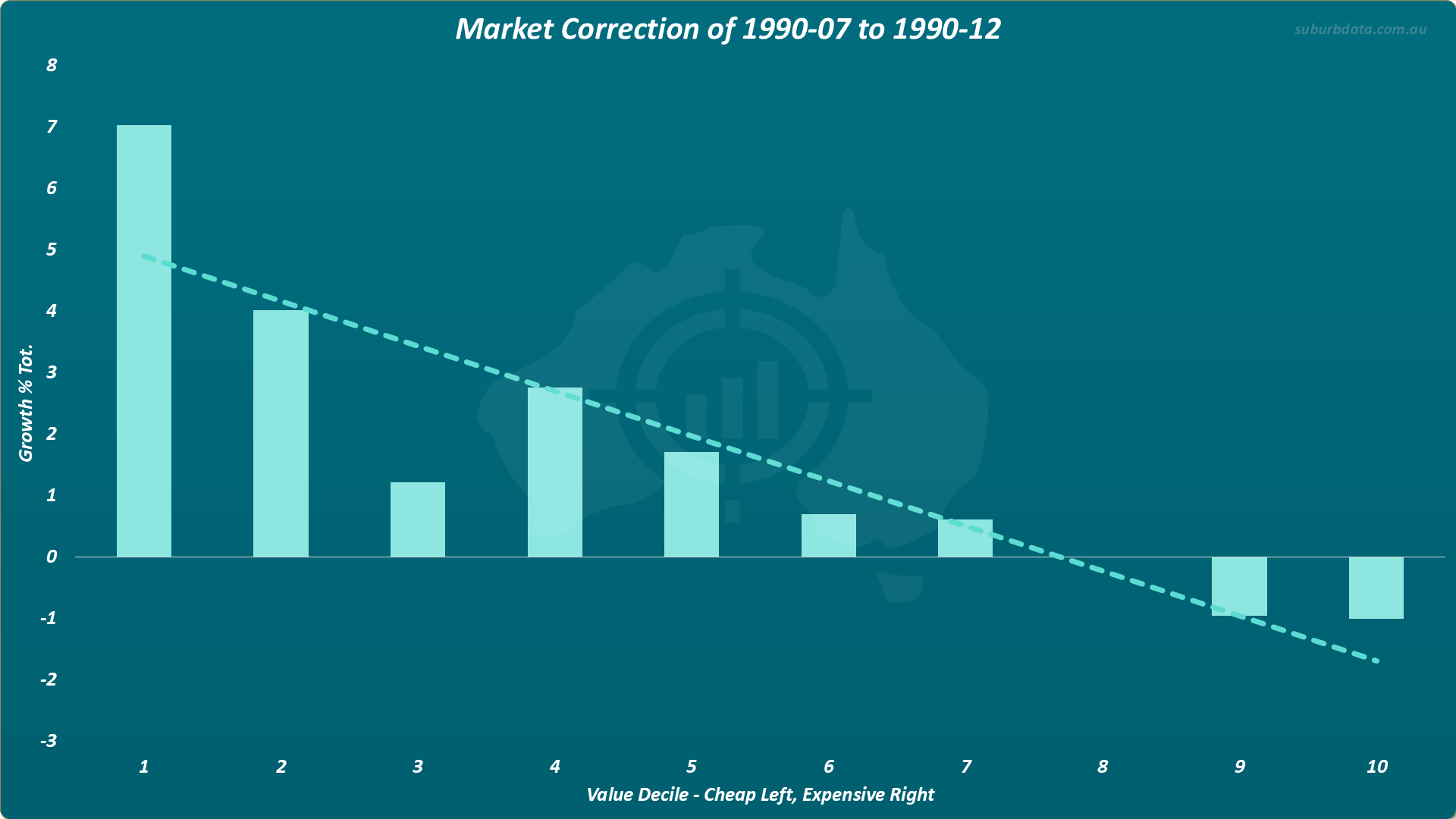
- Period: July 1990 to December 1990
- Duration: 6 months
- Cheapest decile: plus 7%
- Most expensive decile: minus 1%
- Result: Cheap markets grew. Expensive markets went backwards.
The nation was having a tough time. Cheap markets were booming.
Correction 2: November 2008 to April 2009
The chart below shows growth by value decile during the Global Financial Crisis.
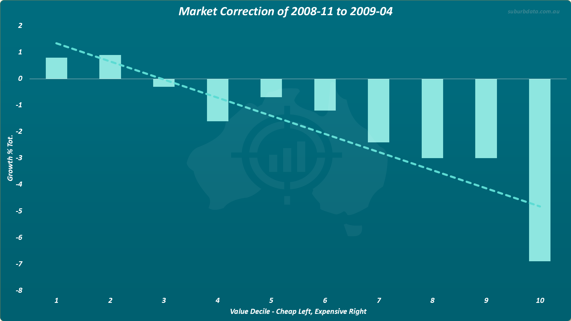
- Period: November 2008 to April 2009
- Duration: 6 months
- Cheapest decile: plus 1%
- Most expensive decile: minus 7%
- Result: Cheap markets held. Expensive markets fell hard.
Correction 3: May 2011 to August 2012
The chart below shows growth by value decile during the third correction.
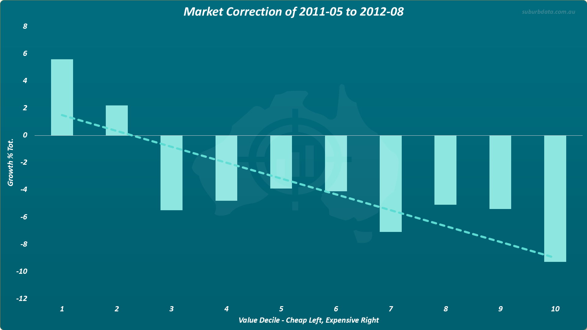
- Period: May 2011 to August 2012
- Duration: 15 months
- Cheapest decile: plus 6%
- Most expensive decile: minus 9%
- Result: A gap of 15 percentage points between the cheapest and most expensive deciles.
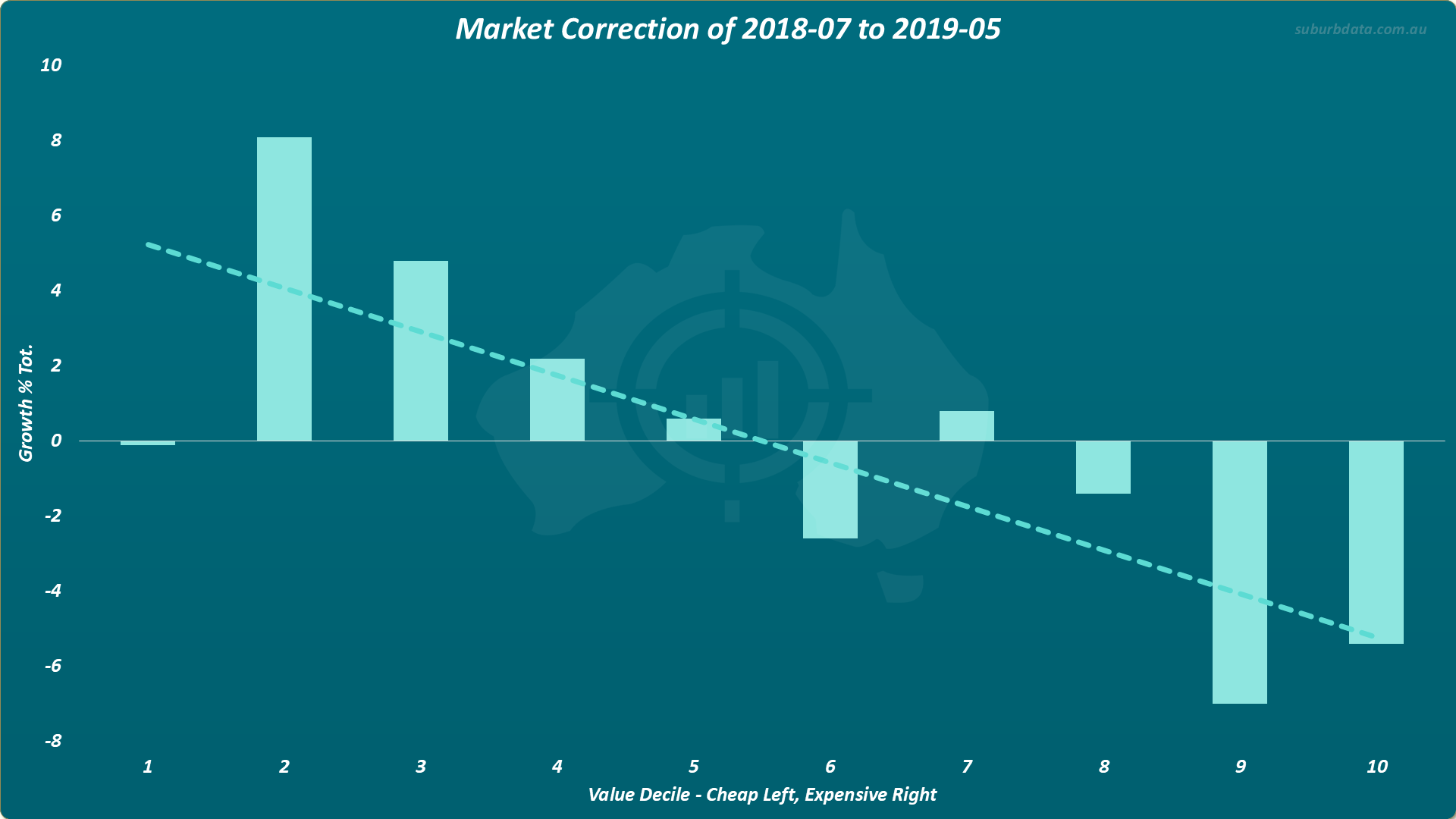
Correction 4: July 2018 to May 2019
The chart below shows growth by value decile during the fourth correction.
- Period: July 2018 to May 2019
- Duration: 11 months
- Cheapest decile: near zero
- Most expensive decile: minus 5%
- Result: The cheapest SA3 barely moved. Expensive markets fell. The trend line slopes the same way.
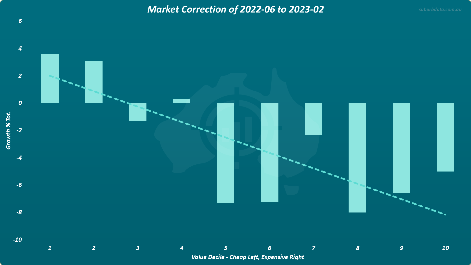
Correction 5: June 2022 to February 2023
The chart below shows growth by value decile during the most recent correction.
- Period: June 2022 to February 2023
- Duration: 8 months
- Cheapest decile: plus 3.5%
- Most expensive decile: minus 8%
- Result: Same pattern. Cheap positive. Expensive negative.
Five corrections. Five results in the same direction. The trend line in every single chart slopes downward from cheap to expensive.
Why Does This Happen
Two reasons might explain the pattern:
- Demand shuffles down. Perhaps when buyers become cautious, they move toward more affordable options. If so, demand would concentrate at the cheaper end of the market.
- Wage earners at full tilt. Perhaps lower income earners working 37.5 hours a week have flexibility. They might supplement income with part-time work when times get tough. Perhaps a higher income earner can’t significantly supplement their income giving a few rideshare trips each night. If so, when mortgage stress hits, they have to sell.
Conclusion
Cheaper markets do not fall the most during tough times. Expensive markets do.
Five corrections across 45 years. The same pattern every time.
The advice to avoid cheap markets because they are riskier is not just wrong. It is the opposite of the truth.
Cheap markets are not the risk. They are the refuge.
In tough times, there is no flight-to-quality. Instead, there is a flight-to-affordable.