

A lot of experts read demographic statistics as a guide to demand. If 80% of properties in a suburb are houses, they say the demand is for houses. Buy a house. Do not buy a unit.
The statistic does not say what they think it says.
80% houses is a fact about supply, not demand. Confusing the two is one of the worst mistakes an investor can make.
Supply and Demand Determine Prices
Prices move on the relationship between supply and demand.
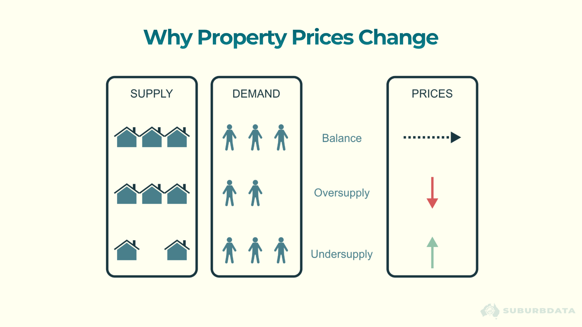
- Balance: supply matches demand, prices hold steady
- Oversupply: more property than buyers, prices fall
- Undersupply: more buyers than property, prices rise
Supply and demand are two separate categories. They are measured separately. They move independently. A statistic about one is not a statistic about the other.
This is the error fake experts make. They read a supply statistic and call it demand.
80% Houses Tells You About Supply, Not Demand
If 80% of properties in a suburb are houses, that figure describes what has been built. Not what buyers want.
80% of properties built were houses. 80% of dwellings developed were houses. 80% of properties supplied to the market were houses.
What gets built is supply. Supply is the enemy of capital growth.
Developers do research before they build. For relatively new suburbs, the supply mix might still reflect demand. But what if the houses were built 10, 20, or 30 years ago? What if the demographics have changed?
Demand for a certain type of property cannot be determined by the proportion of that property type in a suburb.
The chart below shows what the 80% figure might mean in a theoretical suburb. 100 properties. 80 houses. 20 units. Eight of the houses are vacant. None of the units are.

- Vacancy: 1.1% for units, 2.0% for houses
- Stock on market: 0.8% for units, 1.2% for houses
Houses have higher vacancy and more stock for sale. Units are tighter on both measures. The majority property type is the oversupplied one.
That is the mistake. Reading supply as demand sends investors toward the oversupplied end of the market.
The Same Mistake With Family Type
Family-type statistics get read the same way. If most residents are families with kids, experts say to buy a house. The suburb is not for singles or couples without kids.
Same error. The statistic describes who currently lives there. Not who wants to.
What if singles and no-kid couples want to live in the area, but no units have been built for them? Demographic dominance reflects what was supplied, not what is sought.
There are good reasons to buy a house over a unit for long-term holds. Land content compounds value over time. That is a fair argument. But it is not a demographic argument. Buy the house because of land. Not because the suburb has families in it.
What Actually Indicates Demand
If demographic proportions describe supply, what describes demand?
Two current metrics do real work:
- Vacancy rate, compared between property types in the same suburb. Lower vacancy means tighter supply against demand.
- Percentage stock on market, compared between property types. Lower stock on market means fewer sellers, tighter availability, stronger demand pressure.
Both are current. Both compare like with like inside the same suburb. Both measure what buyers and renters are actually doing today.
Demographic data comes from the census. Census happens every five years. The data is often published a year after census night. By the time investors read it, the figures are at least a year out of date, sometimes closer to six.
Vacancy and stock on market update monthly.
These are two metrics. A reliable view of supply and demand needs more. An algorithm that weighs many metrics together is more useful than any single number. But even two current metrics beat a stale demographic proportion.
Conclusion
The advice to buy what the majority lives in is not just wrong. It is supply data dressed up as demand data.
80% houses tells you what has been built. Not what is wanted. Supply is the enemy of capital growth, and the majority property type may be the one in oversupply.
Vacancy rates and stock on market are current. Census data is stale. Two current metrics beat a stale proportion, and many current metrics beat two.
Do not blindly swallow what professionals spew out.