

Selling agents repeat the line. This area has great features and therefore will always be in high demand.
The implication is that features dictate demand, so affluent suburbs must be the best performers.
The data shows that is not true. Affluent areas grow in cycles. They fall harder than cheaper markets in corrections. They are not outperformers over time.
Demand Is Not Desire
A teenage boy wants a Ferrari. He cannot buy one. His desire does not move the price.
The diagram below shows the difference between wishful thinking and real demand.
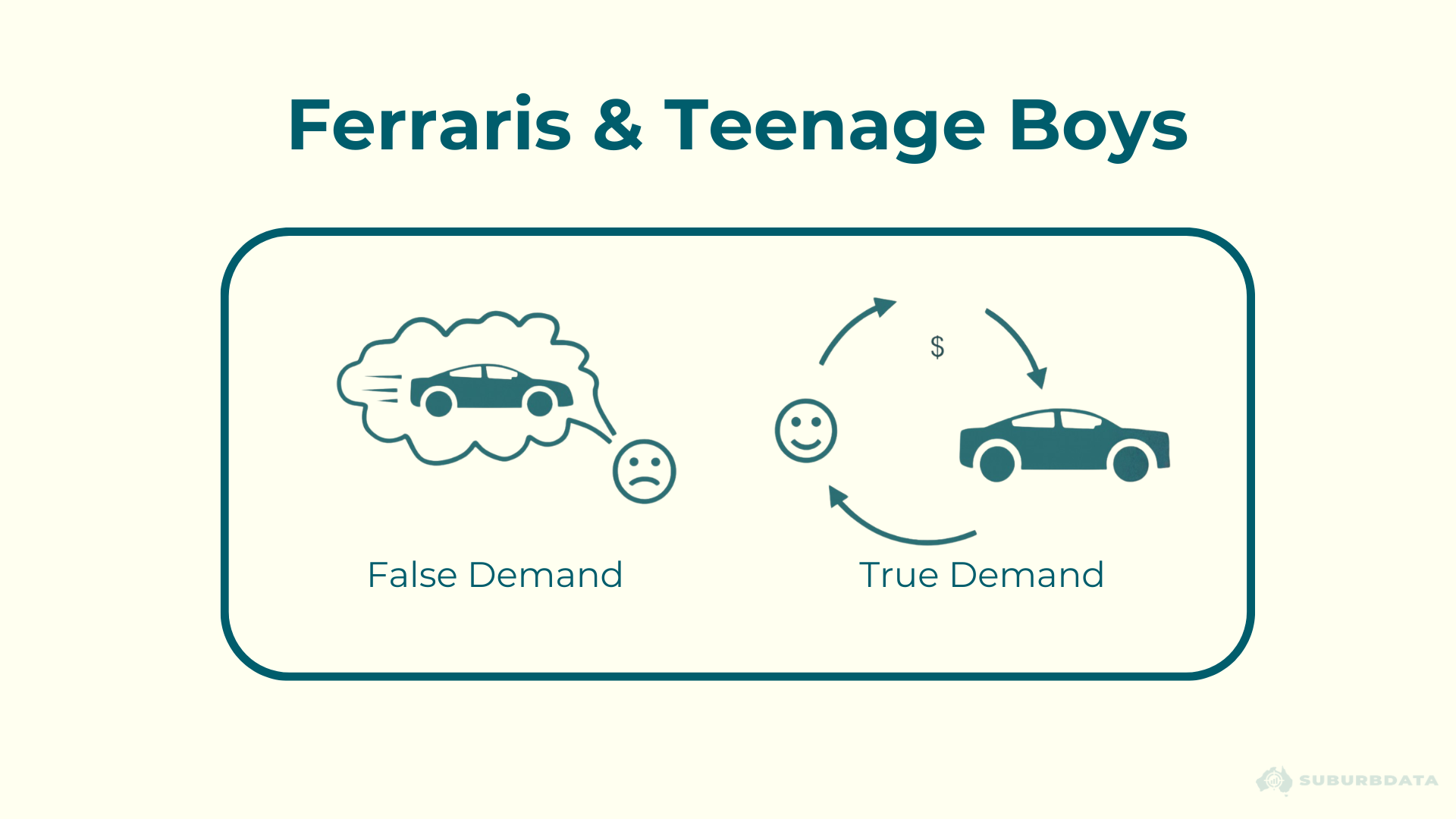
The same logic applies to property:
- False demand: wanting to live somewhere
- True demand: paying enough to push prices up
A suburb being an appealing place to live all year round does not mean the demand to buy there is high all year round.
Affluent Areas Grow in Cycles
The diagram below shows how growth ripples outward from affluent areas to neighbouring suburbs.
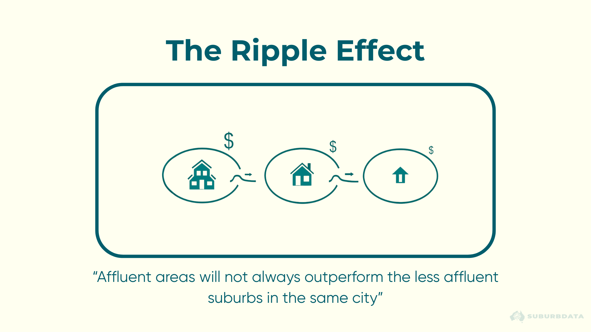
At the start of a growth cycle, an affluent area might take off first.
After a few years, buyers eventually consider those areas too expensive. They start looking for the next best alternative.
Demand reduces for the affluent area. Demand increases for its neighbour.
That is the ripple. Both the ideal market and the bridesmaid suburbs go through accelerated and reduced phases. No suburb outperforms forever.
Affluent Areas Fall Hardest in Corrections
The chart below shows annual price growth across three segments of the Australian property market from 1998 to 2018 (chart sourced from Core Logic). Top 10% most expensive, median, and bottom 10%.
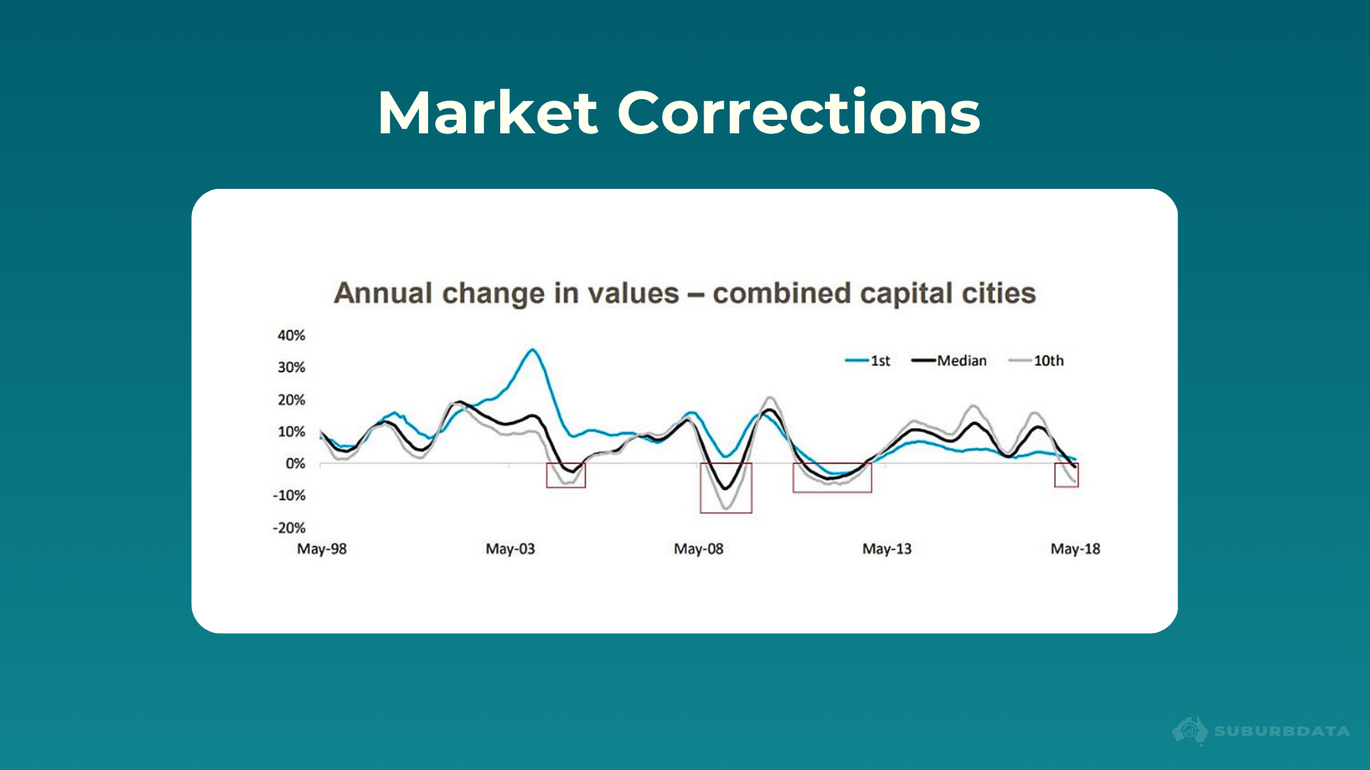
- Period: May 1998 to May 2018
- Duration: 20 years
- Corrections observed: 4
- Affluent areas: fell hardest in all 4
- Cheapest 10%: went negative only once
In tough times, demand for upper-class markets drops more noticeably than for the cheaper end.
Growth Is Driven by Supply and Demand
If there are 100 mansions and only 10 millionaires, mansion prices fall - oversupply.
If there are 1,000 buyers chasing 10 affordable properties, prices rise.
The mistake is assuming nice features create more demand. Features are relevant, but there is something else involved.
That something else is price.
Features Define Price, Not Demand
Imagine two properties:
- Property A: close to shops, schools, transport, parks. Quiet tree-lined street. 4,000 square metre block. 10 bedrooms, 4 bathrooms, 2 pools, tennis court, helipad.
- Property Z: miles from anything. 5-minute drive to a servo. 400 square metre block. Rusty shed. No town water or sewerage.
If features alone determined demand, then demand for property A should be way higher than demand for property Z.
Now add a price tag:
- Property A asking $150,000,000
- Property Z asking $150
Demand for property A could literally be zero. But demand for Z could be in the thousands.
As prices rise in a specific suburb, buyers eventually cannot justify paying so much. They look elsewhere for value. Nothing subdues demand like sky-high prices.
Demand is not a function of features alone, it is dependent on features and price.
Conclusion
Capital growth comes from one thing. Demand exceeding supply.
Desirable areas do not deliver the best growth. Historical data shows this.
The Ripple Effect shifts growth between affluent areas and their neighbours. The data shows affluent areas fall hardest in corrections.
Features set the current price. Price plus features set the current demand. Growth depends on whether demand exceeds supply going forward.
What matters is whether demand outweighs supply in that market. That can happen in areas with less features, less desirable areas.
The advice that desirable areas always grow best is not just wrong according to historical data. It mistakes desire for demand.