

Amenities make suburbs more desirable and more expensive. But decades of Australian housing data show they do not deliver superior long-term capital growth. This article breaks down why proximity to schools, train stations, beaches, shops, and even walkability scores determine price, not performance and why investors who chase amenities are usually paying for comfort, not returns.
Amenities Feel Like They Should Drive Property Growth
When investors talk about “good” suburbs, the same amenities are often mentioned.
- Schools
- Train stations
- Shops
- Cafes
- Parks
- Beaches
- Sporting facilities
- Places of worship
The logic feels obvious.
More amenities make an area more appealing. It sounds sensible. It feels intuitive.
But intuition is not evidence.
Why Amenities Feel Like a Growth Signal (But Aren’t)
A suburb with good amenities is often more expensive.
That creates a powerful mental shortcut.
Expensive must mean better, right? Better must mean stronger growth, yes?
This is where investors make a critical mistake.
They confuse price levels with growth rates.
Price Premium vs Growth Rate: The Core Error
A suburb near amenities may command a premium.
That does not mean it will grow faster.
If an amenity has existed for a long time, its benefit has already been embedded in prices.
Price premium and price growth are two different things.
Apples and Oranges: Why Growth Converges Over Time
To understand why amenities fail as long-term growth drivers, consider a simple analogy.
100 years ago:
Apples cost 1 cent and grow at 4% per year.
Oranges cost 2 cents and grow at 8% per year.
After 100 years:
Apples are worth $0.50.
Oranges are worth $44.
At some point, the price gap becomes unreasonable.
Consumers consider oranges over-priced, so demand for them reduces. Apples appear to be much better value for money, so demand for them increases. Over time, growth rates converge.
Over the long-term there is a tendency for all properties, suburbs and cities to approach the same growth rate.
When Amenities Can Affect Growth (Briefly)
Amenities can influence growth temporarily when they are introduced.
- A new train station
- A new transport corridor
- A major infrastructure upgrade
Initially:
Prices rise faster as buyers factor in the new amenity.
The price gap between neighbouring suburbs widens.
But eventually:
The benefit is fully priced in.
Growth reverts to the market average.
Above-average growth fades once the adjustment is complete.
Do Train Stations Drive Property Growth?
If train stations genuinely drive long-term capital growth, the data should show it clearly.
Over decades, suburbs with stations should pull away from those without.
Let’s test that.
Sydney Suburbs With Train Stations vs Without
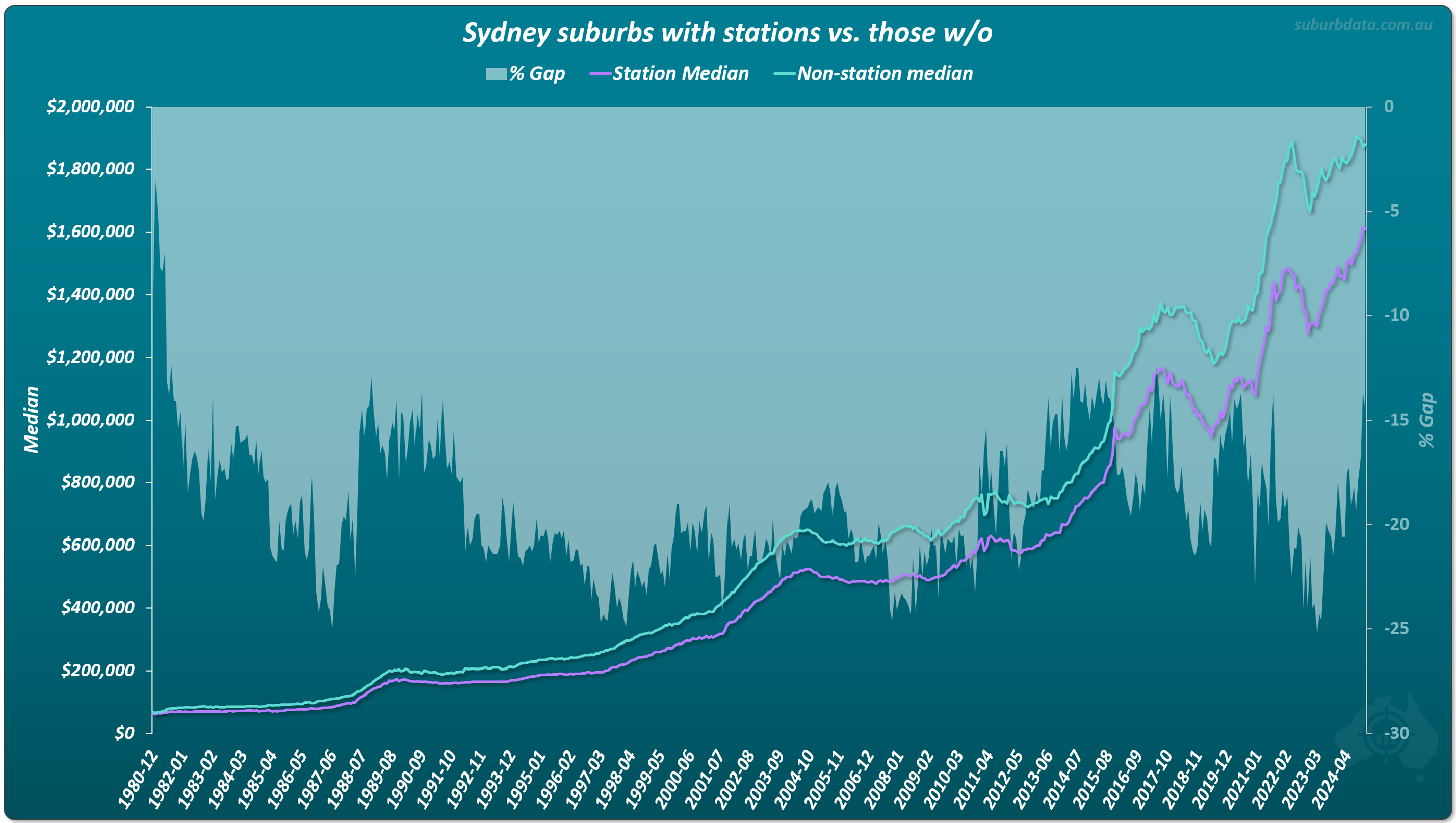
In 1980, Sydney suburbs with train stations were about 9% cheaper than those without.
Over 44 years, prices rose substantially in dollar terms.
But the percentage gap barely changed.
By 2024, the gap was around 14%.
No exponential widening. No compounding advantage.
Not even after 44 years.
Melbourne Suburbs With Train Stations vs Without
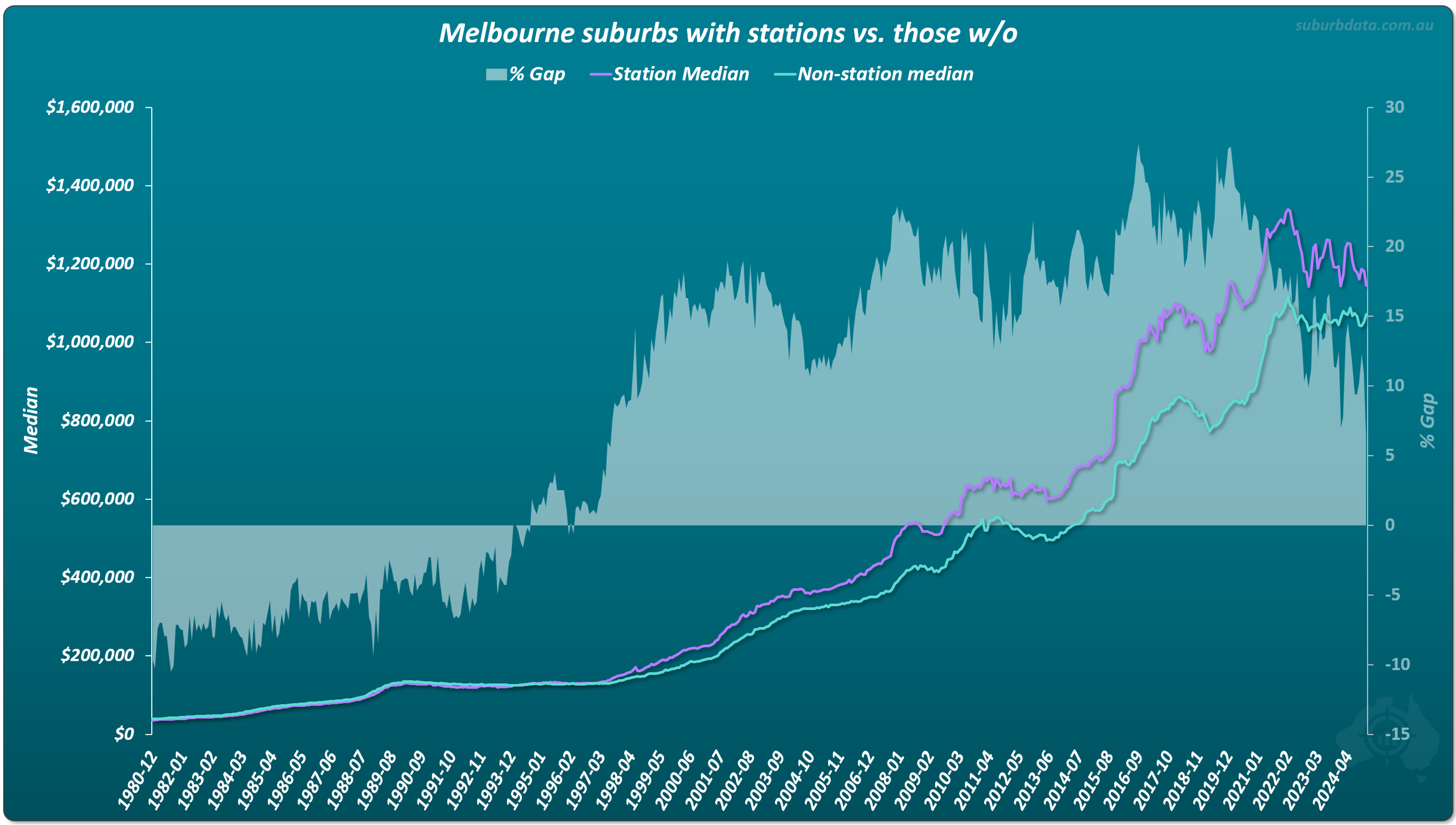
In Melbourne, suburbs with stations were about 10% cheaper in 1980.
By 2024, they were about 6% more expensive.
That is a 16% shift over 44 years — less than 0.4% per year.
Hardly noticeable. Certainly not a growth driver.
Brisbane Suburbs With Train Stations vs Without
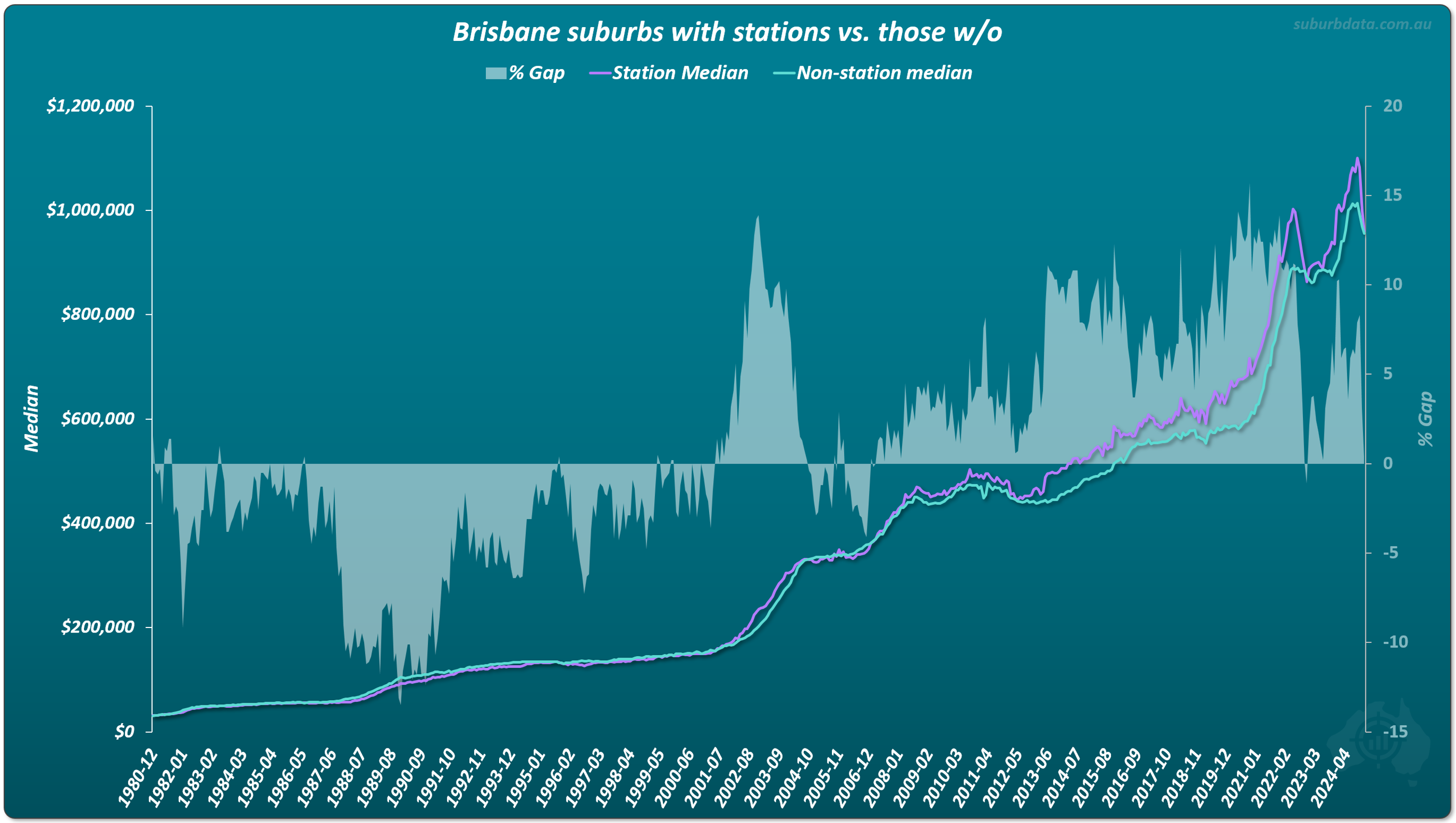
Brisbane is even clearer.
The growth curves cross repeatedly.
One group leads. Then the other catches up.
This is classic mean reversion.
Time levels out growth.
Do Train Stations Improve Rental Yield?

The yield gap barely moves.
No sustained advantage. No compounding benefit.
Do Good Schools Drive Long-Term Property Growth?
Melbourne is well known for its school-focused suburbs.
Properties in these areas command significant premiums.
But premiums are not growth.
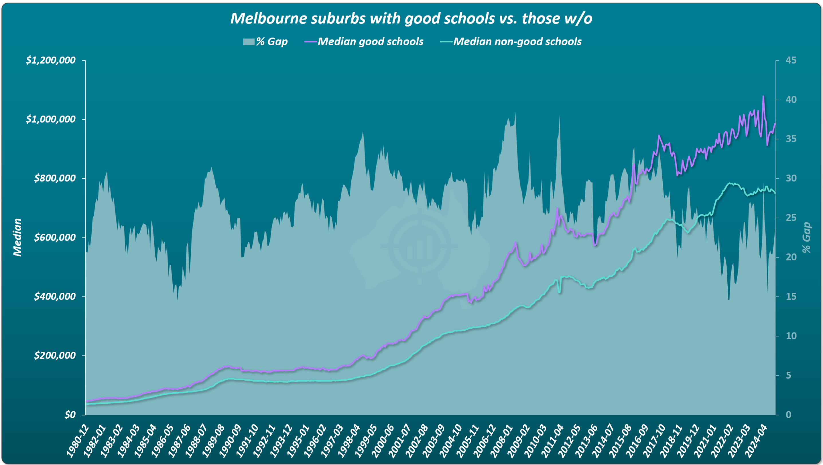
In 1980, the price gap was around 20%. In 2024, it was still around 20%.
If schools drove superior growth, that gap should have exploded.
It did not budge.
Do Beaches Increase Property Values or Property Growth?
Sydney’s beachside suburbs are among the most expensive in Australia.
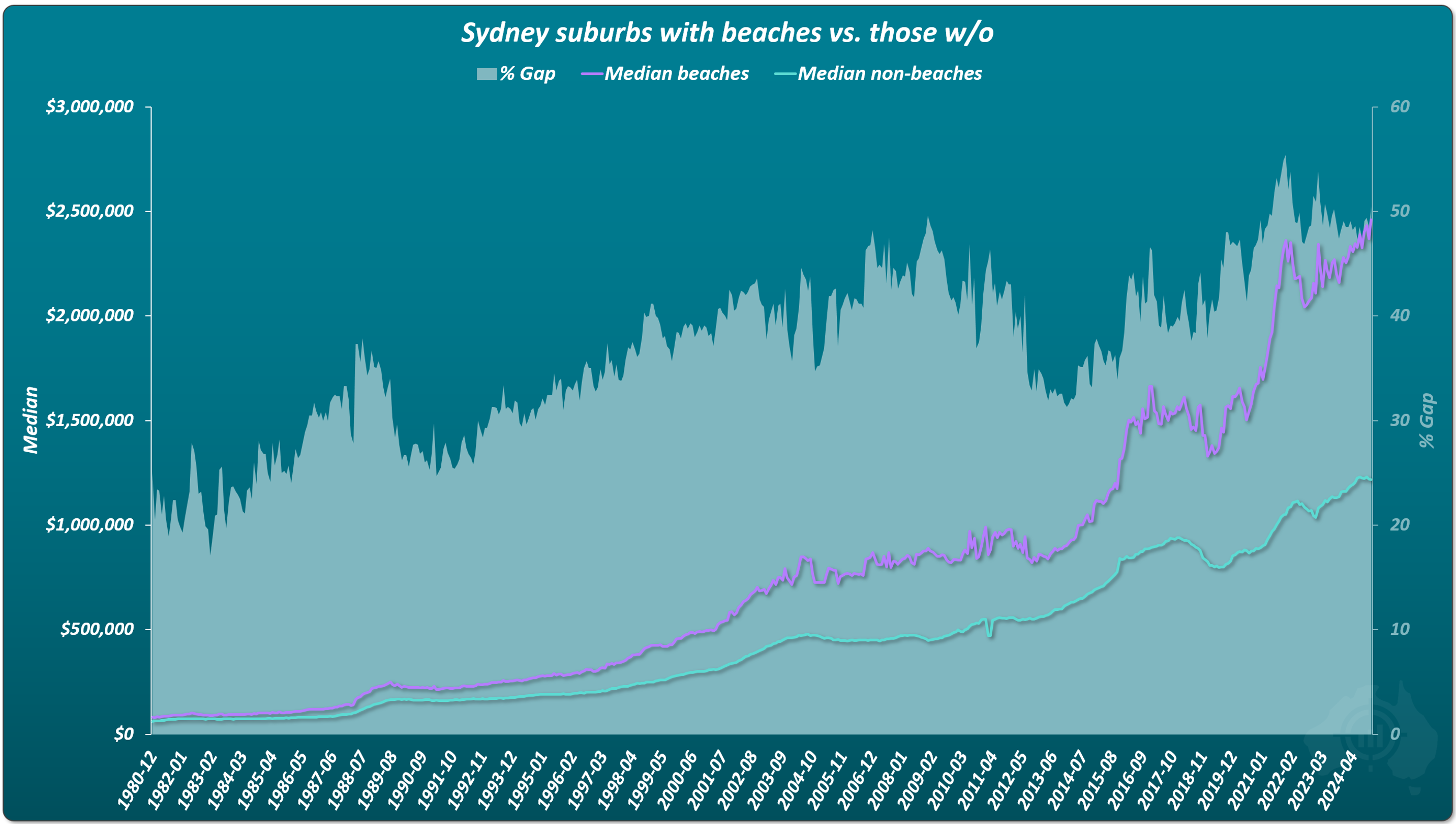
Since 1980, the gap widened from roughly 25% to 50%.
Over the same period, Sydney prices rose around 2,400%.
If beaches drove growth, the gap should be hundreds of percent wider.
It isn’t.
Beaches determine price. But they do not influence long-term growth.
Do Shopping Centres Improve Long-Term Property Growth?
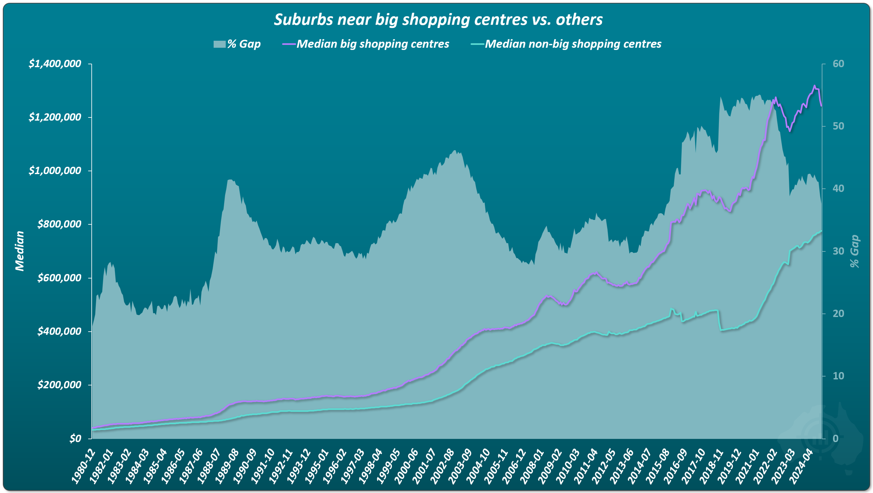
Over 44 years, the gap oscillates between 25% and 55%.
Once again, price not performance.
Do Airports Harm or Improve Property Growth?
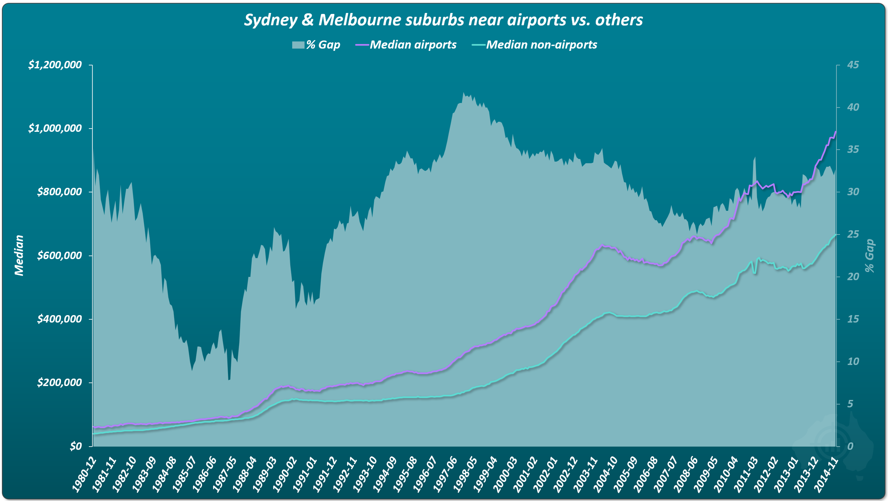
Airports are often seen as negative amenities due to noise.The price gap swings wildly.
Under 10% at some points. Over 40% at others. Eventually returning close to where it started.
No lasting disadvantage. No lasting advantage.
Brisbane Airport Case Study
After the new Brisbane Airport opened in 1988, nearby suburbs underperformed for about 4 years because they were under the flight path.
Over the following 20+ years, prices caught up.
Short-term disruption. No long-term difference.
Walkscore and Property Growth: Testing Many Amenities at Once
What if it’s not one amenity?
What if it’s the combined effect of many smaller ones?
- Cafes
- Bus stops
- Gyms
- Parks
- Retail
What Walkscore Measures
Walkscore aggregates dozens of amenities into a score out of 100.
A higher score means more amenities, closer together, easier to access on foot.
Reliable Walkscore data goes back to December 2014.
That’s not long enough to prove growth on its own but it still allows us to test the logic.
Who Topped Walkscore in 2014 vs 2024?
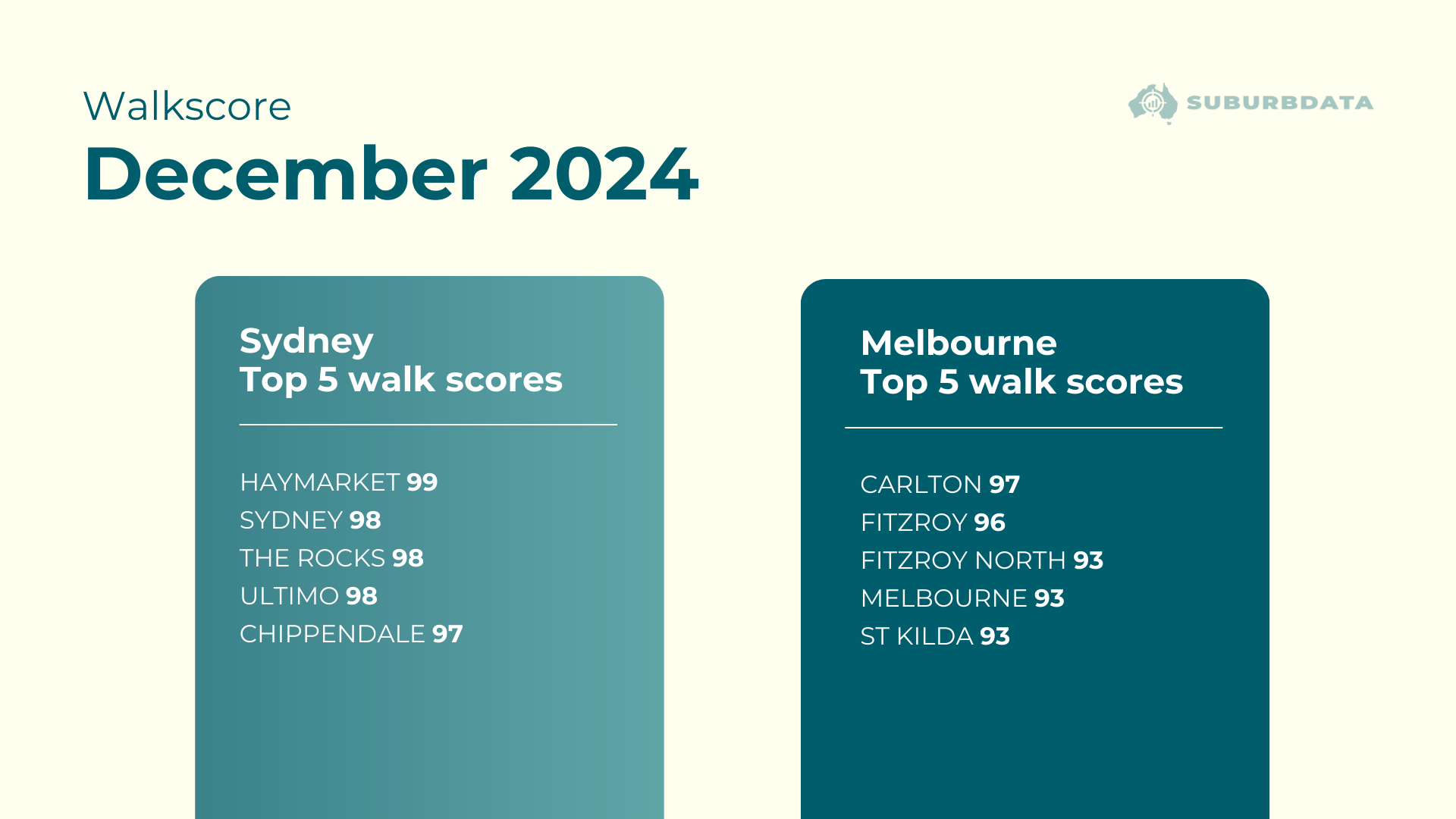
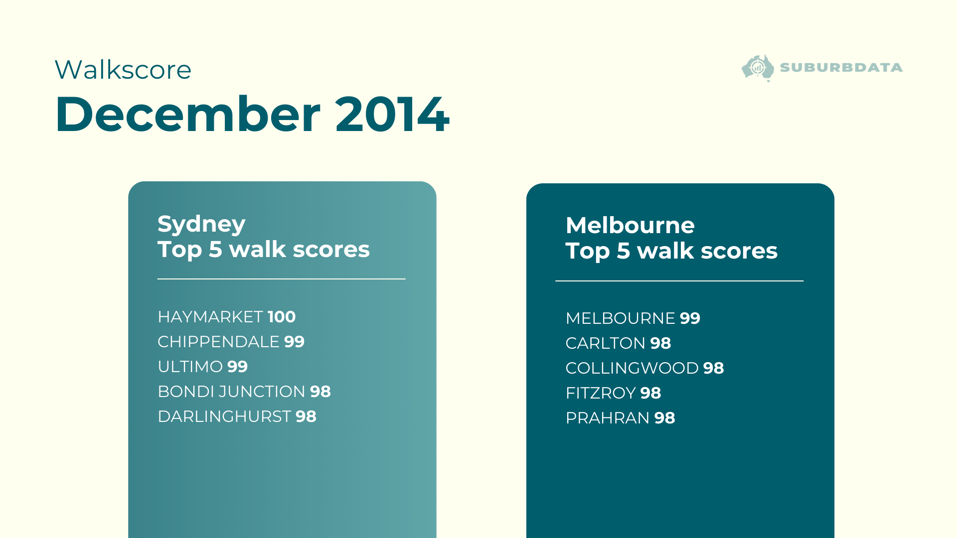
The same inner-city suburbs dominate both lists.
Amenities didn’t suddenly appear. They’ve been there for decades.
Walkscore vs Long-Term Capital Growth
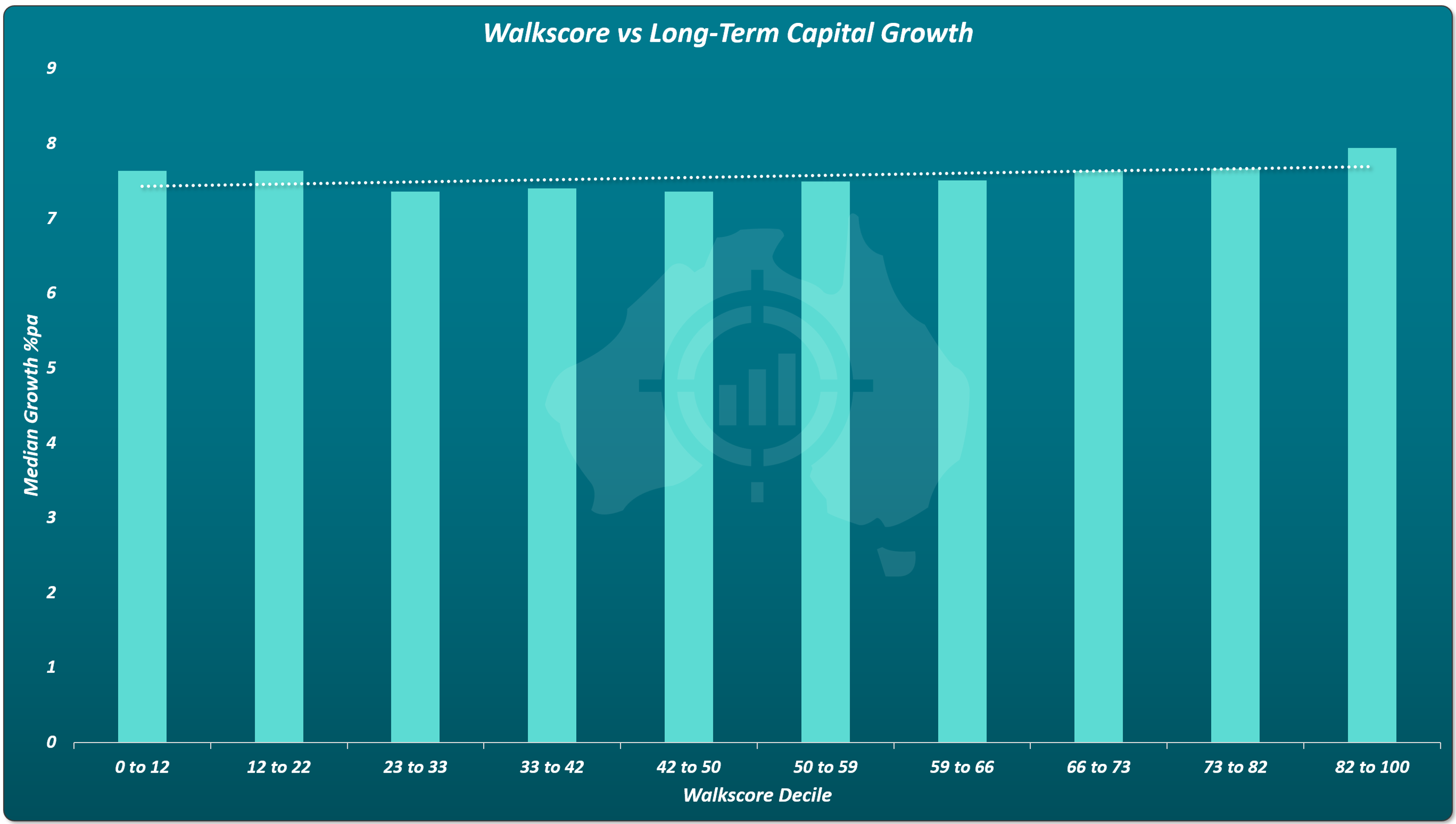
Suburbs were grouped into 10 equal buckets based on Walkscore.
Each bucket represents 10% of Australian suburbs. The result is unmistakable.
The line of best fit is almost flat.
- Low Walkscore suburbs.
- High Walkscore suburbs.
Same long-term growth.
The A-Grade Property Myth
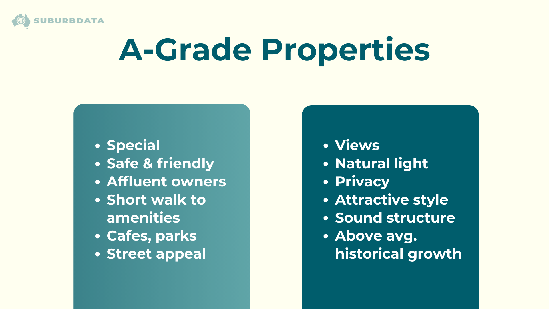
Some argue that even if suburb medians behave this way, specific “A-grade” properties outperform.
If that were true, price dispersion should increase over time.
What the Data Shows Instead
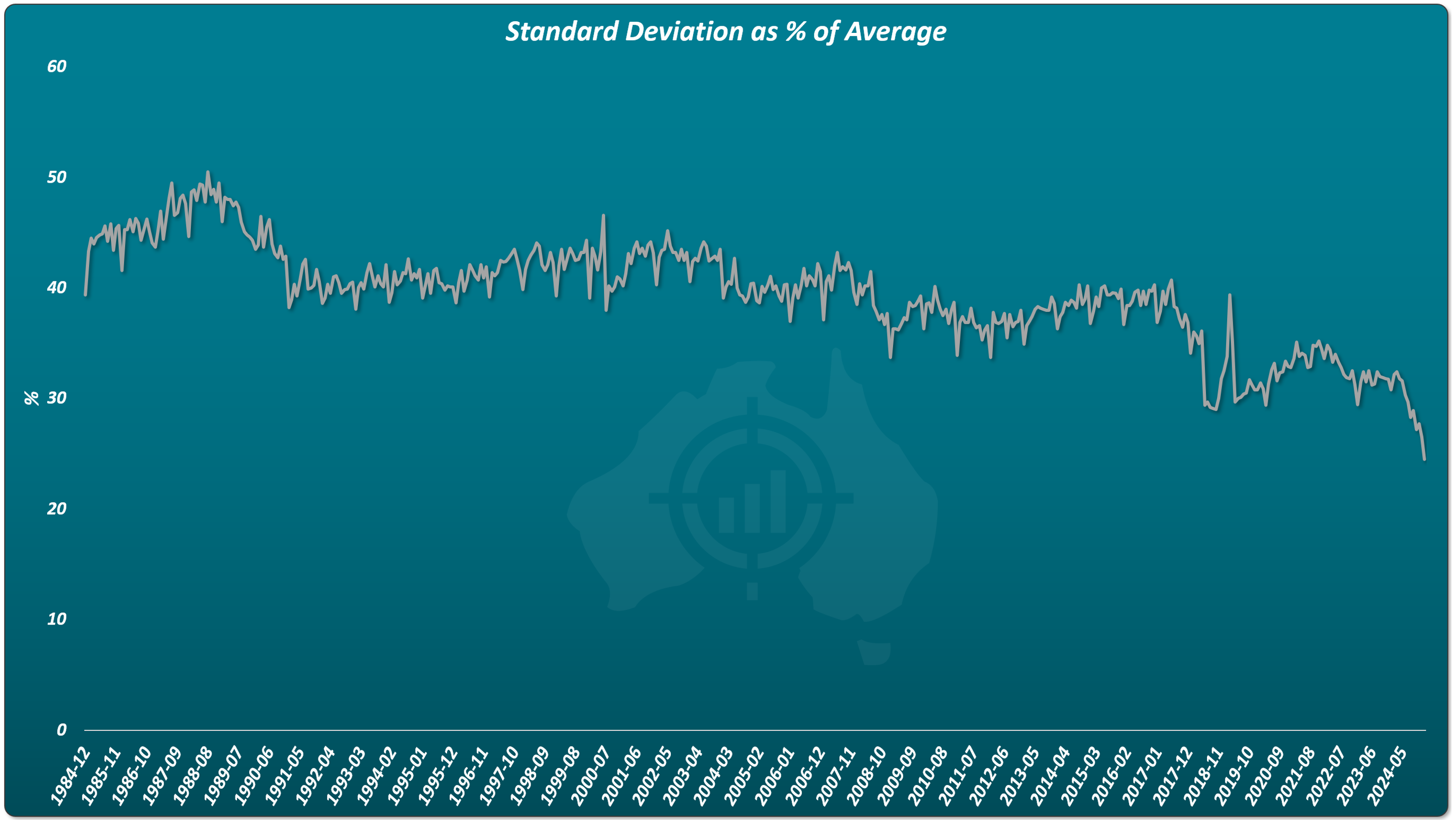
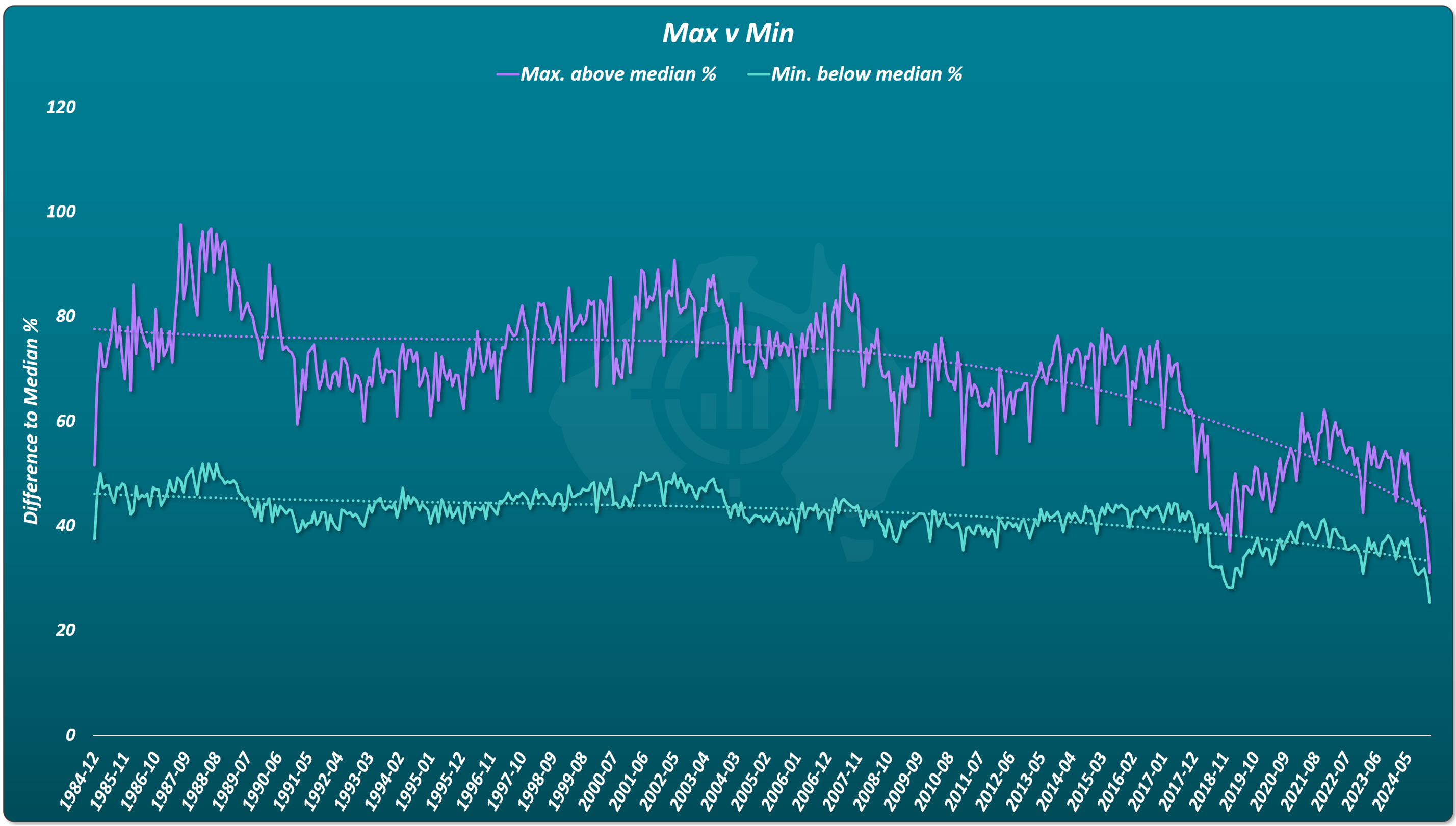
The gap between the most expensive and cheapest properties has shrunk.
There is no evidence of long-term A-grade separation.
Final Answer: Do Amenities Drive Property Growth?
Across cities, amenities, decades, and property types:
Markets with amenities are not superior.
Markets without amenities are not inferior.
Amenities dictate price, not growth.
Any growth boost from a new amenity is temporary.
Once priced in, growth slows back to normal.
The Investor Takeaway
Amenities make places nicer to live.
They do not reliably improve long-term returns.