

Investors spend a lot of time looking into rail lines, hospital builds, and highway upgrades. The belief is that big projects drive big growth.
Infrastructure amenities attract buyers. Construction brings jobs. Jobs bring people. People drive demand.
When you test this against historical data, the relationship either disappears or runs in the wrong direction.
Infrastructure research is one of the biggest time sinks in property investing. And it is largely unnecessary.
Testing It With Real Data
The ABS Engineering Construction Activity dataset tracks public spending on:
- Roads
- Bridges
- Railways
- Pipelines
- Harbours
- Water storage
- Electricity
- And more civil infrastructure projects
It only captures data at the state level. But it answers the most fundamental question first: does the relationship between infrastructure spending and capital growth exist at all?
Every state and territory was measured each quarter over 25 years. Engineering construction activity per capita, adjusted for inflation, was plotted against the capital growth that followed over the next 3 years.
If infrastructure drives growth, high-spending states should show high following growth. The trend line should slope upward.
The scatter plot below shows every observation. Look at the trend line before reading further.
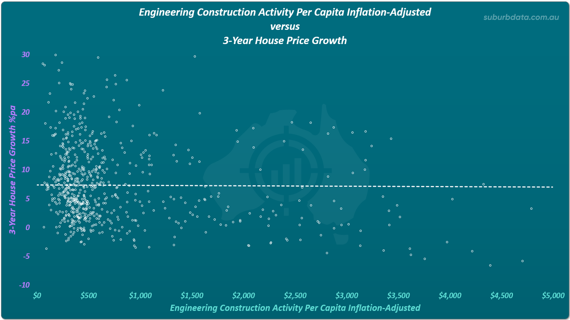
The trend line was almost dead flat. No relationship between engineering construction activity and 3-year capital growth.
Changing the Measure. Same Result.
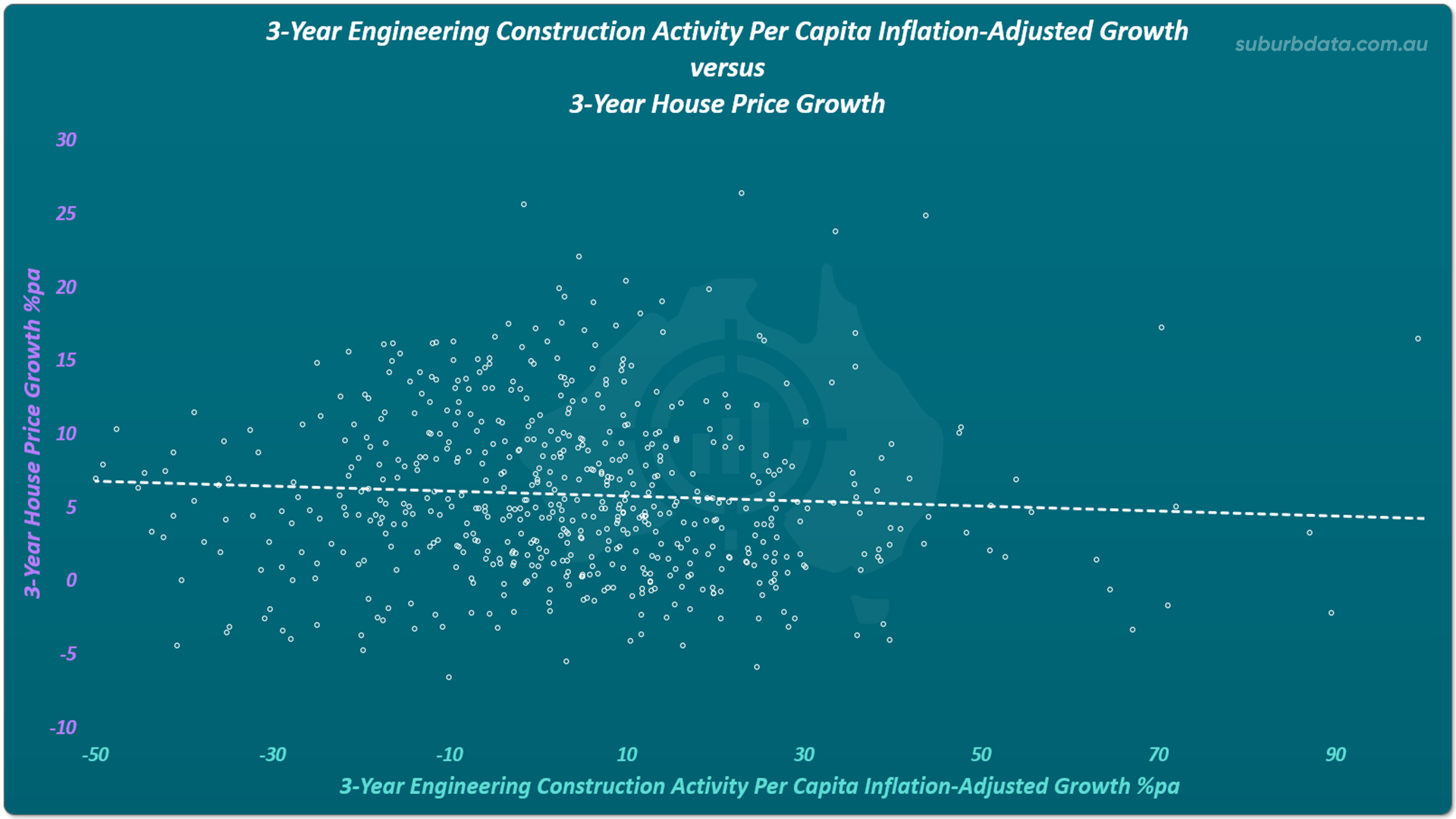
The next test measured the change in engineering construction activity over 3 years. Does a surge in spending predict a surge in growth?
No meaningful relationship in the expected direction.
The chart below shows the same test using change in spending instead of raw dollars. Different measure. Same result. The trend line is flat.
The timeframe was extended to 6 years. A correlation appeared. But it sloped the wrong way.
The chart below shows both axes measuring 6-year change. Before reading the numbers, look at the direction of the trend line.
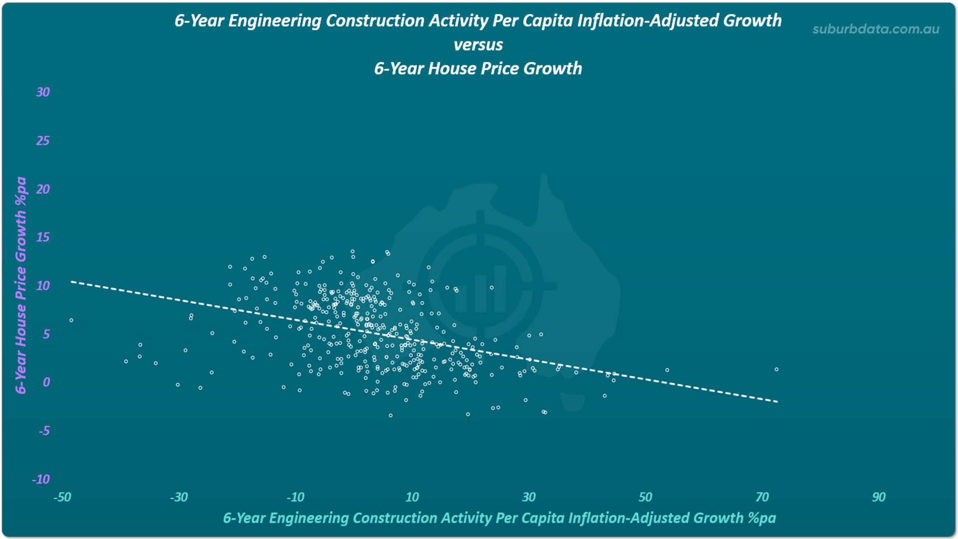
Higher engineering construction activity was followed by lower capital growth. Not higher.
The Relationship Runs Backwards
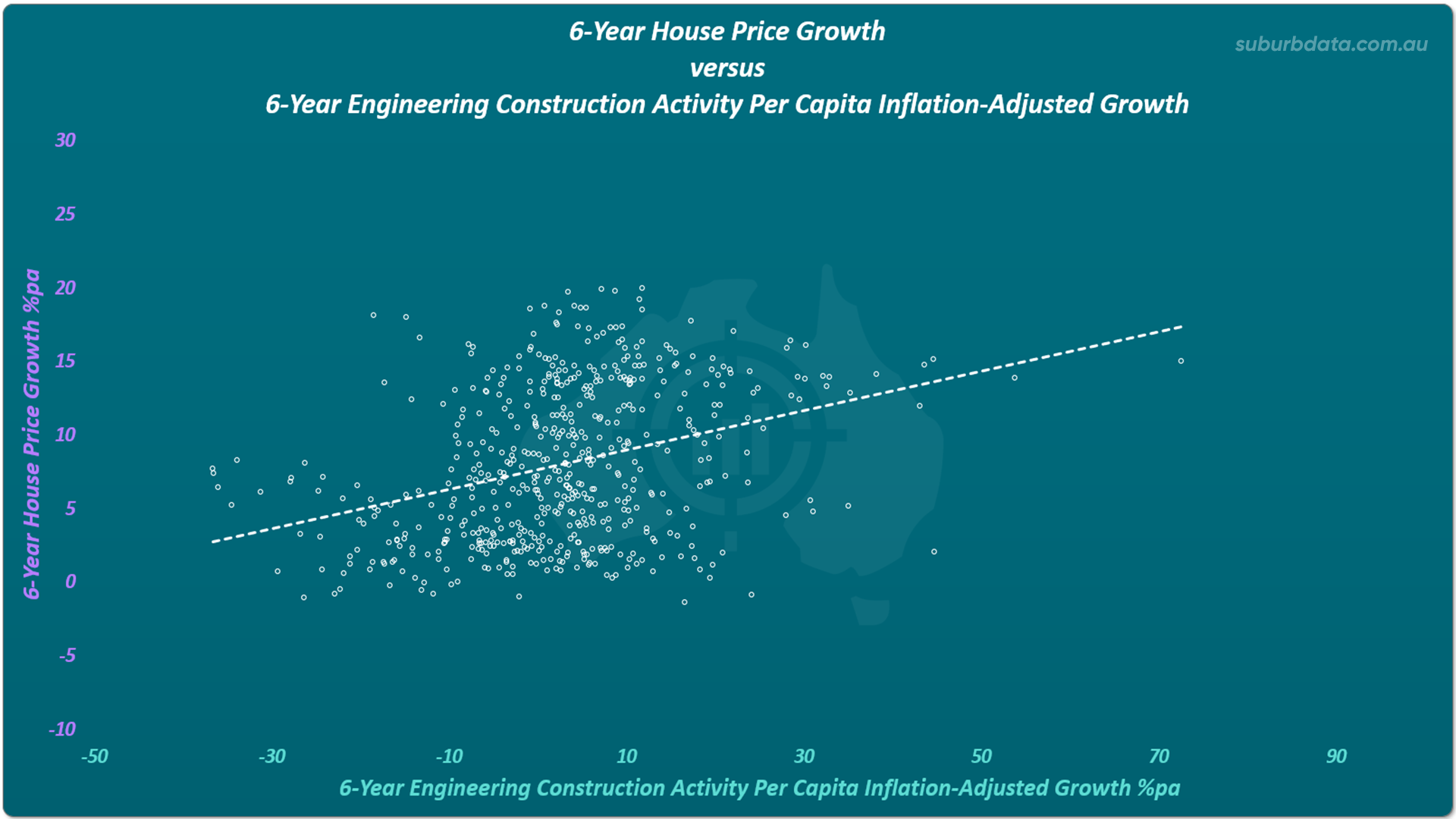
When the sequence was reversed, measuring house price growth first and engineering construction activity after, a positive correlation appeared.
Capital growth leads to infrastructure spending. Not the other way around.
- State governments collect stamp duty based on property values. Higher prices fund new projects.
- Local councils collect rates based on land values. Higher land values fund local infrastructure.
- Federal contributions are tied to state co-funding. State revenue ties back to land values.
When federal and state contributions were removed and only local council spending was analysed, the correlation strengthened. Council budgets are almost entirely dependent on rates. Rates are almost entirely dependent on land values.
Infrastructure does not push up prices. Rising prices fund infrastructure.
The chart below shows what happens when the sequence is flipped. House price growth comes first. Engineering construction activity follows. The trend line now slopes upward.
A Second Dataset. The Same Finding.
The ABS Building Activity Non-Residential dataset covers:
- Hospitals
- Universities
- Offices
- Transport buildings
- Education buildings
- And more
These are different types of projects to Engineering Construction Activity, but still of keen interest to investors.
The chart below shows non-residential building activity per capita plotted against 3-year capital growth. Look at the trend line.
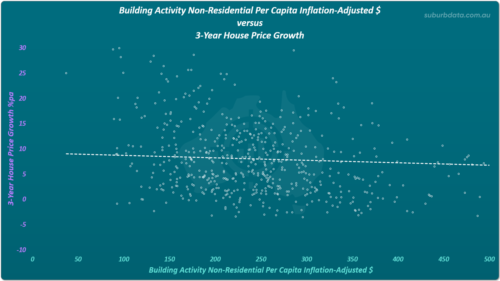
The trend line against 3-year capital growth was flat.
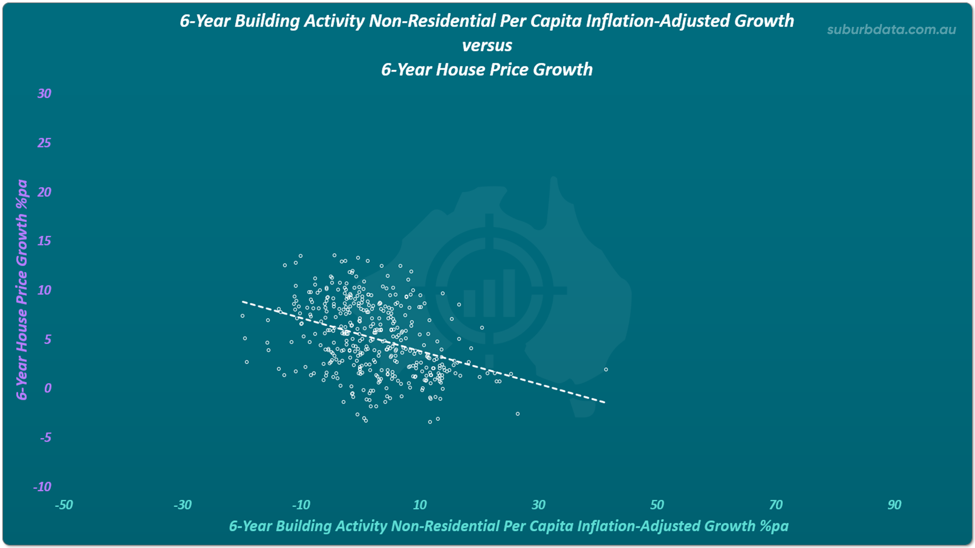
Change in non-residential building activity over 6 years showed the same inverse pattern. Higher building activity. Lower following growth.
The chart below shows that inverse pattern. Both axes measure 6-year change. The trend line falls to the right.
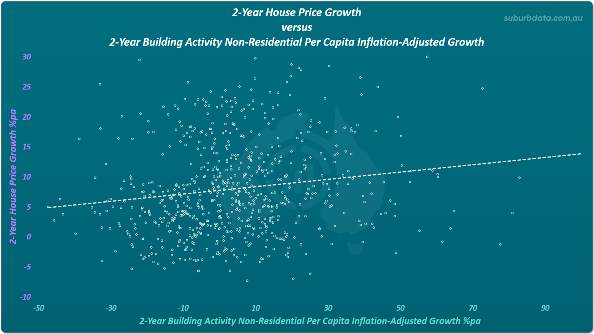
When the sequence was reversed, house price growth again preceded building activity.
The chart below shows the reversed sequence for the non-residential building dataset. House price growth leads. Building activity follows. The same pattern holds across both datasets.
Two separate datasets. The same result both times.
One Weak Signal
The ABS Private Sector Capital Expenditure dataset covers mining, manufacturing, construction, retail, finance, and health. This spending is not dependent on rising land values.
A 3-year change in private capital expenditure showed a weak positive correlation with 2-year capital growth that followed. The trend line climbed slightly. The direction was correct.
The chart below shows that weak signal. The trend line points in the right direction. But look at how scattered the dots are. The relationship exists. But it is not reliable enough to act on.
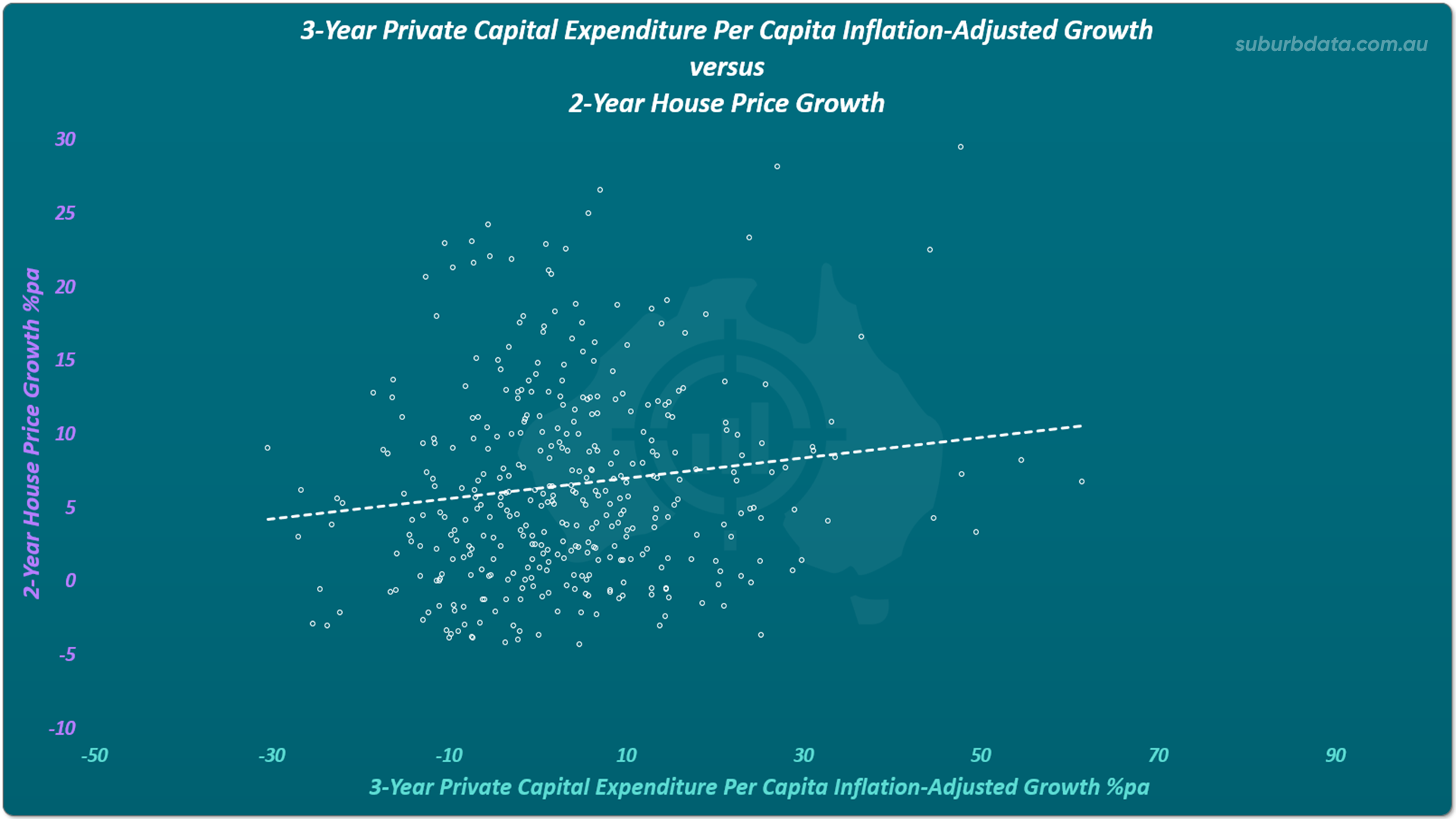
This was the strongest signal found across all three datasets. It was not strong enough to build a strategy on.
120 Projects. One in Ten Made a Difference.
Individual projects were examined next. Each was assessed by comparing impacted markets against control markets before and after opening.
120 projects were analysed. Some results from individual projects follow.
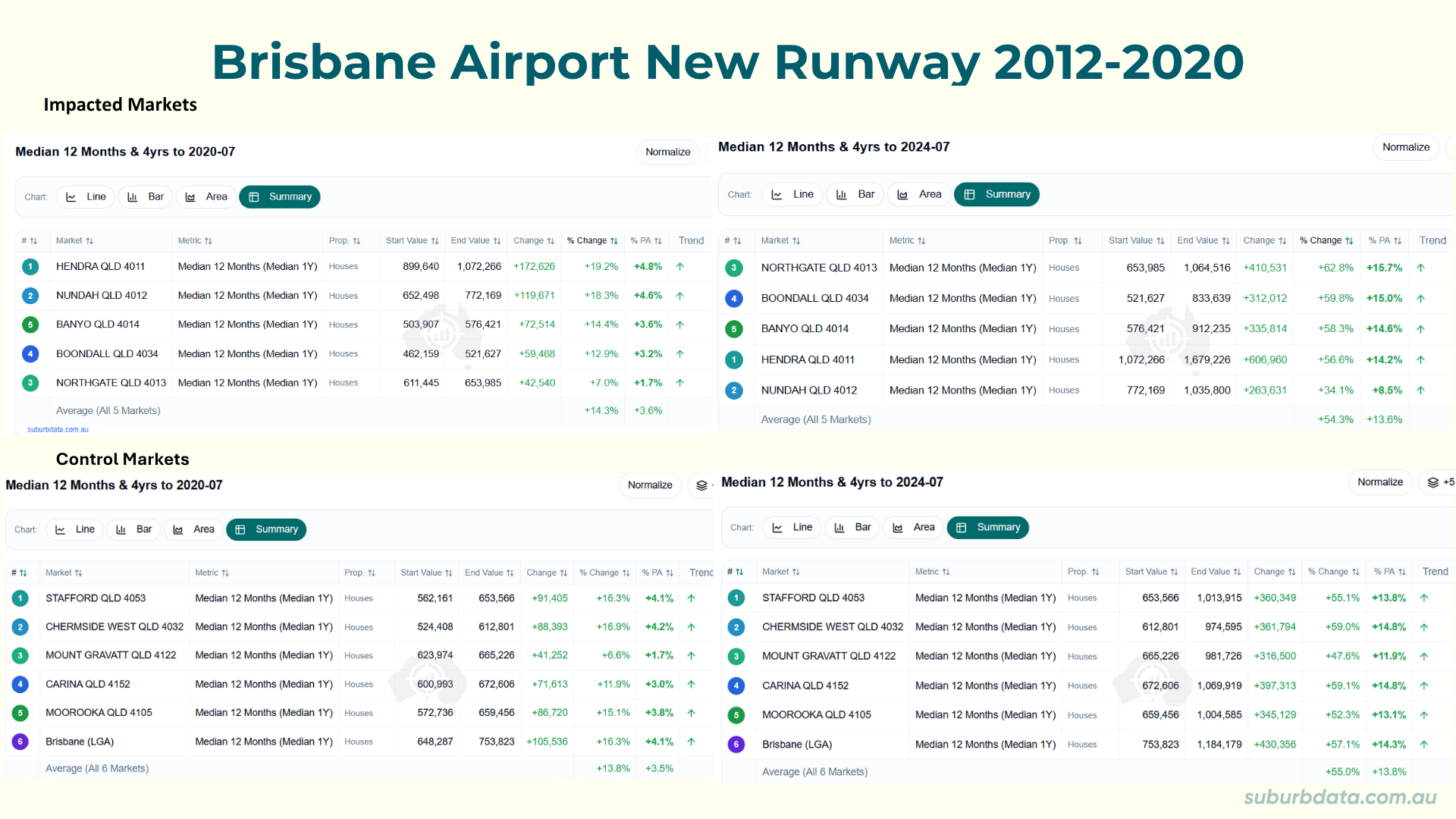
- Brisbane Airport New Runway
- 2012-2020
- $1.1b
- Pre-opening impacted 14.3% versus control 13.8%
- Post-opening impacted 54.3% versus control 55.0%
- No clear uplift.
The table below shows the full suburb-level breakdown for Brisbane Airport. Impacted markets on the left. Control markets on the right. Pre-opening figures top. Post-opening figures bottom. The numbers tell the same story across every suburb.
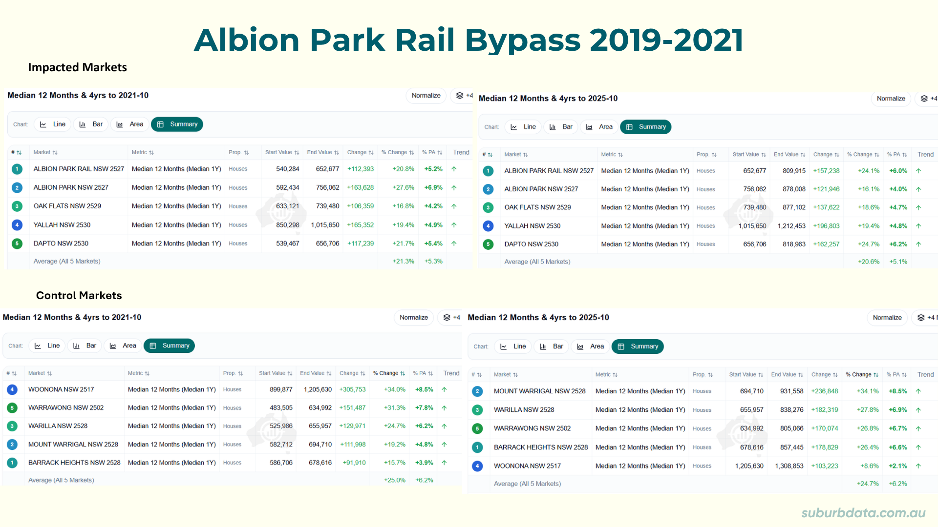
- Albion Park Rail Bypass
- 2019-2021
- $630m
- Impacted markets weaker than controls before and after opening
- No clear uplift.
The table below shows the suburb-level breakdown for the Albion Park Rail Bypass. Impacted markets on the left. Control markets on the right. The control markets outperformed in both periods.
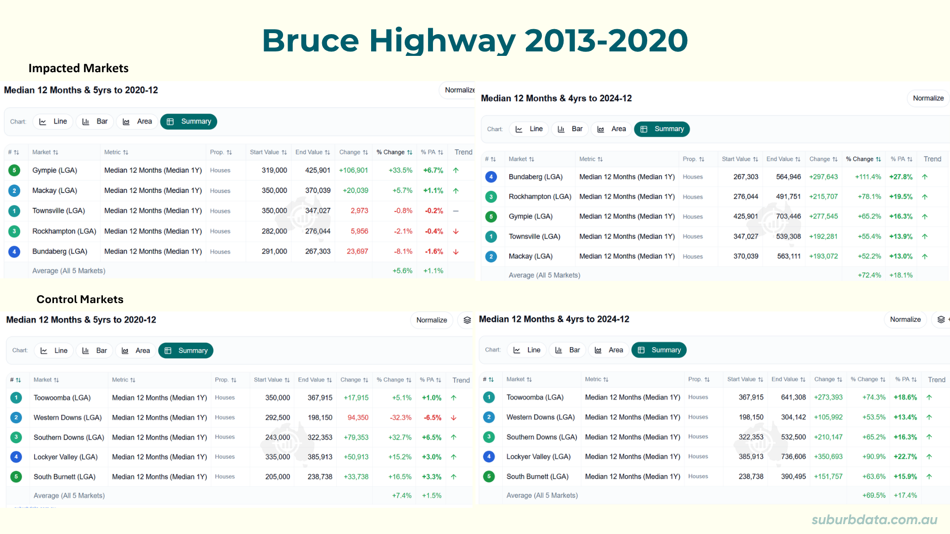
- Bruce Highway Upgrade
- 2013-2020
- $9.57b
- Impacted markets averaged 5.6% pre-completion versus control 7.4%
- Markets recovered post-completion
- The upgrade cannot be credited.
The table below shows the LGA-level breakdown for the Bruce Highway Upgrade. Five impacted LGAs on the left. Five control LGAs on the right. Pre-completion figures top. Post-completion bottom. The impacted markets underperformed before completion and recovered after. The highway did not drive that recovery.
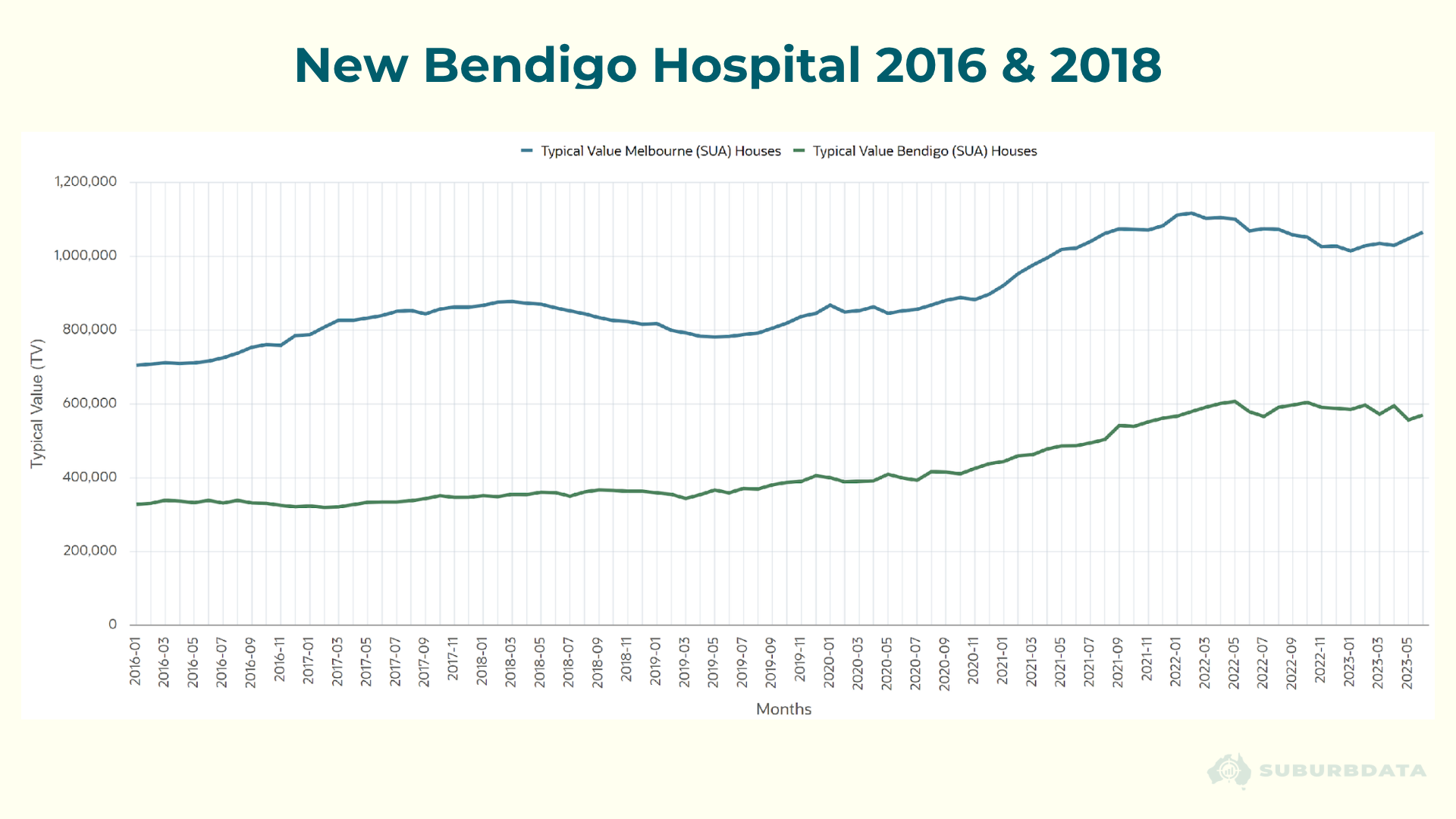
- New Bendigo Hospital
- 2016 and 2018
- $630m
- No growth at Stage 1 completion
- Values rose from 2020
- That coincided with COVID, not the hospital.
The chart below shows Bendigo property values against Melbourne from 2016 to 2023. Stage 1 completed in 2016. Stage 2 in 2018. Look at where the Bendigo line starts climbing.
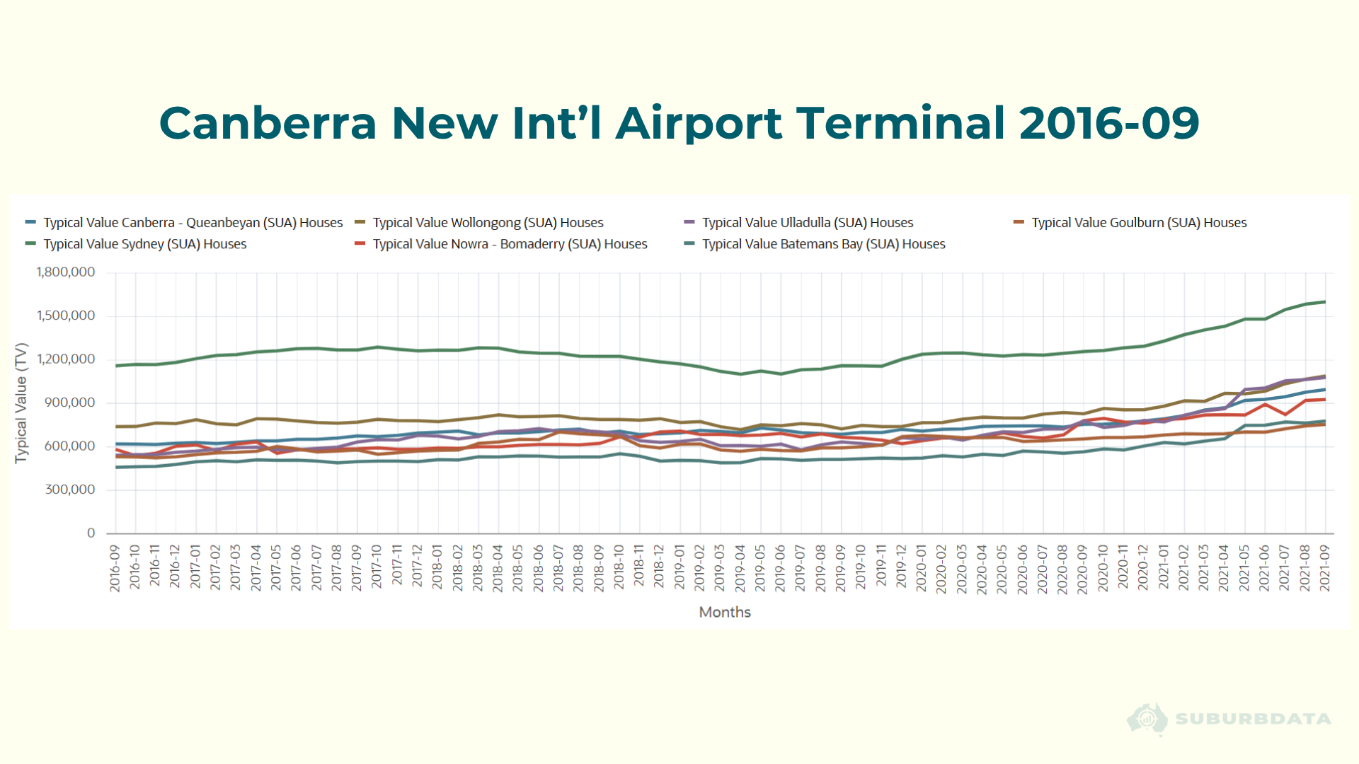
- Canberra New International Airport Terminal
- 2016
- $2b
- No discernible benefit compared to comparable cities.
The chart below shows Canberra property values alongside Sydney, Wollongong, Nowra, Goulburn, and other nearby cities from 2016 to 2021. The terminal opened in 2016. Look for any separation in the Canberra line after that date.
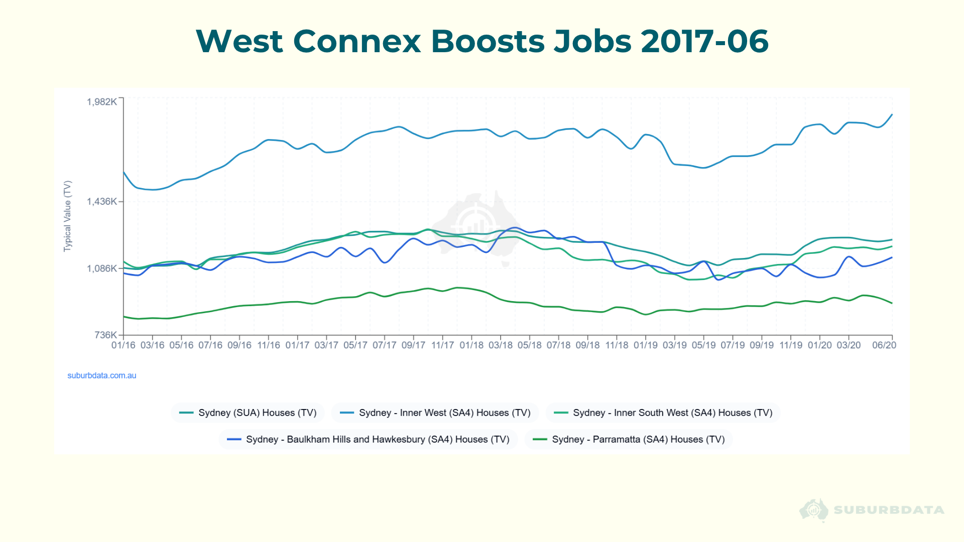
- WestConnex
- 2017
- $1.6b
- Sydney and western SA4 markets failed to reach 5% per annum in the years that followed.
The chart below shows Sydney SA4 property values from January 2016 to June 2020. WestConnex construction was underway from mid-2017. Look at how the lines move across all SA4 regions during and after construction.
After analysing 120 projects, only 1 in 10 showed any measurable impact on surrounding property values.
The exceptions shared one condition. Remote location. Large number of construction workers relative to local population. Project duration long enough to sustain rental demand. Once construction ended, demand subdued.
An Infrastructure Expert With 500 Reports
One revered expert has published infrastructure hotspot reports since 2007. Over 500 recommendations made across 13 years. They considered infrastructure to be the ultimate driver of residential property values.
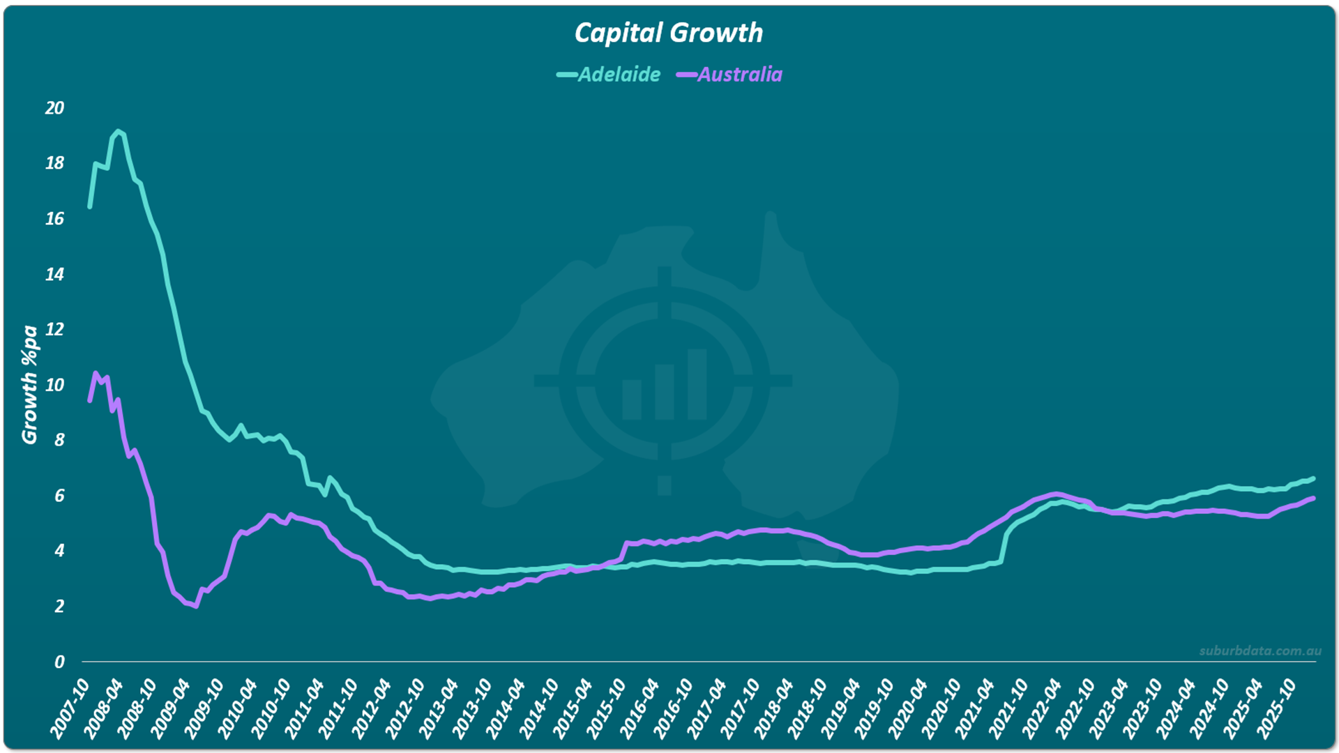
Those 500 recommendations were tested against the benchmark. The benchmark was median house price growth across all Australian Significant Urban Areas.
Alpha measures how far above or below the benchmark each recommendation performed. Zero alpha means the same as random suburb selection. Negative alpha means underperformance.
The chart below shows the first recommendation from their 2007 report. Adelaide. The turquoise line is Adelaide growth per annum. The purple line is the national rate. Look at where Adelaide sits relative to the national line across the full period.
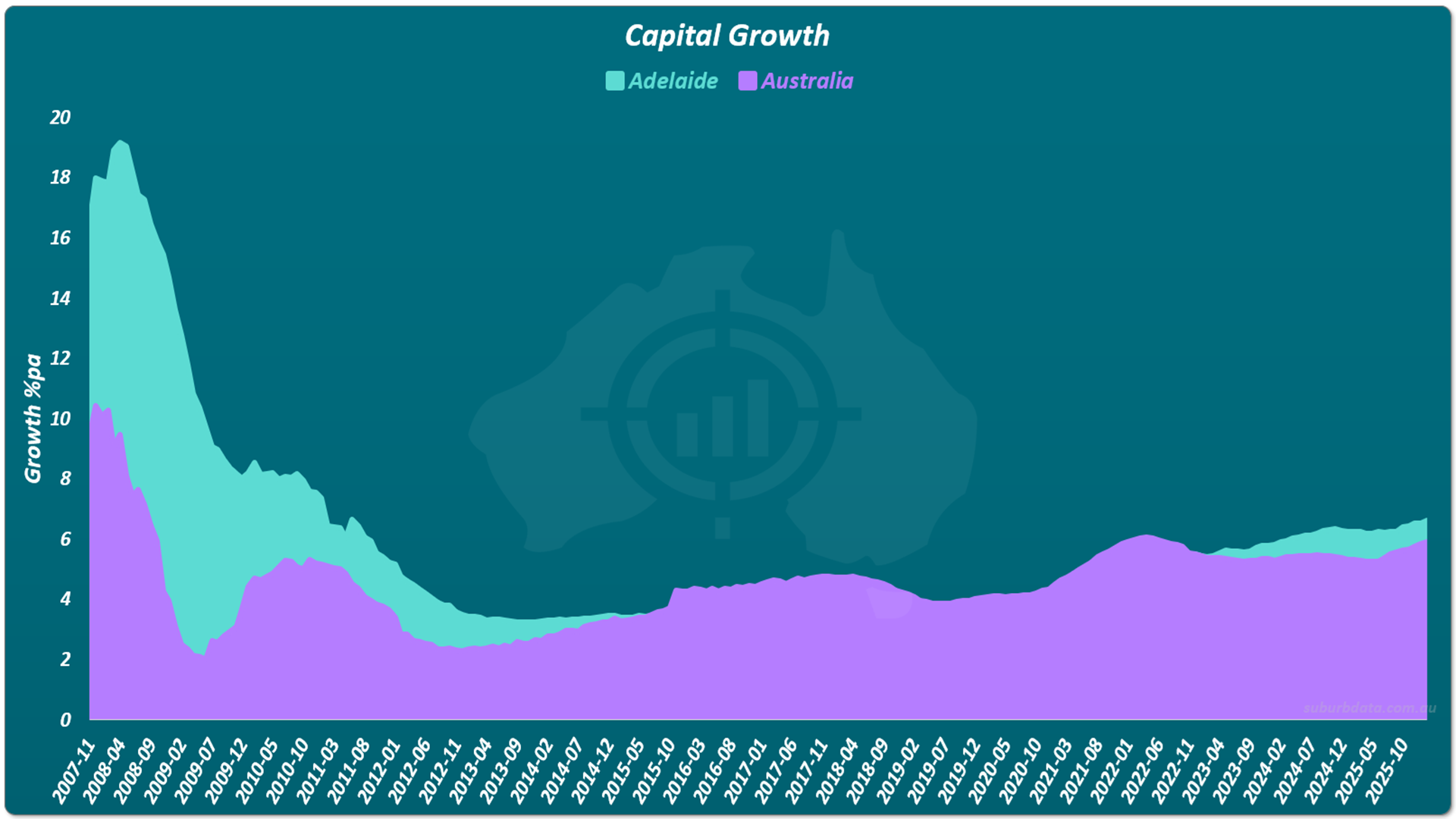
The chart below shows the same data with the alpha shaded. The teal area shows when Adelaide outperformed the benchmark. The purple area shows when it fell behind. Adelaide was a genuine win. But one win does not prove anything.
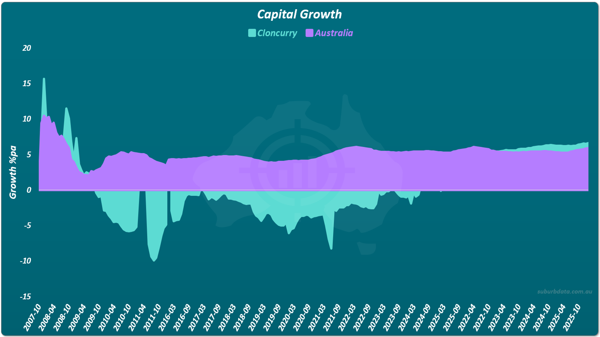
The chart below shows the second recommendation from the same report. Cloncurry. Picked on the basis of five major mines and a $500 million copper project. The teal shaded area shows when Cloncurry outperformed the benchmark. The purple area shows when it fell behind. Look at how much of the chart is purple.
The chart below shows the alpha (performance above the nation) for every growth period from 1 to 18 years. A bar to the right means above benchmark (outperformance). A bar to the left means below (underperformance).
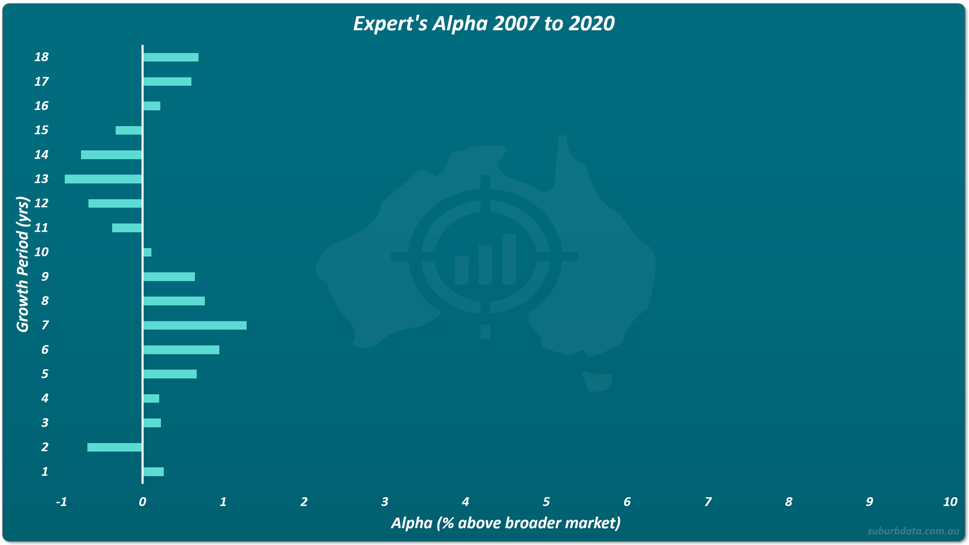
The best growth period was 7 years. Median alpha: 1.3% per annum. If the broader market grew 60% over 7 years, these recommendations grew 75%. That 15% extra does not survive exit costs. Capital gains tax, agent commission, and stamp duty on re-entry consume approximately 7% per trade plus CGT.
The worst period was 13 years. Alpha was negative by approximately 1%. Holding an infrastructure hotspot for 13 years produced less growth than the broader market.
What a Non-Infrastructure Algorithm Delivers
The SuburbData DSR (demand to supply ratio algorithm) does not consider infrastructure as a variable.
The charts below show DSR versions 1, 2, and 3 across the same growth periods. Every bar points to the right. No negative periods across any version.
The chart below shows DSR1 performance across all growth periods from 1 to 15 years. Compare the direction and length of every bar against the expert's chart above.
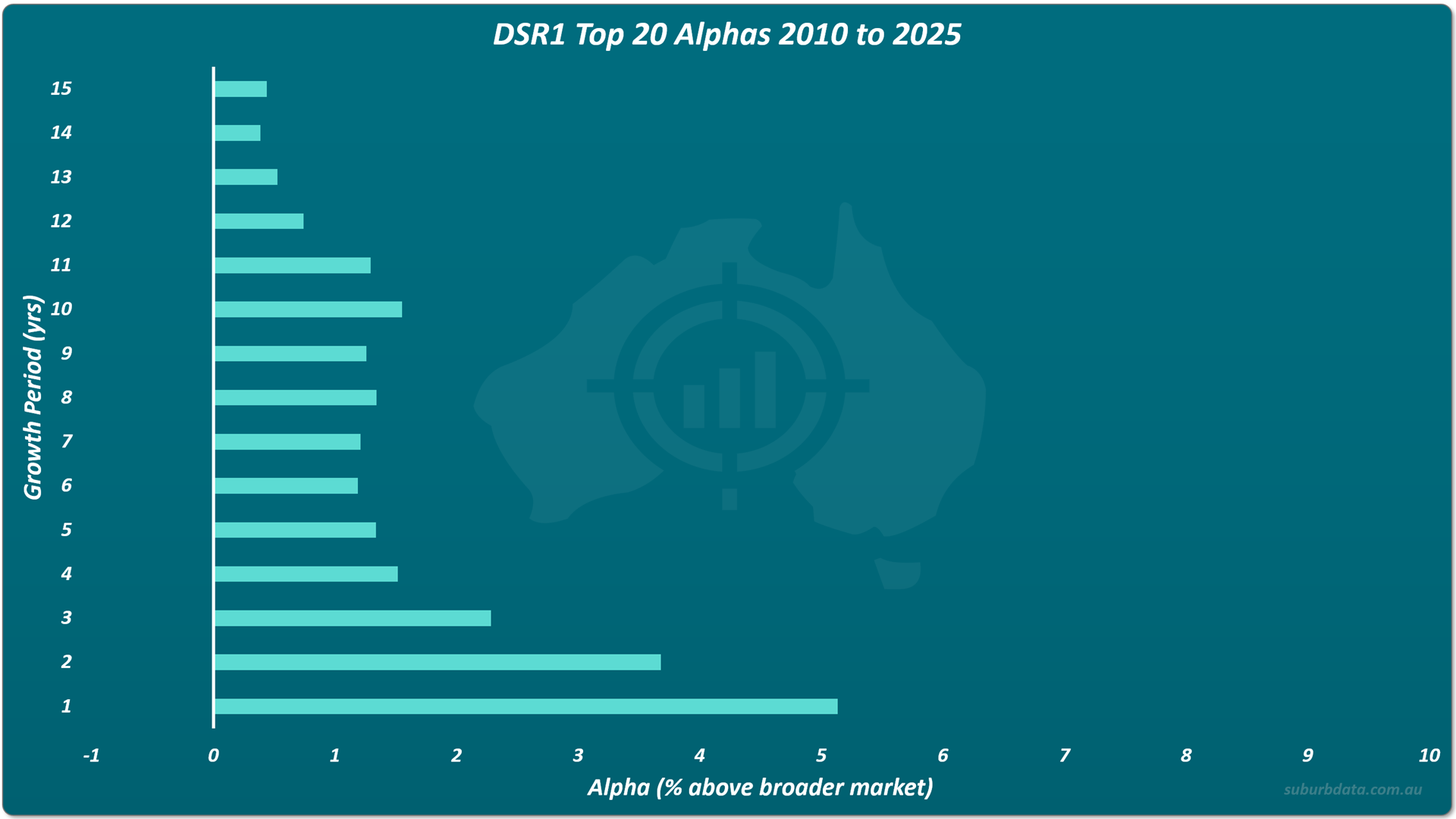
DSR1 delivered approximately 5% alpha in year one. Positive across every growth period tested. No infrastructure variable included.
DSR2 covers the same growth periods. Every single one points to the right. No negative periods. No infrastructure variable.
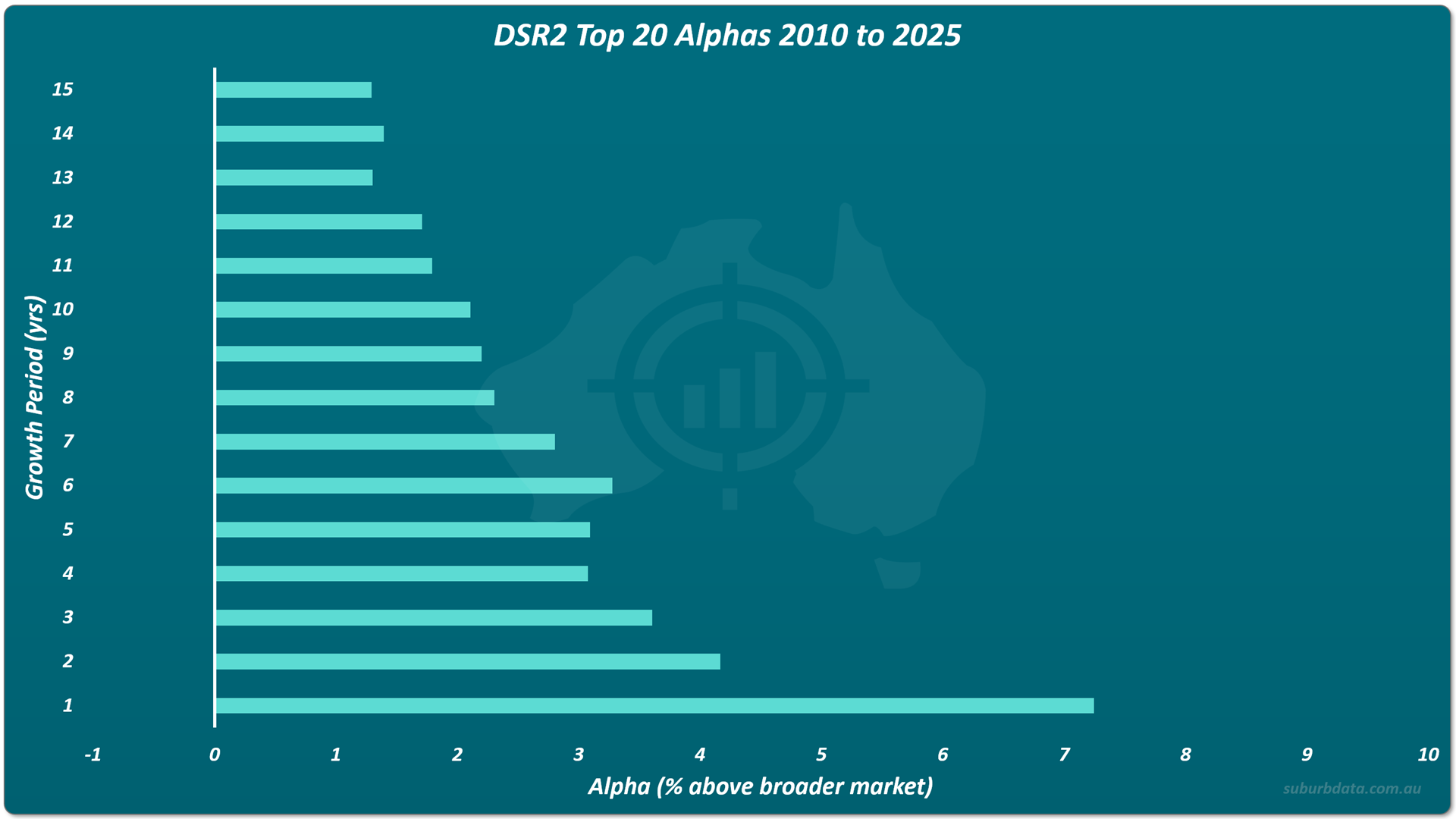
DSR2 maintained positive alpha from 1 to 15 years. The worst period was 13 years at approximately 1.3%. It never went negative. No infrastructure variable included.
DSR3 shows the strongest performance of the three versions. The bars are longer across the short-term periods. Every bar still points to the right. The worst period still beats the infrastructure expert's best.
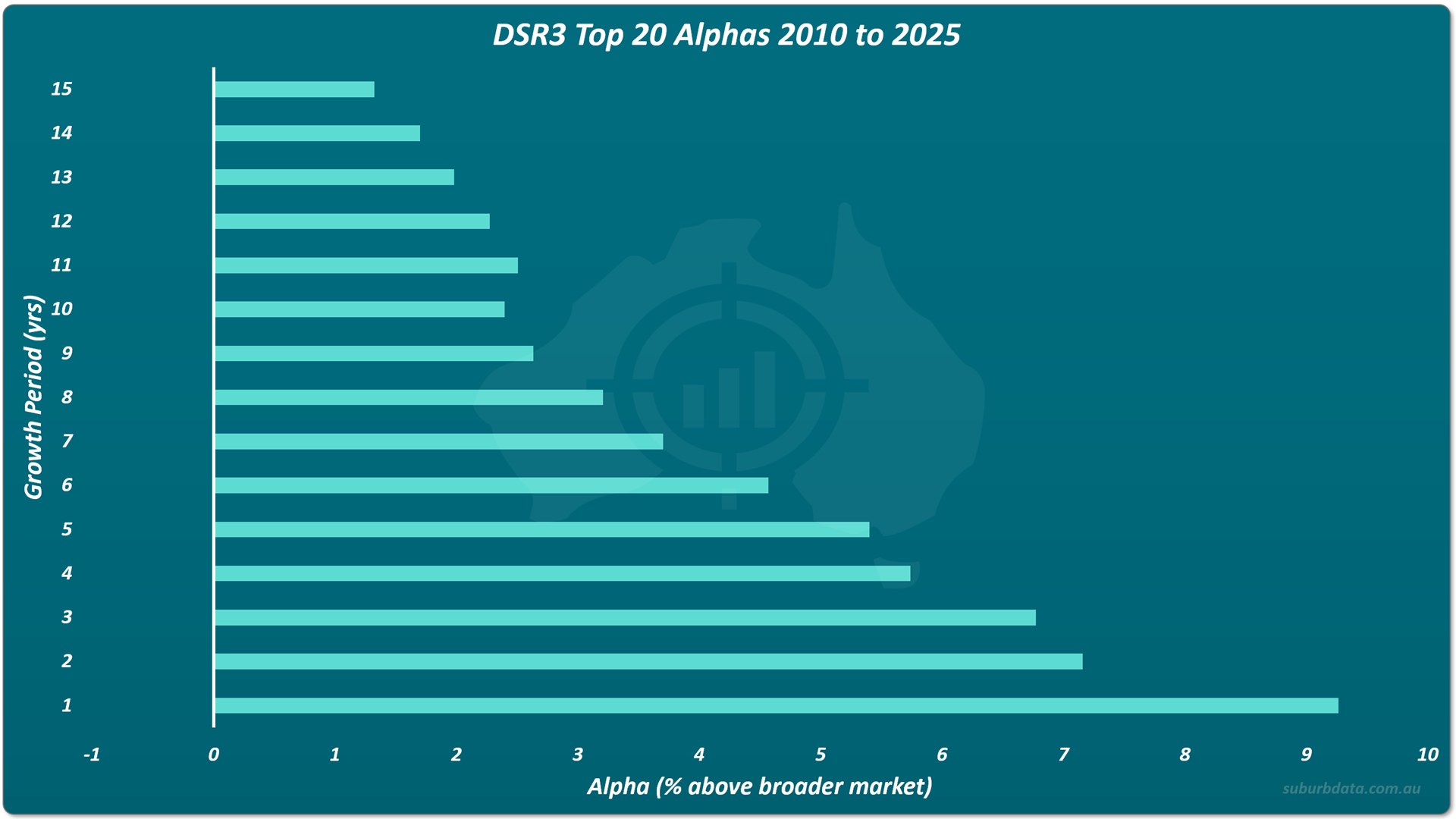
DSR3 delivered over 9% alpha in year one. Worst period was 15 years at approximately 1.3% more growth than the national benchmark. No negative periods. No infrastructure variable included.
The Expert's Most Recent Work
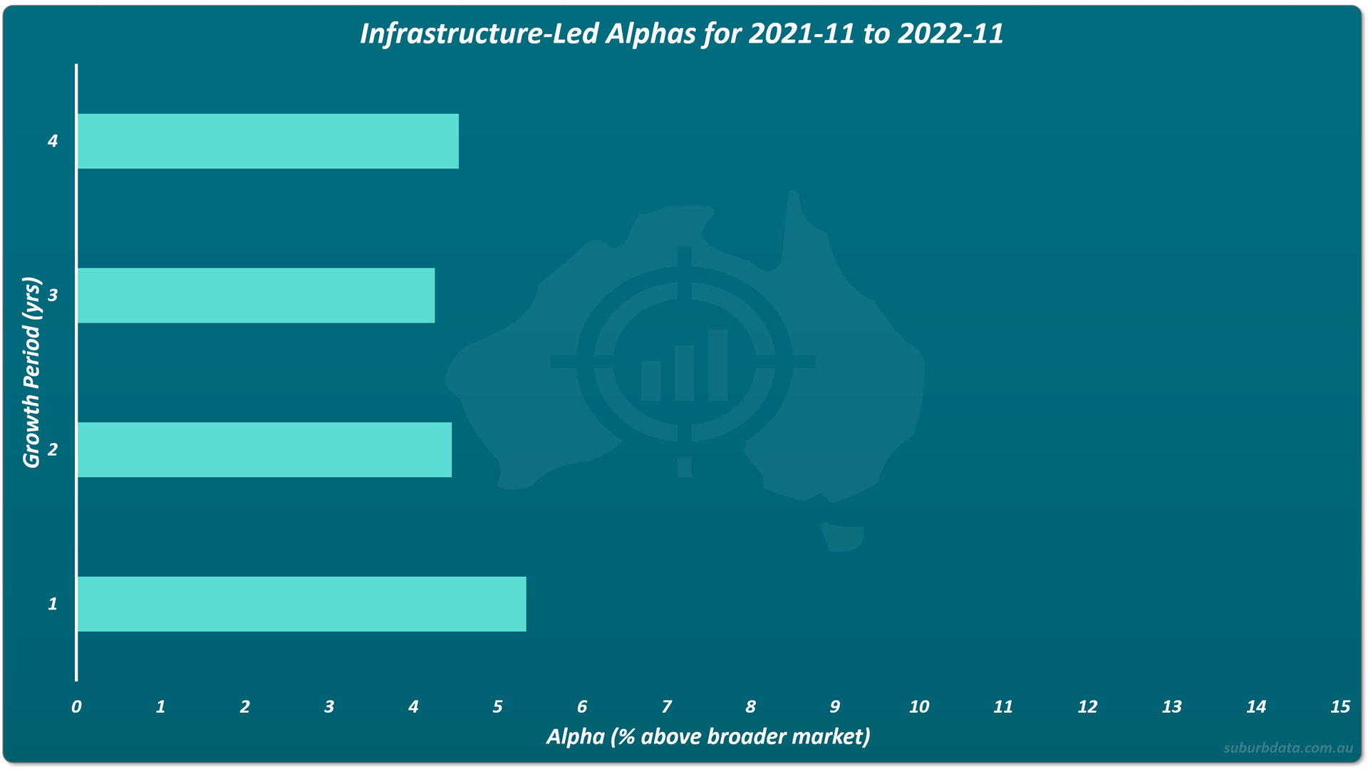
Recent infrastructure-led reports from 2021 and 2022 showed improvement. 40 recommendations. Alphas above 4% across 1 to 4-year growth periods.
The charts below show those recent alphas alongside DSR3's performance for the same period across its top 10 local government areas.
The chart below shows the expert's recent infrastructure-led recommendations from 2021 to 2022. Four growth periods. All bars above 4%. This is the best the infrastructure method has produced.
The chart below shows DSR3 for the same period across its top 10 local government areas. Same four growth periods. Same X axis scale. The difference is immediate.
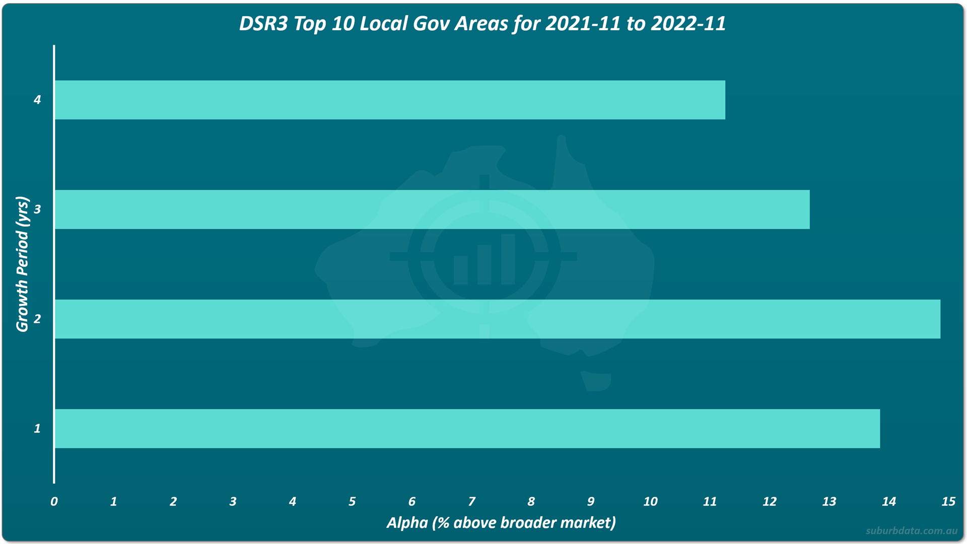
DSR3's worst period for that era was 4 years at approximately 11% alpha (growth of 17% pa, 87% total).
The expert's 4-year alpha was approximately 4.5% (growth of 10.5% pa, 57% total).
What This Actually Means
- ABS data shows no meaningful correlation between infrastructure spending and capital growth. Where a correlation exists, it runs in reverse.
- 9 out of 10 individual projects produced no measurable uplift in surrounding property values.
- An infrastructure expert with 500 recommendations over 18 years delivered a peak alpha that does not survive transaction costs.
Infrastructure research is not worthless. It is overrated.
The time spent on the next rail line or hospital announcement is time not spent on variables that actually predict growth.
Conclusion
Big projects. Little payoff.
Three ABS datasets. 120 specific projects. 500 expert recommendations. The finding is consistent.
Infrastructure spending does not reliably drive capital growth.
The markets that outperform are not the ones with the biggest projects. They are identified by more reliable variables that measure supply and demand.