

There are many professionals in the property investment industry who claim that investors should look for areas with strong past growth and buy into those same markets.
The logic sounds simple. If it performed well before, it should perform well again.
But this belief is not supported by historical data.
When you zoom out and look over longer time frames, a very different pattern emerges. Property markets don’t continue to outperform indefinitely. Instead, they tend to level out and grow at similar rates over time.
There is a clear reason for this, and the easiest way to understand it is through a simple analogy.
The Apples and Oranges Analogy
Imagine walking into a fruit shop 100 years ago.
You see apples and oranges sitting side by side:
- Apples cost 1 cent each
- Oranges cost 2 cents each
Now assume:
- Apples grow at 4% per year
- Oranges grow at 8% per year
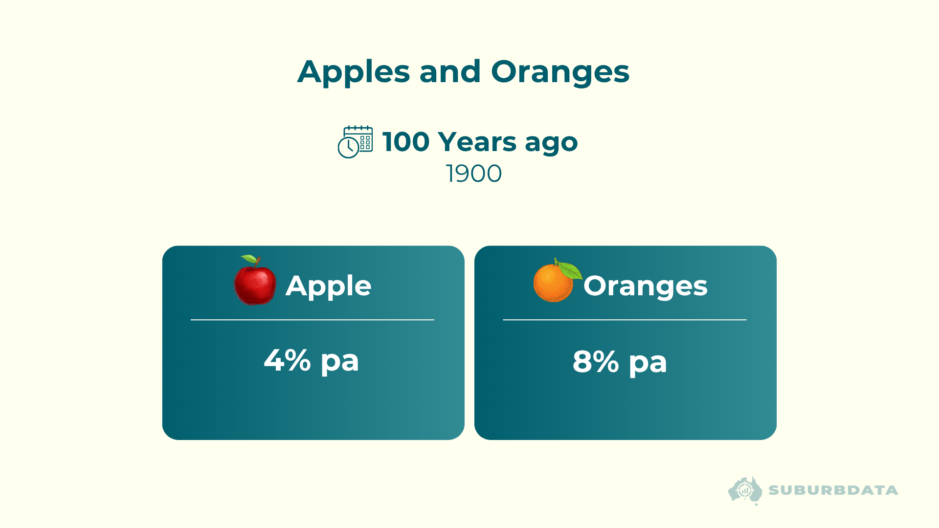
At first, this seems reasonable. But extend this over 100 years.
You’d end up with:
Apples worth around 50 cents each
Oranges worth around $44 each
That creates an absurd price gap. Oranges have gone from being twice as valuable as apples to 88x as valuable.
But it is still just an orange.
What Happens When Prices Diverge
Now imagine walking back into that same fruit shop.
What would buyers do?
They wouldn’t keep buying oranges.
At some point, oranges become too expensive. Buyers shift to a cheaper alternative - apples.
This creates:
- Falling demand for overpriced oranges - decreasing their growth rate
- Rising demand for affordable apples - increasing their growth rate
The gap begins to close.
From Analogy to Property
Now translate this into property.
Think of:
- Apples → Property A
- Oranges → Property B
Let’s say:
- Property A = $500,000
- Property B = $1,000,000
There may be valid reasons for that difference, e.g.:
- Block size
- Views
- Distance to shops
But here’s the key question:
Can those differences justify one property becoming massively more expensive over time?
No. Instead, the same ratio will persist.
B will remain twice as expensive as A. Both will grow at the same rate.
B did not outgrow A to become twice as expensive. It started off twice as expensive because it had a better block size, better views and was closer to shops.
B has always been twice as expensive as A. That ratio will continue unless there is a change to either property’s:
- Block size
- Views
- Distance to shops
The Ripple Effect
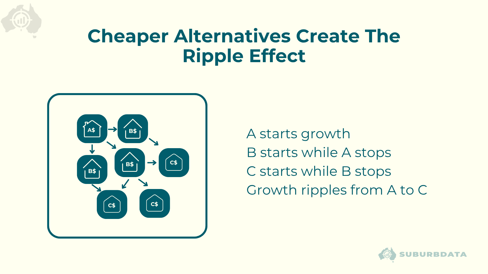
This is how growth actually spreads.
During a boom:
- Perhaps premium suburbs grow first
- Prices become too expensive
- Buyers shift to cheaper alternatives
- Growth spreads elsewhere
What the Data Shows
Short-term growth is varied:
- Some suburbs boom
- Some stagnate
- Some fall
But as the timeframe increases, something changes.
Extreme outcomes begin to disappear. Growth starts clustering into a narrower range.
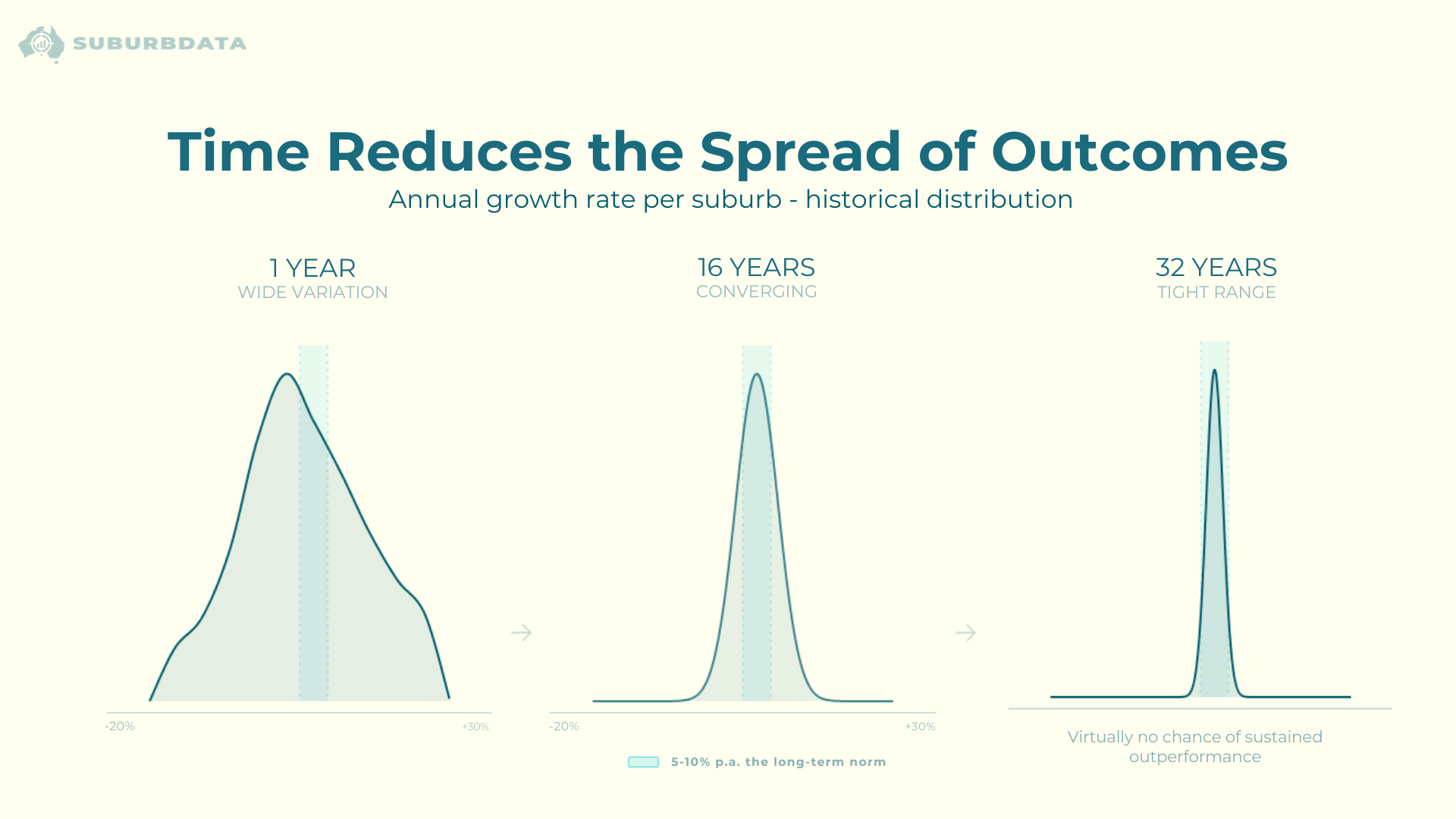
There is a progression from short-term wide spreads → long-term tight clustering
Why it matters: This is the actual proof, not just theory.
By the time you reach long timeframes, most results sit within a tight band.
There is effectively no practical chance of sustained long-term outperformance.
The longer you hold a property for, the more likely you will have average growth.
The Illusion of Compounding
You’ve probably seen charts like this before.
A small difference in annual growth produces a massive difference over time.
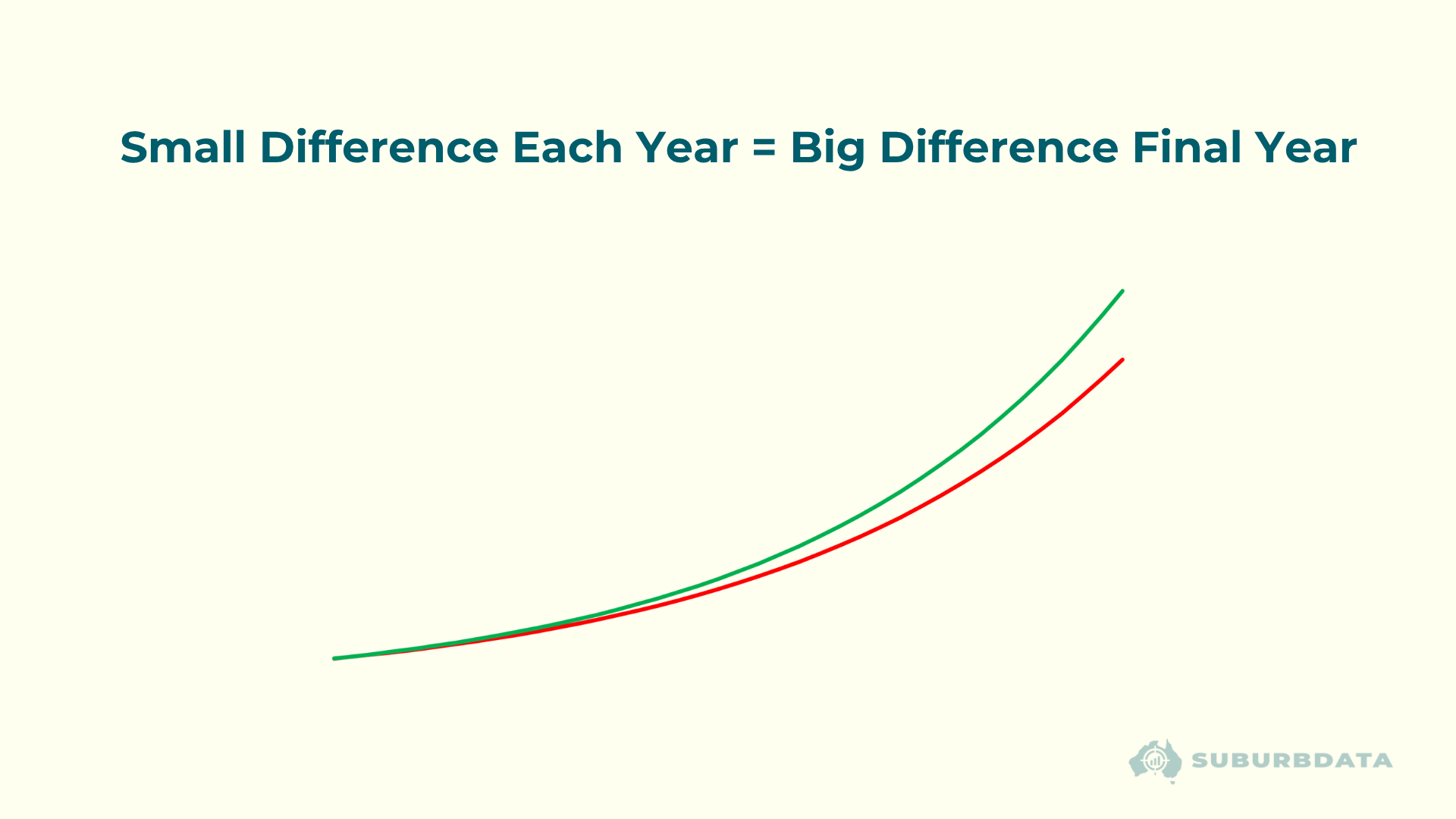
Two smooth curves gradually separating
Why it matters: This is the false belief investors buy into
The math is correct. The assumption is not.
This theoretical chart relies on one condition: That a market can consistently outperform every year for decades.
That has never happened.
You will never see a “real” long-term chart that looks like the one above for any property, street, suburb, area, or city. Not even the smoothed national median.
What Real Growth Actually Looks Like
Real property growth is not smooth.
It looks like:
- Surges
- Plateaus
- Pullbacks
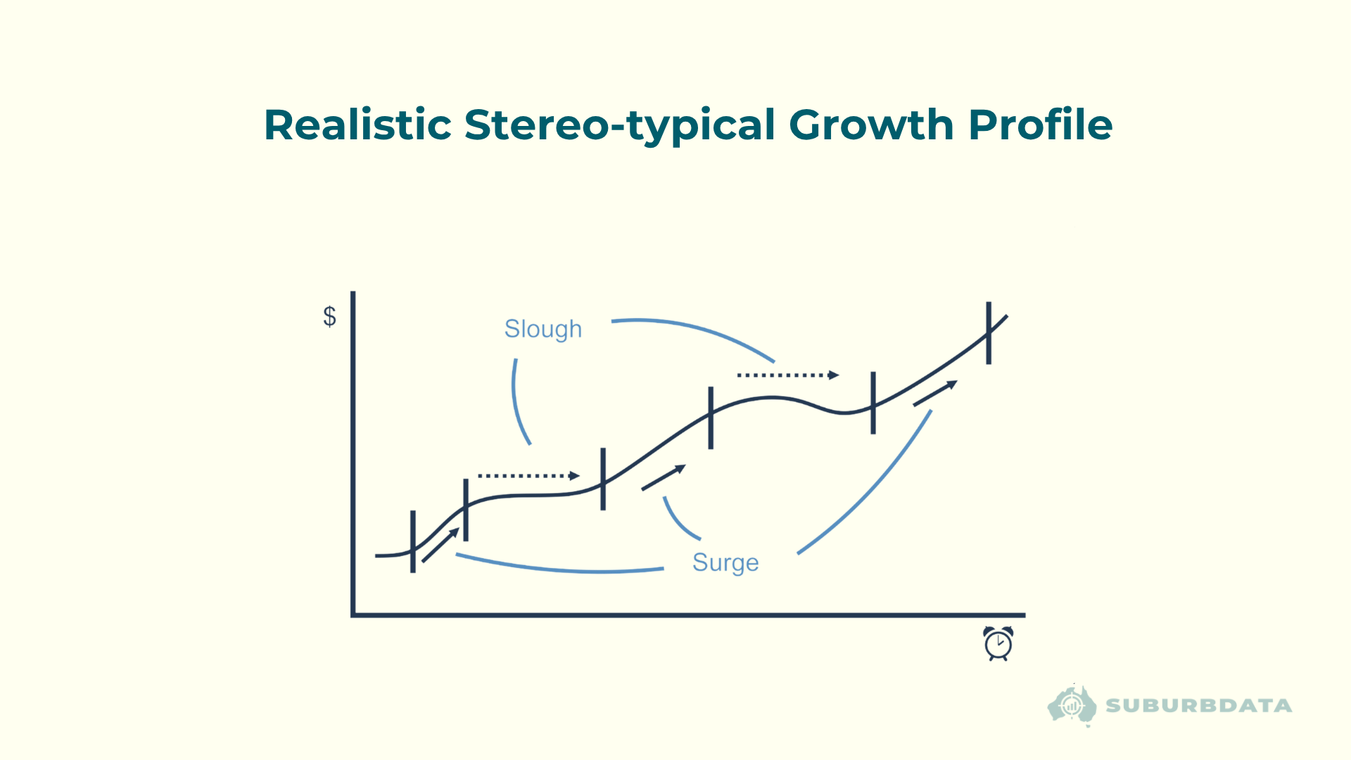
Uneven, step-like growth pattern with cycles
Why it matters: Replaces the “myth curve” with reality
There is no consistent pattern in timing, duration, or magnitude.
And importantly, leadership changes. The outperforming markets in one decade are replaced by the underperforming markets of the next.
The “Winner” Problem
When people look at long-term charts, they focus on the winner.
But that’s misleading.
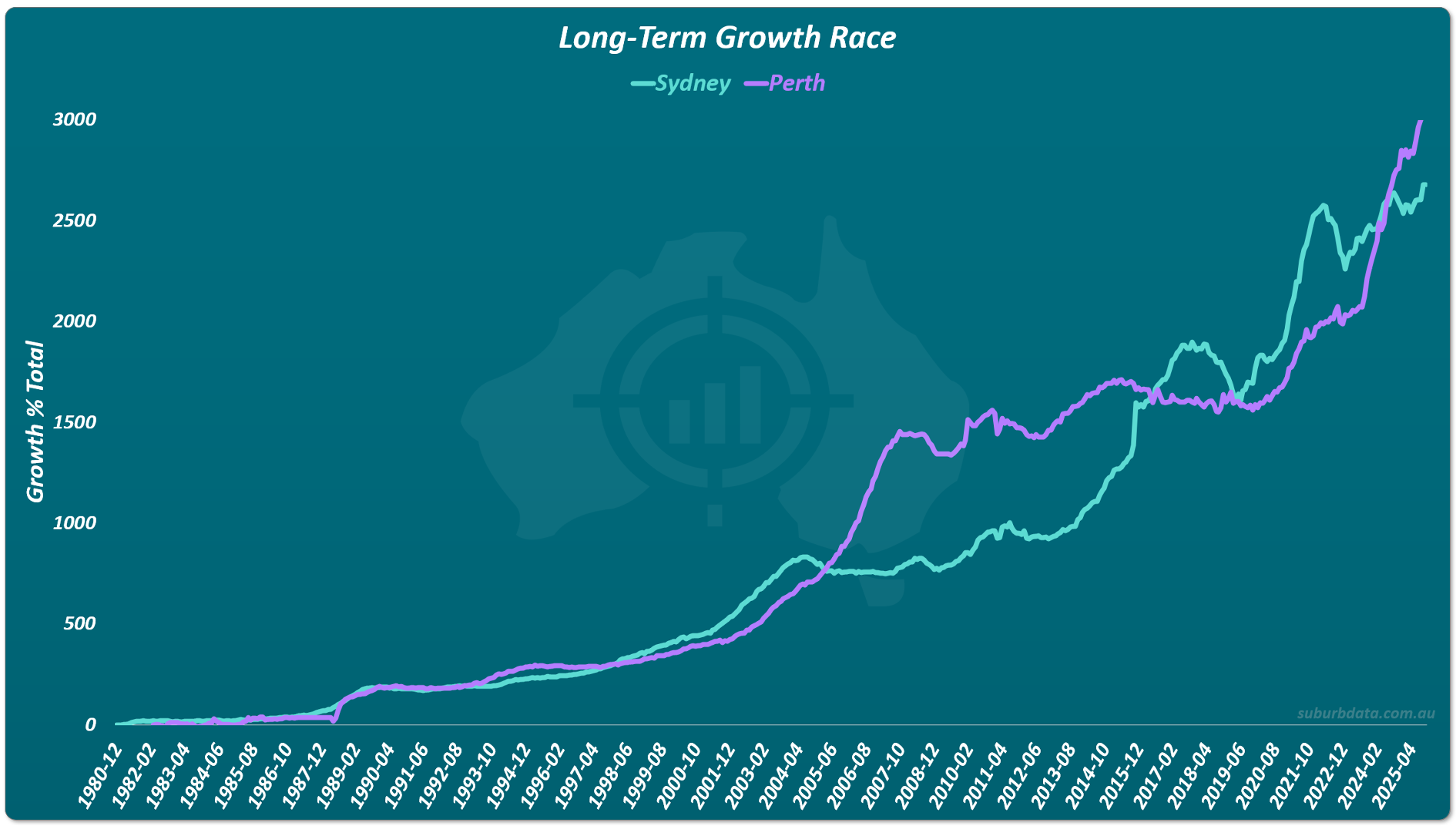
The two lines overtake each other multiple times
Why it matters: Shows that “winning” is temporary and cyclical
The winner is often just the market that performed best most recently.
If one market was a long-term outperformer, a gap would form and would continue to widen.
Instead, the gap widens and narrows. Sometimes there is a crossover. That pattern repeats.
What Actually Works (and What Doesn’t)
There are 3 features that do show better performance over the long-term:
- Houses are better than units
- Older properties are better than new
- Built-up areas are better than greenfield estates near vacant land
But these don’t find outperformers because the vast majority of properties have these 3 features.
These features help you avoid underperformers.
A Note on Amenities and Change
New amenities can trigger faster growth:
- A new train station
- New shops
- New school
But only temporarily. Once the benefit is priced in, growth returns to normal.
It’s not the presence of an amenity that drives growth — it’s the change.
Conclusion
Because of compounding and buyer behaviour, no property, suburb, or city can continually outperform another over the long term.
Eventually:
- Price gaps become too large
- Buyers shift their interest
- Growth rebalances
The data consistently shows: Over time, all markets tend toward similar long-term growth rates.
What This Means for Investors
If long-term outperformance isn’t realistic, then the strategy needs to change.
Instead of trying to pick lifelong winners:
- Focus on shorter-term opportunities
- Find areas where demand is higher than supply - a high Demand to Supply Ratio (DSR)