

For decades, property investors have been told that buying closer to the CBD leads to better long term capital growth.
It sounds logical. Inner suburbs feel more established, more desirable, and more scarce. As a result, proximity to the CBD is often treated as a shortcut for making a “safe” investment decision.
But when you examine decades of Australian property data, that assumption does not hold up.
In this Expert Busting episode, we analyse long term capital growth across multiple cities, timeframes, and distance bands to test whether buying close to the CBD actually improves investment outcomes.
What we find is clear. Proximity to the CBD is not a reliable driver of higher property growth, and relying on it can lead investors to make suboptimal decisions.
Why Investors Believe Buying Close to the CBD Works
The idea that proximity to the CBD drives superior capital growth is usually supported by research rather than anecdote.
Over the years, several reports have suggested a relationship between distance to the CBD and price growth. These reports are frequently cited by commentators, buyer’s agents, and so called experts as proof that buying closer in is safer or smarter.
But there is a problem.
When you look closely at these studies, almost all of them suffer from at least one major flaw and often several at once.
The Data Problems Behind the CBD Property Myth
Across many of the reports used to support the CBD proximity argument, the same issues appear repeatedly.
Short timeframes A single period of analysis Small or selective sample sizes Poor or misleading research methodology
Any one of these is enough to weaken a conclusion. Combined, they make the conclusions unreliable.
Before we can talk about whether proximity to the CBD really matters, we need to address these flaws directly.
The AHURI Report and the Origins of the CBD Growth Claim
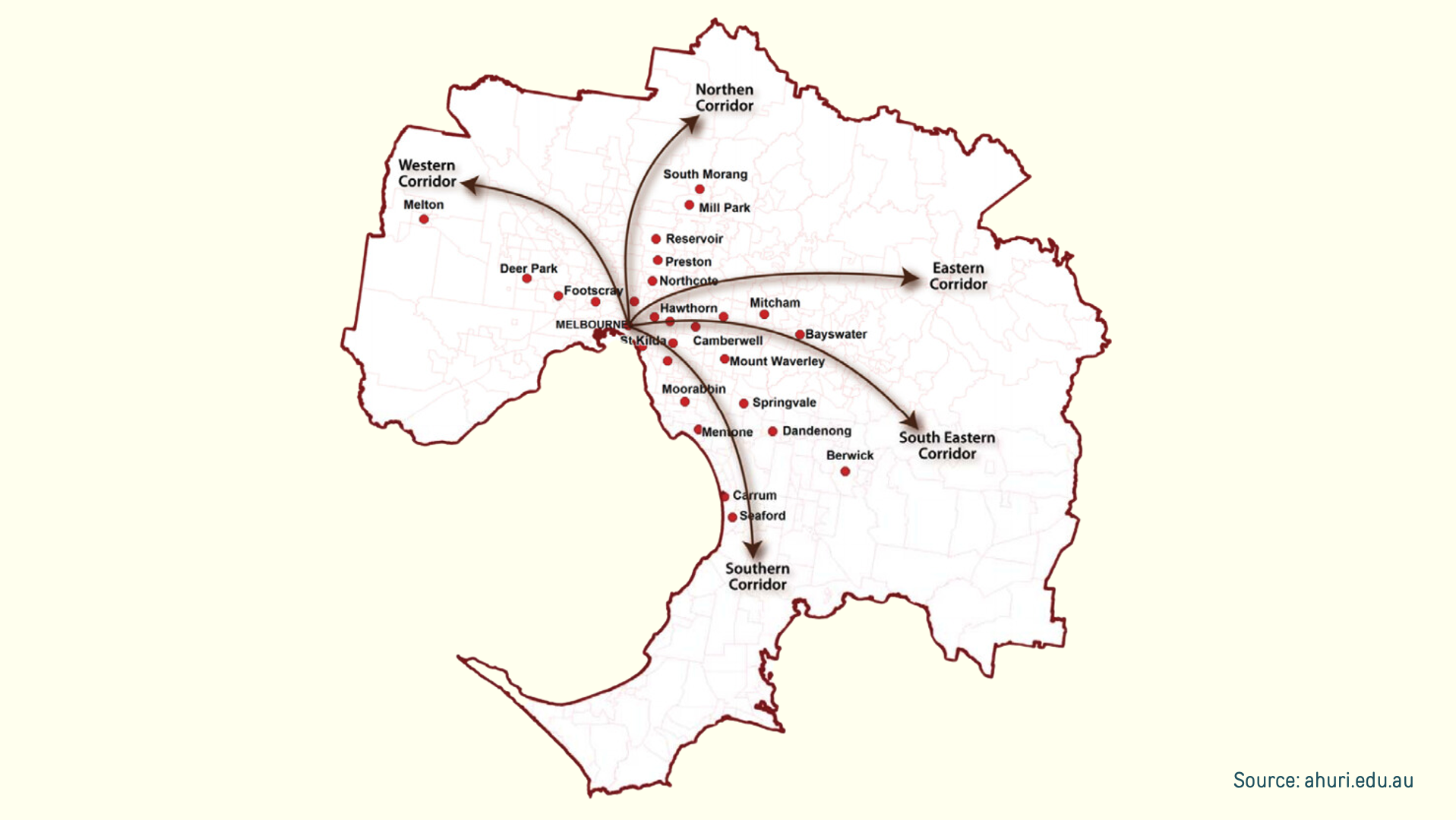
One of the most commonly referenced pieces of research comes from the Australian Housing and Urban Research Institute. Their report mapped Melbourne into several growth corridors north, west, east, south-east and south and compared price growth of selected suburbs at increasing distances from the CBD.
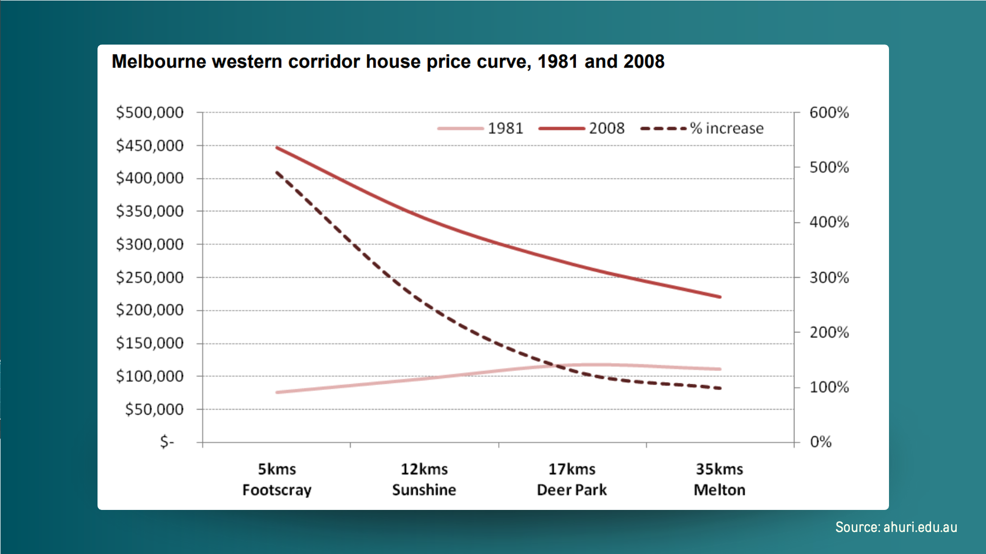
At first glance, the charts appear convincing. The percentage growth line trends downward as distance from the CBD increases, reinforcing the idea that being closer equals stronger growth.
But when you examine the structure of the analysis, serious issues emerge.
Problem 1: Too few suburbs, arbitrarily chosen
Melbourne has roughly 400 suburbs.
The AHURI analysis used around 30.
Even within each corridor, only a small number of suburbs were selected. There is no clear explanation for why these suburbs were chosen or why others were excluded.
If 7.5 percent of suburbs behave one way, there is no justification for assuming the remaining 92.5 percent behave the same.
Problem 2: Inconsistent spacing from the CBD
Looking at the western corridor, AHURI compared Footscray, Sunshine, Deer Park and Melton.
On the chart, these suburbs appear evenly spaced. On the map, they are not.
The distances between them vary significantly, yet the horizontal axis makes them appear evenly distributed. This visually exaggerates the apparent decline in growth as distance increases, making the trend look stronger than it really is.
Problem 3: Single Timeframe
The most important issue is the timeframe.
The original AHURI chart analysed just one 27 year period from 1981 to 2008.
During that specific window, suburbs closer to the CBD did outperform.
But markets are cyclical. A result observed in one period does not automatically apply to the next.
To test whether proximity truly drives growth, the analysis must be repeated across multiple timeframes.
What Happens When You Change the Timeframe
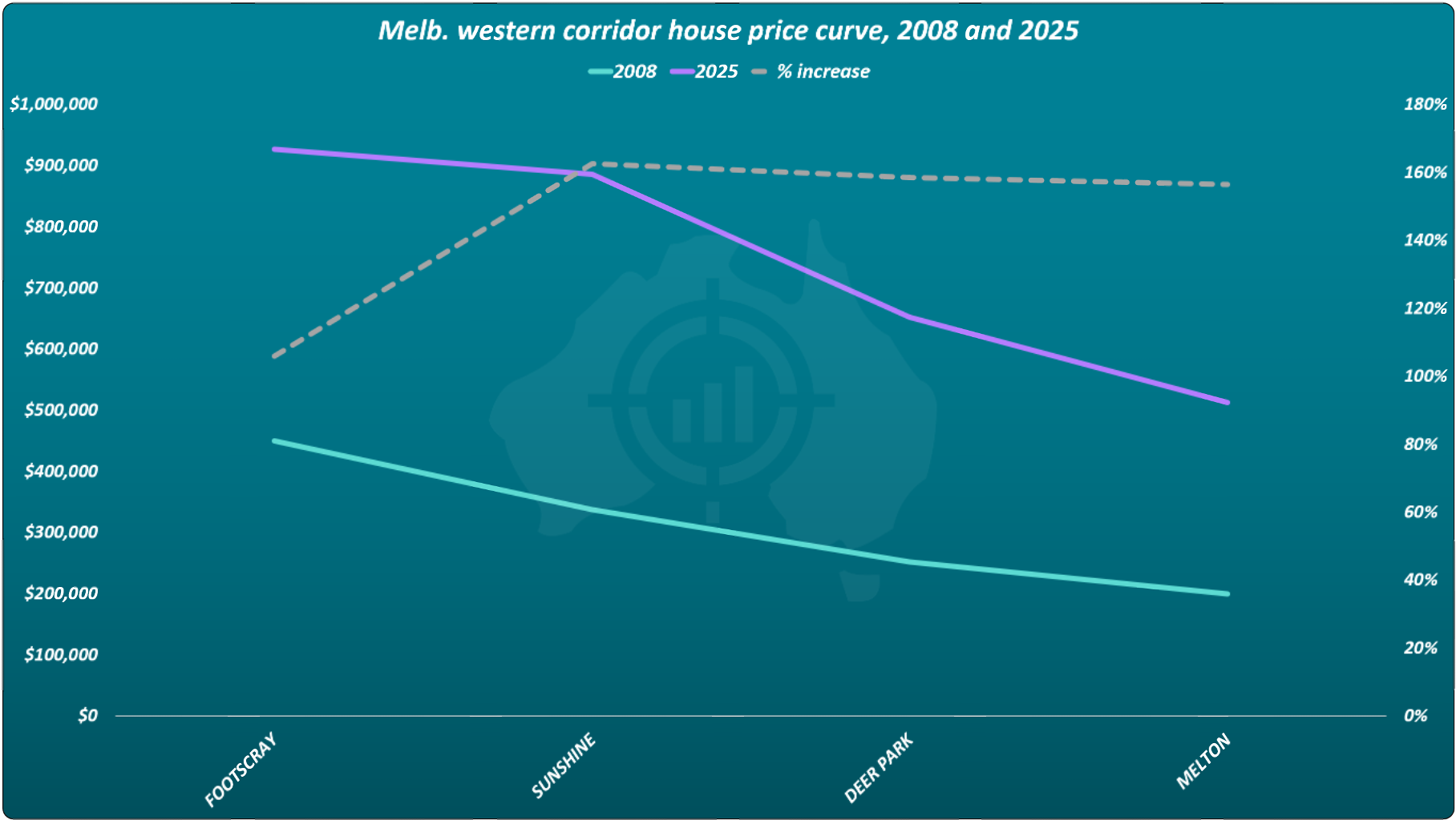
Using the exact same suburbs chosen by AHURI, we recreated the chart for the next 17 years from 2008 to 2025.
Nothing else changed. Same suburbs. Same structure. Same flawed spacing.
Only the timeframe moved forward.
The result reversed.
Footscray, the suburb closest to the CBD, became the worst performer.
An investor who bought in Footscray in 2008 expecting CBD proximity to guarantee outperformance would have been disappointed.
The earlier result was not wrong. It was context dependent.
The other 4 corridors showed the same problem. Change the start and end dates, and you get a different conclusion.
Why timeframe matters more than proximity
To avoid this trap, data scientists use a technique called cross validation.
Instead of analysing one fixed period, the same analysis is repeated across many overlapping timeframes.
For example 1981 to 2001 1982 to 2002 1983 to 2003
If the same relationship appears in every window, the conclusion is robust. If it flips depending on the window chosen, it cannot be relied upon.
AHURI did not do this. They used one timeframe and drew a permanent conclusion from it.
A second major report: broader, but still flawed
Another widely cited report was produced by the Reserve Bank of Australia and the Real Estate Institute of Australia.
This report looks stronger on the surface because it includes Australia’s five largest cities.
However, it introduces a new problem.
Instead of measuring distance in kilometres, it groups suburbs into just two categories.
Inner ring Outer ring
It then compares the ratio between median prices in those two groups.
If the ratio increases, the conclusion is that inner suburbs must be growing faster.
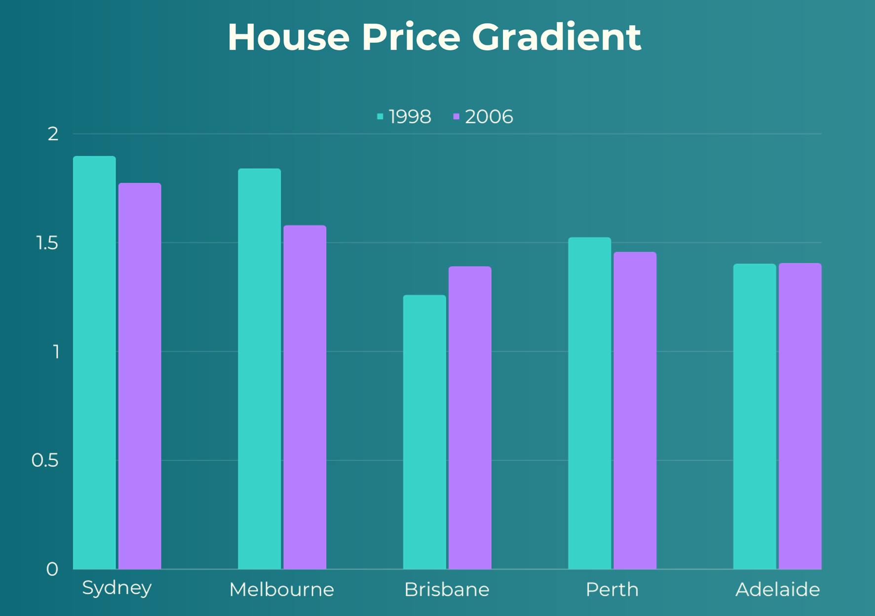
And for the period from 2006 to 2014, that is exactly what the chart shows.
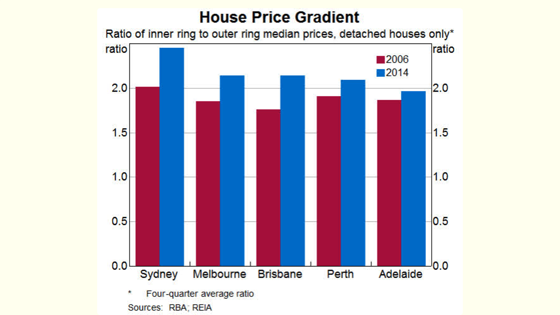
Same method, different period, different resul
Again, looking at a different period gave a different result. We recreated the same comparison for the previous eight year period, but ending in 2006.
Same cities. Same inner and outer definitions. Same ratio method.
This time, the result was very different.
Only one city showed inner suburbs pulling further ahead. In most cities, the outer ring closed the gap.
Once again, the conclusion depended entirely on when you start and finish the measurement.
Looking beyond two points in time
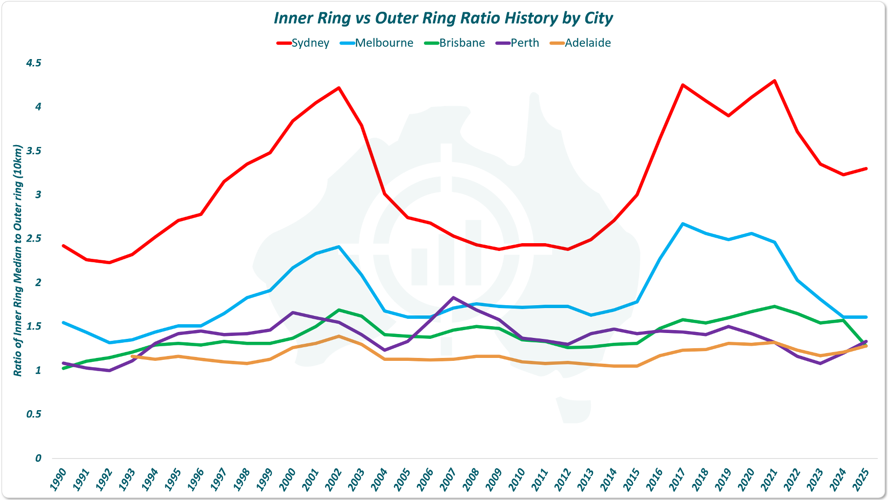
Bar charts comparing just the start and end year hide what happens in between.
To address this, we plotted the inner to outer ring ratio every year from 1990 to 2025.
What this reveals is not a trend, but a cycle.
Ratios rise. Ratios fall. And over time, they tend to return to similar levels.
If proximity to the CBD were a genuine growth driver, these ratios would steadily climb.
They do not.
A Better Way to Measure CBD Distance and Property Growth
Inner versus outer is a blunt tool.
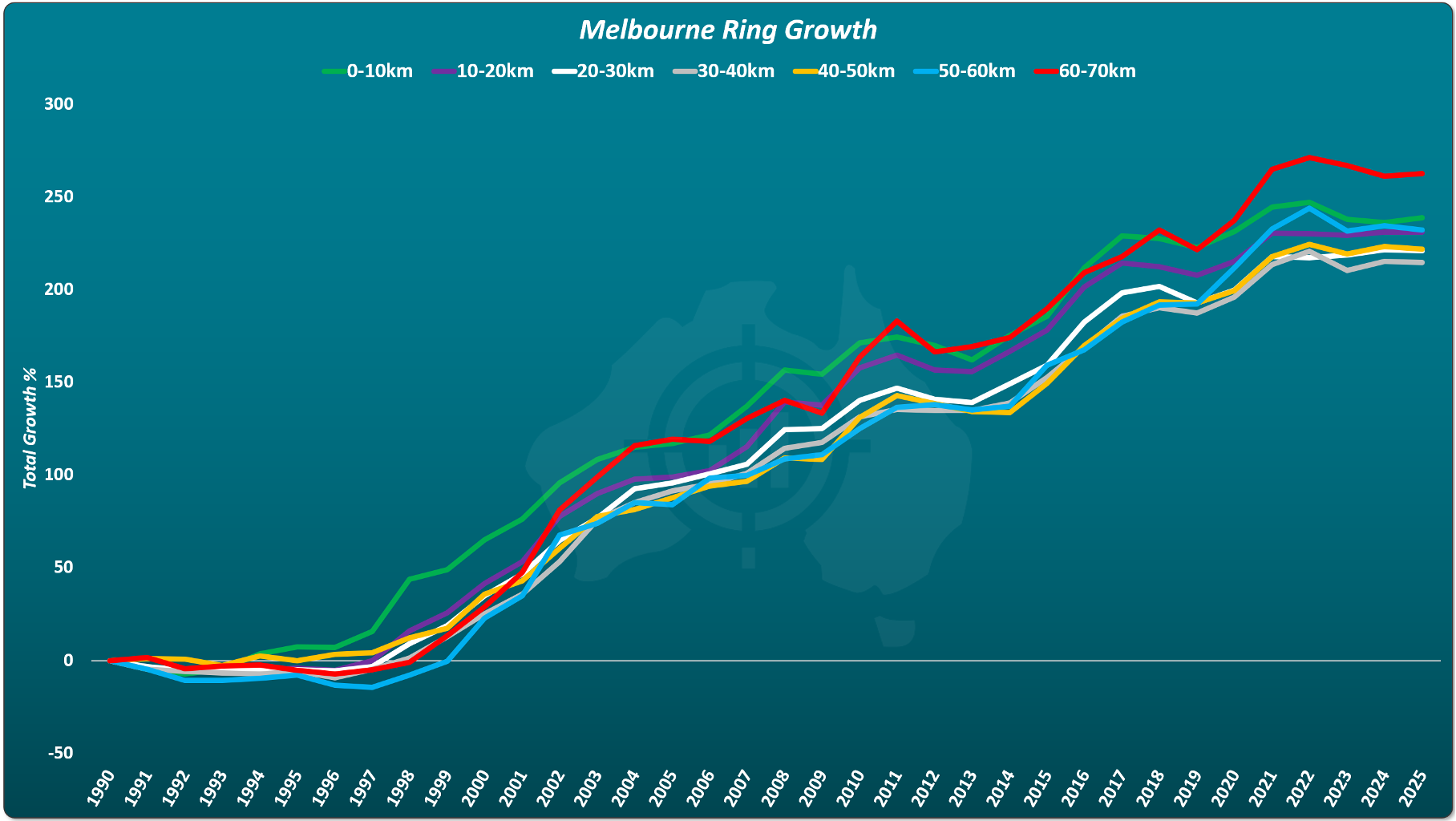
So we rebuilt the analysis using distance bands.
0 to 10 km 10 to 20 km 20 to 30 km 30 to 40 km 40 to 50 km 50 to 60 km 60 to 70 km
This includes hundreds of suburbs and tracks growth over 35 years.
The curves cross repeatedly. No group separates itself. There is no widening gap favouring inner suburbs.
In Melbourne, the highest growth for this specific period came from the suburbs furthest from the CBD.
That does not mean outer suburbs always win.
It means there is no rule.
Expanding the analysis across Australia
To remove any city specific bias, the same distance band analysis was applied to Australia’s ten largest cities.
Thousands of suburbs were included.
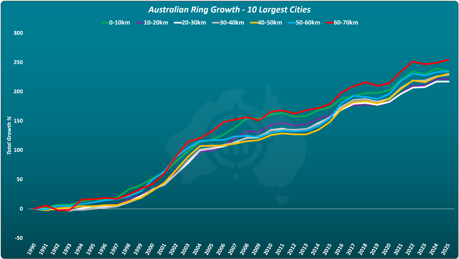
Once again, the result is clear.
Inner suburbs do not diverge upward. Growth curves remain tightly clustered. Curves cross over. Proximity to the CBD does not create superior long term growth.
Rental Yield vs Distance from the CBD
Growth is only part of the equation.
When we examine gross rental yield by distance from the CBD, a pattern emerges.
Yields are lowest in the inner five kilometres and gradually increase with distance.
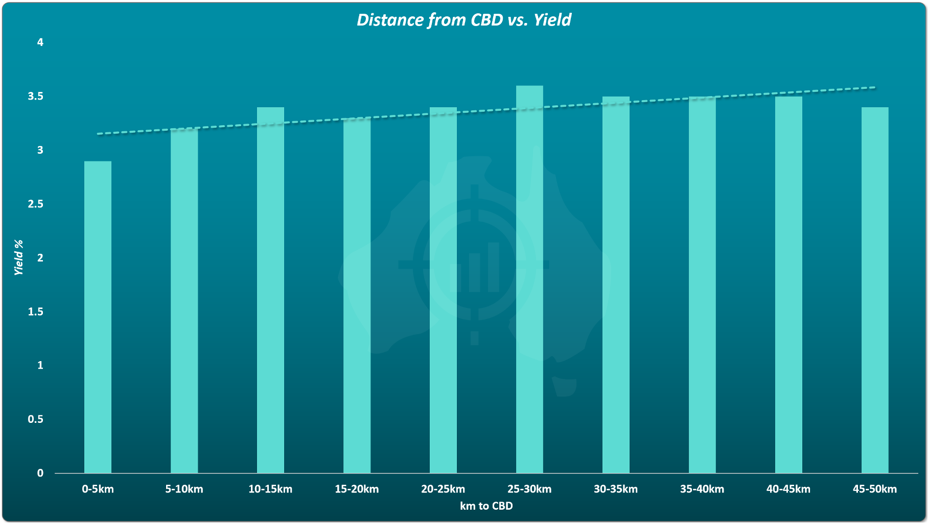
The difference is not dramatic, but it is consistent.
Inner suburbs are not better for growth. And they are worse for yield.
Risk, Volatility, and Buying Close to the CBD
There is also a risk dimension.
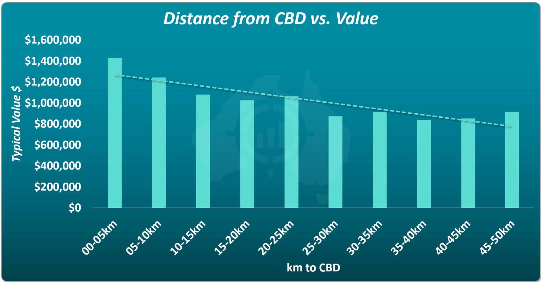
Suburbs closer to the CBD are more expensive. That concentrates capital into fewer assets. It reduces flexibility.
Owning one million dollar property carries more concentration risk than owning two five hundred thousand dollar properties across different locations.
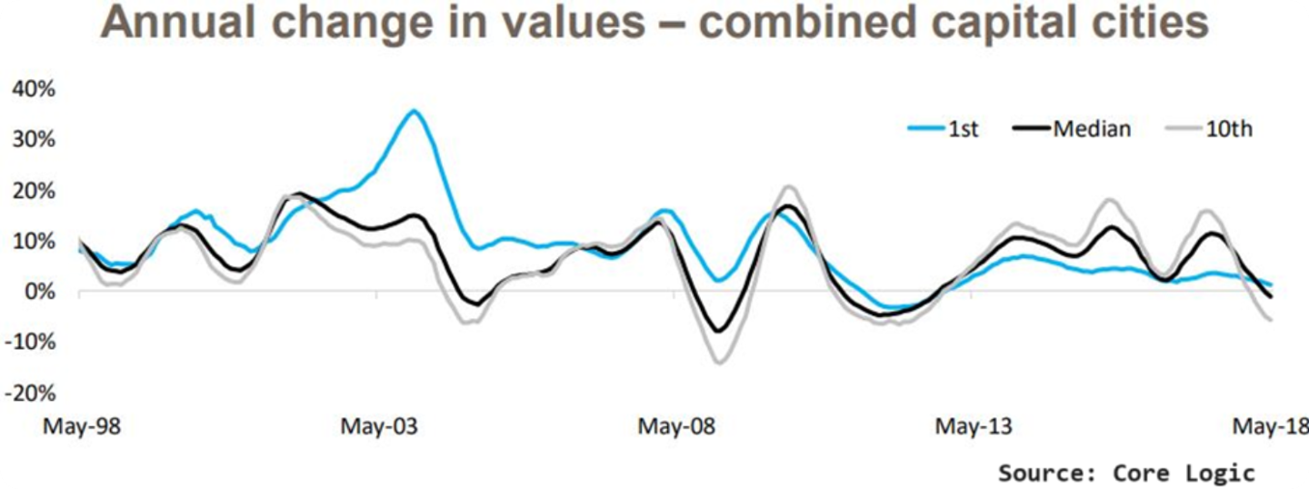
Price volatility data also shows that more expensive suburbs experience greater price swings.
Conclusion: Does Proximity to the CBD Really Matter for Property Investment?
After examining decades of data across multiple cities, timeframes and methodologies, the conclusion is clear.
You do not need to buy closer to the CBD to achieve stronger long term growth.
Buying closer to the CBD does not improve growth outcomes. It results in lower yields. It increases concentration risk. It exposes investors to higher volatility.
That does not make inner suburbs bad investments.
It simply means proximity itself is not a growth driver.
A critical clarification
This analysis is not suggesting that fringe or greenfield suburbs are superior investments.
Large tracts of vacant land, house and land packages, and developer controlled estates introduce supply risks of their own.
Other considerations investors often overlook
Flexibility You cannot sell part of a property. Multiple lower priced assets provide options a single expensive purchase does not.
Capital Gains Tax Owning multiple properties allows sales to be staggered across financial years, potentially reducing CGT exposure.
Stamp duty More expensive properties attract higher stamp duty. Over long holding periods this is less important, but it still affects entry cost.
Timing entry City wide booms often start in inner rings and ripple outward. That lag can be used as a signal to buy in the next ring outwards. There is no signal for the innermost ring.
Final takeaway
• Buying closer to the CBD does not lead to higher long term capital growth
• Growth outcomes depend heavily on timeframe, not proximity
• Inner suburbs typically have lower rental yields
• More expensive inner suburbs carry higher concentration risk
• Distance from the CBD is not a reliable property investment rule