

Experts tell investors to avoid suburbs with a high percentage of public housing. The claim is that it suppresses growth.
It sounds reasonable. Disadvantaged residents. Discounted rents. Government stock mixed with private.
We researched historical data across four census years and every suburb in Australia. We found that public housing has no impact on growth.
What Public Housing Is
Public housing is also known as:
- State housing
- Government housing
- Social housing
State governments provide discounted rentals to people who cannot afford market rent. Eligibility is based on income, disability, or family circumstances.
The Data Source
Public housing percentages come from the Australian Bureau of Statistics (ABS). The census is held every five years. One question asks tenants who they rent from. One option is Government Housing Authority.
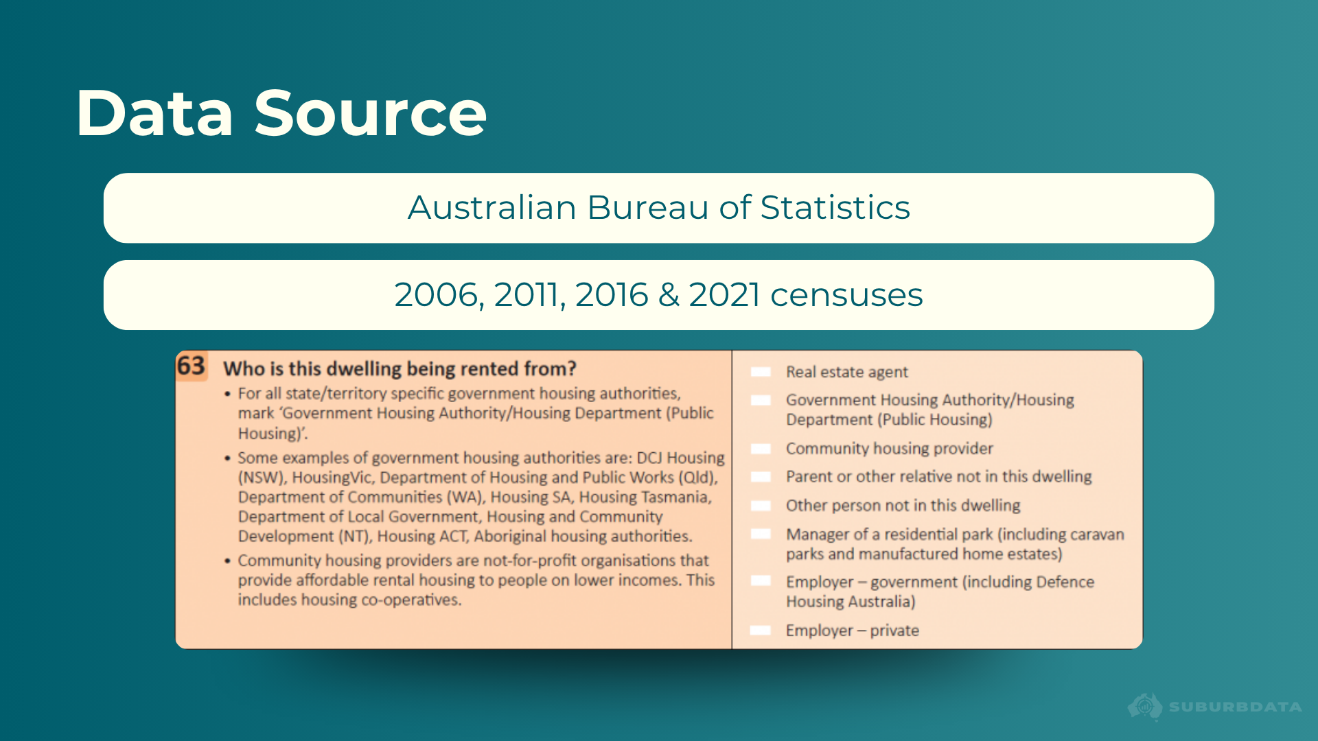
Data covers four census years:
- 2006
- 2011
- 2016
- 2021
The next census is due in 2026. Census night is usually in August.
Suburbs with fewer than 500 census respondents were excluded. This removes unreliable data, probably in remote suburbs with no real estate activity.
What the Numbers Look Like
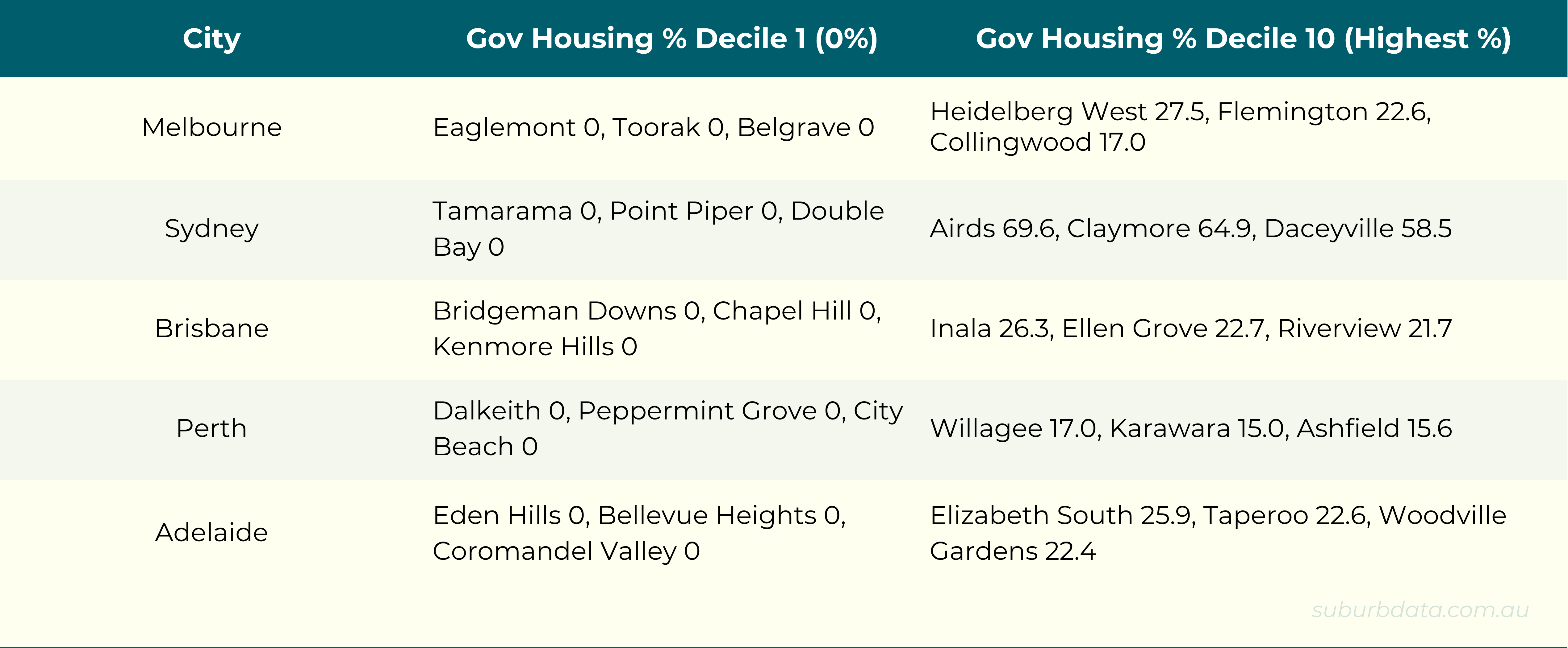
Public housing concentration varies dramatically across the country. The table below shows suburbs from the lowest and highest deciles across the five major capitals. Numbers are averaged across all four census years.
Long-Term Public Housing Has No Impact on Growth
The chart below shows the relationship between long-term public housing concentration and long-term capital growth. Decile 1 (left) is the lowest concentration. Decile 10 (right) is the highest.
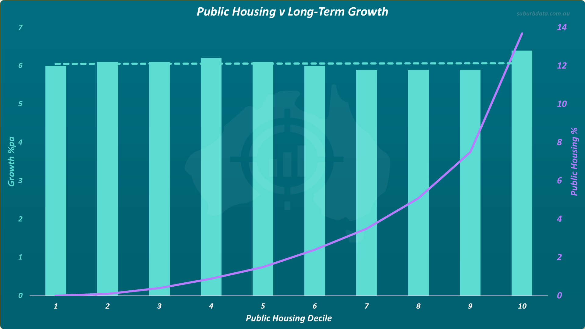
- Lowest decile: 0% median public housing
- Highest decile: 14% median public housing
- Result: No relationship between public housing concentration and capital growth.
The bars are similar in height. The trend line is flat (dotted green line at top).
Zero public housing or 14% public housing. Growth is the same.
Why Public Housing Does Not Affect Long-Term Growth
Nobody can know the cause. The following are theories.
Two reasons might explain the flat trend line:
- Stable public percentages. Public housing concentrations barely shift between censuses. A high public housing area now has likely been one for decades. Buyers know. It is priced in.
- Factored into prices. Buyers in high public housing areas pay less. Buyers in low public housing areas pay more. This shows in the price level, not the growth rate. Growth is a change in price over time. A feature already priced in does not affect future growth.
Once the market has priced a feature, it usually takes a change in that feature to shift the growth rate.
What About Change in Public Housing?
Stable public housing has no impact. A changing concentration might.
The chart below shows the 15-year change in public housing from 2006 to 2021 against the 3-year capital growth that followed.
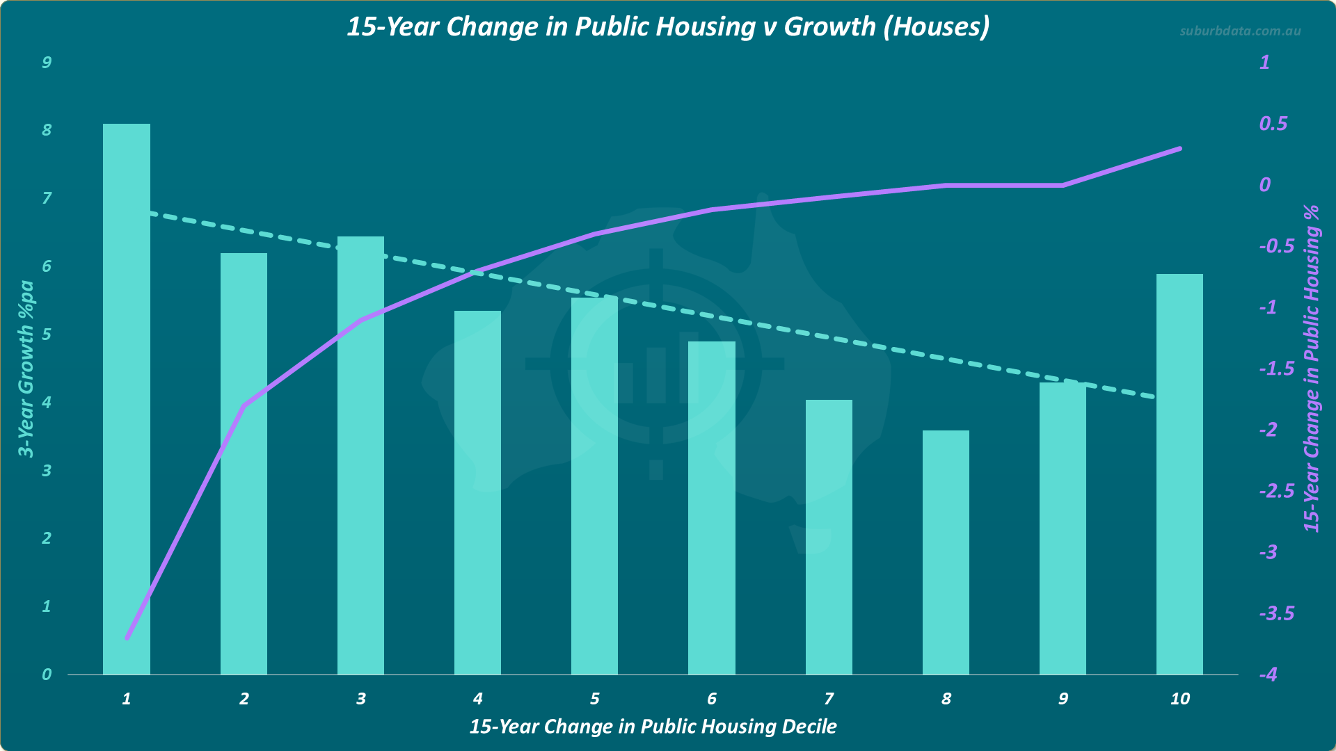
- Period: 2006 to 2021
- Duration: 15 years
- Pattern: Biggest drops in public housing produced the highest following growth
- Result: Downward sloping trend line
The trend line slopes from top left to bottom right. Suburbs that lost public housing grew more in the next 3 years.
But this is one timeframe. Property cycles span 20 years. One result is not enough. The pattern must hold across multiple periods.
Testing Across Two Timeframes
A 10-year window provides two periods to examine across the 4 censuses:
- 2006 to 2016
- 2011 to 2021
The chart below shows the 10-year change in public housing against the 3-year capital growth that followed.
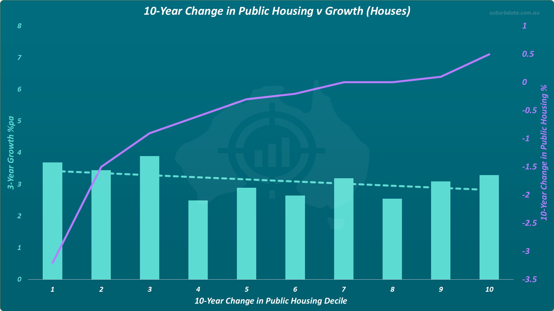
- Growth gap from decile 1 to decile 10: 0.5% per annum
- Total over 3 years: 1.5%
- Result: Trend line flat. Bars uneven. Weak relationship.
The relationship weakens with more data.
Testing Across Three Time-frames
A 5-year window provides three periods:
- 2006 to 2011
- 2011 to 2016
- 2016 to 2021
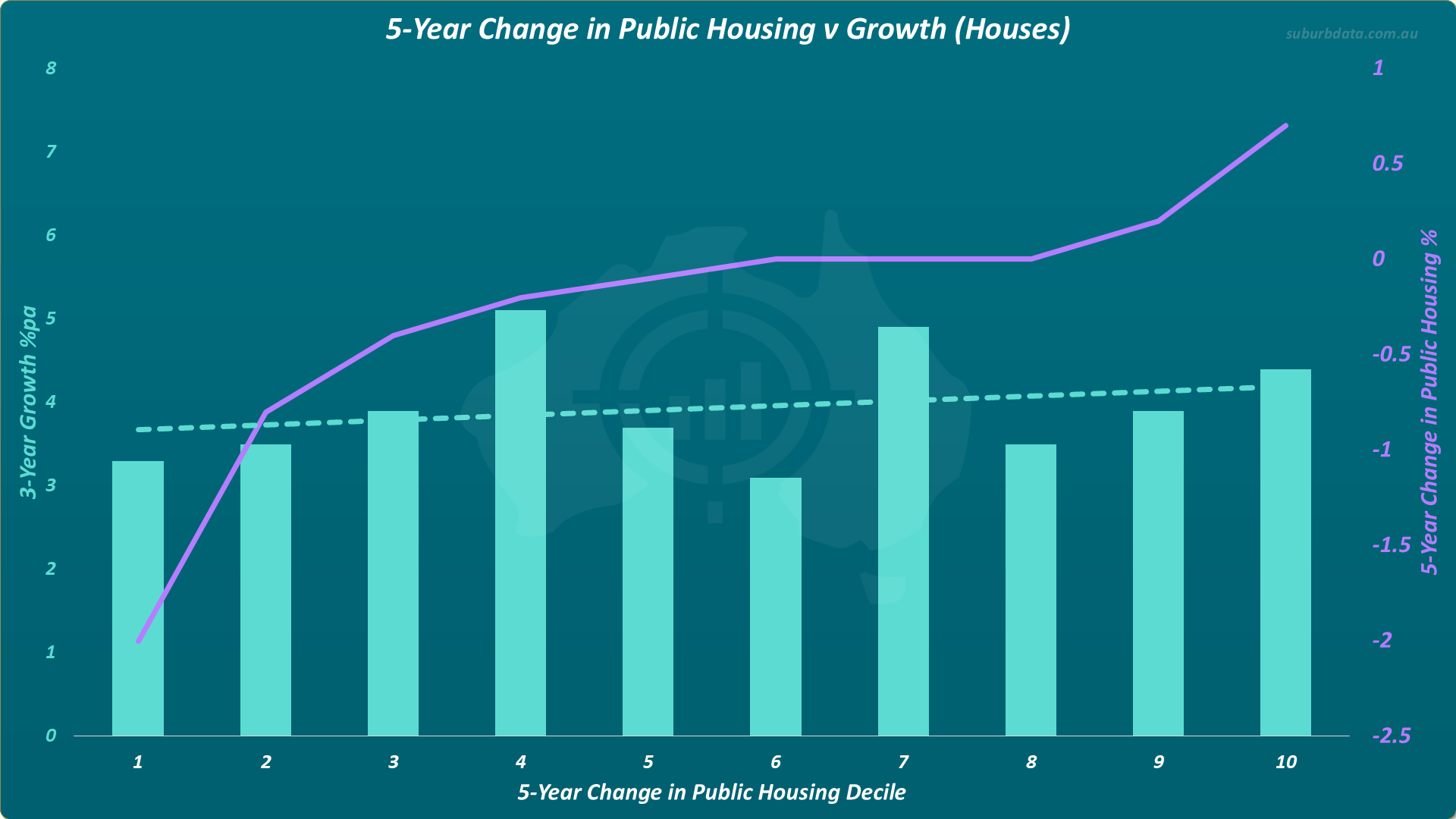
- Trend line: flat, slight upward slope
- Bars: sporadic. Decile 4 and 7 too tall. Decile 6 too low.
- Result: Slope contradicts earlier timeframes.
Three periods. No reliable relationship.
Change in public housing does not help locate high-growth markets.
Why Change Does Not Predict Growth
Four possible explanations:
- Lingering stigma. Perhaps area reputations outlast the public housing itself. If so, home buyers react to perception more than statistics.
- Change is too small. A suburb cannot reduce public housing if it already has zero. Large shifts only happen in high-concentration areas.
- Cohort is too small. The character of a suburb is unlikely to change significantly if the percentage of a certain cohort is measured in the low single digits. Halving public housing from a very high figure of 10% to 5% is still only a change of 5%. 95% of the suburb’s residents have not changed.
- Investor prejudice. Perhaps professional commentary tarnishes the entire public housing cohort when only a minority cause problems.
These are theories. We do not know cause, we only know correlation.
Public Housing and Gross Rental Yield
The chart below shows public housing concentration against gross rental yield. Gross rental yield is annual rent divided by property value, before expenses.
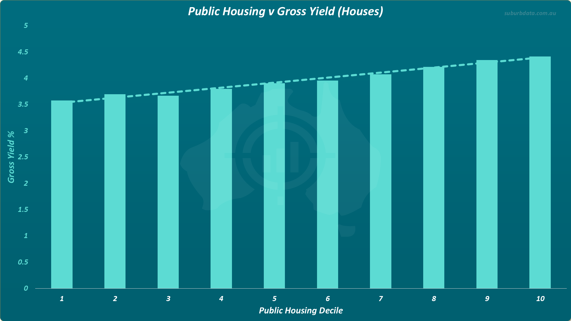
- Lowest decile yield: 3.5%
- Highest decile yield: 4.4%
- Gap: 0.9% per annum
- Result: Higher public housing, higher gross yield.
Public Housing and Vacancy Rate
The chart below shows public housing concentration against vacancy rate. Vacancy rate is the percentage of rental properties currently advertised as available.
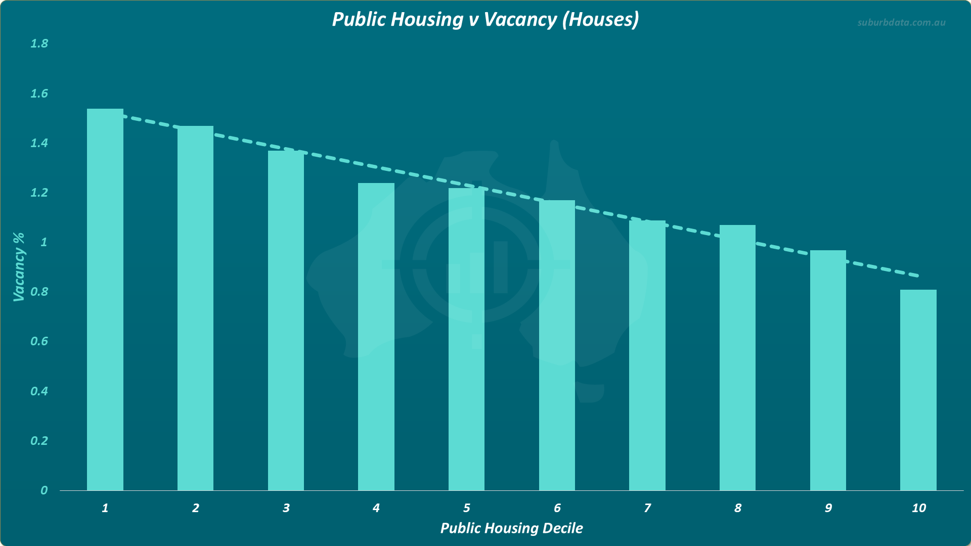
- Lowest decile vacancy: 1.55%
- Highest decile vacancy: 0.8%
- Pattern: consistent drop from left to right across every decile
- Result: Higher public housing, lower vacancy.
Decile 10 vacancy is half that of decile 1.
High public housing suburbs deliver higher yield and lower vacancy. Cashflow is stronger, not weaker.
Why Vacancy Rates Are Lower
Three possible explanations:
- On a good wicket. Perhaps tenants in cheaper areas with high public housing are more likely to be life-renters. If they struggle for accommodation, there may be content to stay put.
- Aspirational tenants. Perhaps renters in expensive areas with low public housing are more likely to upgrade or buy. If so, turnover rises.
The cause is speculative. But the correlation is consistent.
Public Housing Affects Price, Not Growth
Public housing affects price level. Not growth rate.
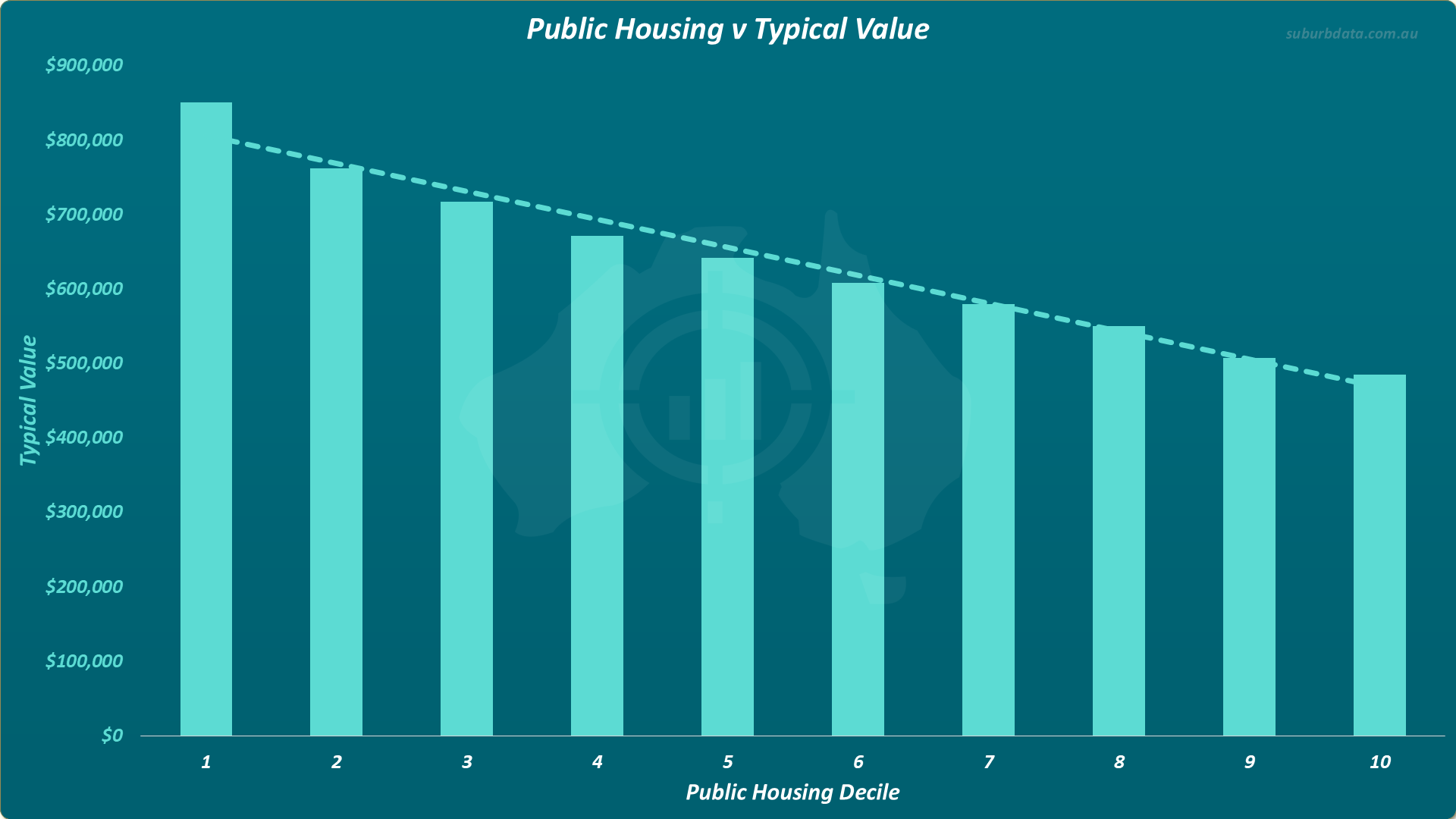
- Lowest decile typical value: $850,000
- Highest decile typical value: $480,000
- Gap: 45% lower
- Result: Higher public housing, lower entry price.
This data is not partitioned by city. Actual values vary across markets. A high public housing concentration in Sydney implies a different price point than in Hobart.
Public housing is a pricing signal. Not a growth signal. Growth rates are the same. Entry prices are lower.
How to Counter Problem Tenants
Tenant risk exists in any suburb. Four practices reduce it:
- Target low vacancy rate suburbs. Tenants in tight markets know a bad rental history closes off future options. Behaviour improves.
- Get landlord's insurance. A safety net for loss of rent, damage, and legal costs.
- Get a good property manager. Vet them on tenant selection. Ask how they screen for reliability.
- Aim low for rent. Advertising at $480 instead of $500 widens the applicant pool. The $20 per week foregone is $1,000 per year. A problem tenant costs more.
Conclusion
Public housing does not hurt capital growth. It does not hurt yield. It does not hurt vacancy.
The data is convincing:
- Capital growth: no relationship
- Change in public housing: no reliable relationship across multiple timeframes
- Gross yield: higher in high public housing suburbs
- Vacancy rate: lower in high public housing suburbs
- Property value: lower in high public housing suburbs
Public housing affects entry price. Not much else.
The advice to avoid public housing areas is not just wrong. It reflects professional bias, not historical data.