

"Time in the market" is an often quoted phrase in property investing. Hold long enough. Be patient. Do not try to time it.
The logic sounds simple. If you wait long enough, growth will come.
But this belief is not supported by the data.
When you apply even the simplest trading algorithm to 35 years of Australian property history, timing the market beats holding long-term in 90% of cases. This article shows the proof.
Two Strategies. One Clear Winner.
The debate has always been framed as time in the market versus timing the market. The terms sound similar. The outcomes are not.
- Holding long-term. Buy and wait. Patience is the strategy.
- Trading. Pick when to enter and exit. Capture the growth, sell, reinvest elsewhere.
Holding long-term has a genuine appeal. Growth is almost guaranteed eventually. Once you buy, you do nothing. It is easy.
Easy is not optimal. The longer you hold, the more average your returns become.
Why Trading Outperforms
Growth does not happen consistently. Markets surge, flatten, then surge again. Long-term holders sit through the flat periods. Traders move on to more booms.
There is also a tendency for all property markets to grow at the same rate over the long-term. As shown in EBS 11 and EBS 12, the longer you hold, the closer your returns sit to the national average.
Australia has diverse markets. One city booms while another lags. There is always a growth spurt somewhere. Trading keeps you invested in the surge, not the slough.
Putting It to the Test
The argument needed proof. A simulator was built using one simple rule set and applied to 35 years of historical Australian property data.
One metric was used deliberately. If a trivial single-variable algorithm beats long-term holding, modern algorithms with dozens of variables beat it by an even larger margin. The bar was set low to make the point.
The three rules below governed every buy and sell decision across the entire simulation.
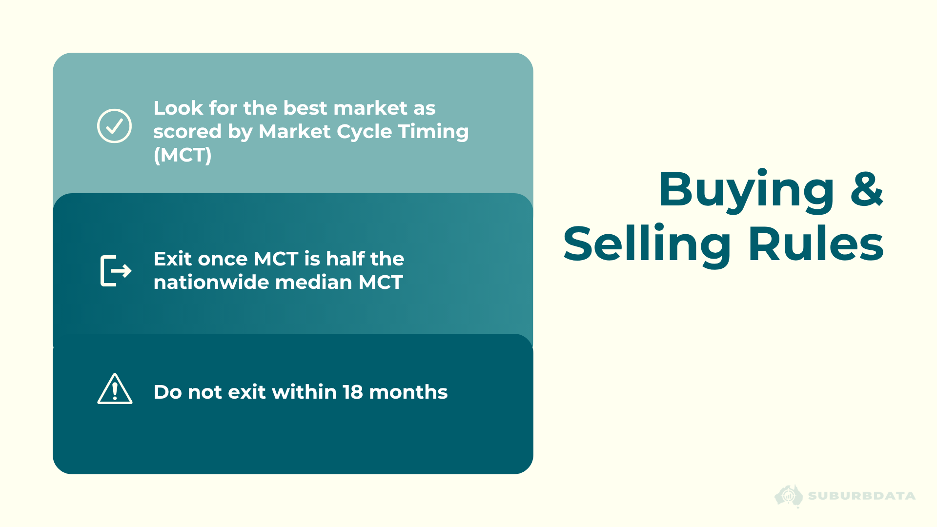
The buying and selling rules:
- Buy the market with the highest Market Cycle Timing score
- Hold until the MCT drops to half the nationwide median
- Do not sell within the first 18 months
- After selling, find the next best MCT market and repeat
MCT is a score out of 100. High MCT means the market has been flat for a long time and is now showing early signs of growth. Low MCT means the market has already peaked or is close to it after a large amount of growth recently.
Every trade in the simulator accounts for real costs. On exit: agent commission of 2%, capital gains tax based on growth at point of sale, and legal fees. On entry: stamp duty at 4%, legal fees and other costs totalling 5%. Each trade removes approximately 7% from profits plus CGT.
What the First Run Showed
The simulator starts in January 1990 and runs to mid-2024.
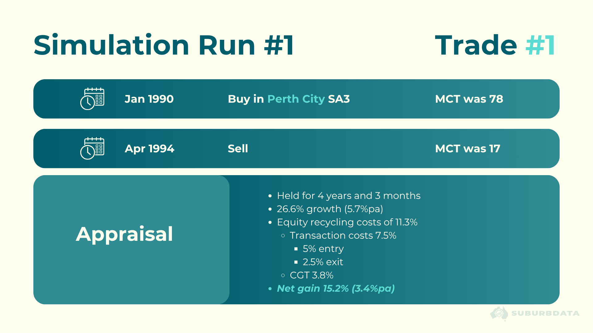
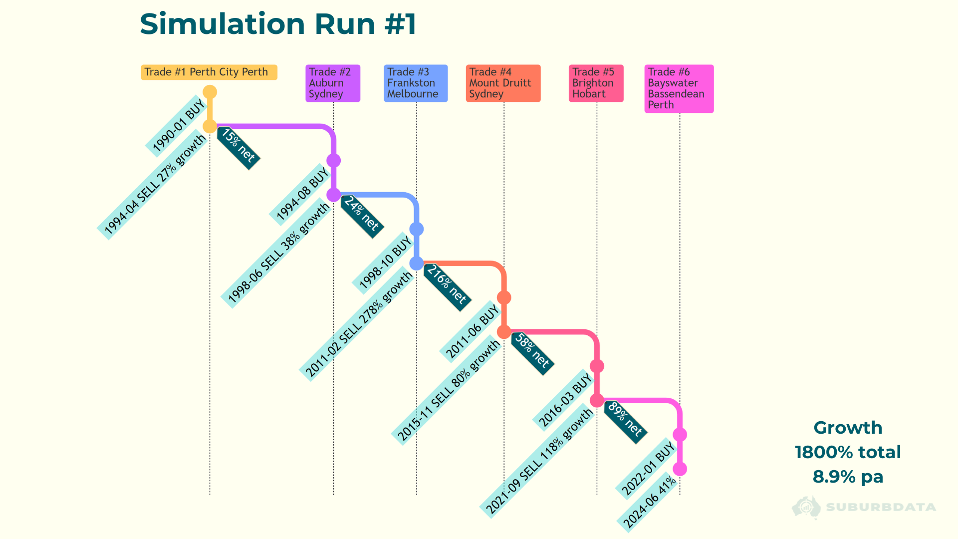
Trade 1: Perth City SA3
- Buy: January 1990. MCT was 78.
- Sell: April 1994. MCT dropped to 17.
- Growth: 26.6%. Net gain: 15.2% or 3.4% per annum.
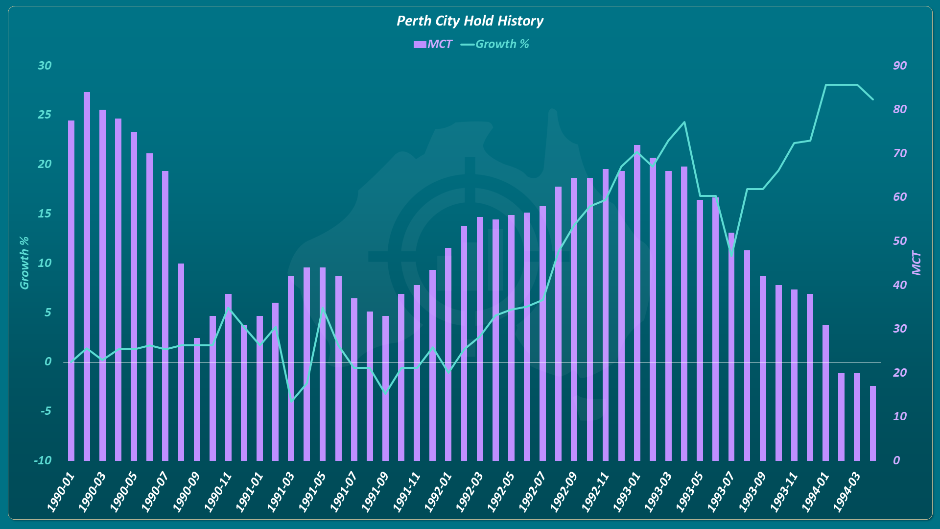
A poor result. The MCT dropped early but the 18-month rule prevented an early exit. The market had already peaked by the time the sell triggered.
The appraisal card below shows the full cost breakdown for this trade.
The chart below shows exactly why. Notice the MCT bars falling sharply in the first two years while the growth line stays flat. The sell only triggers at the far right in April 1994, just as growth accelerates.
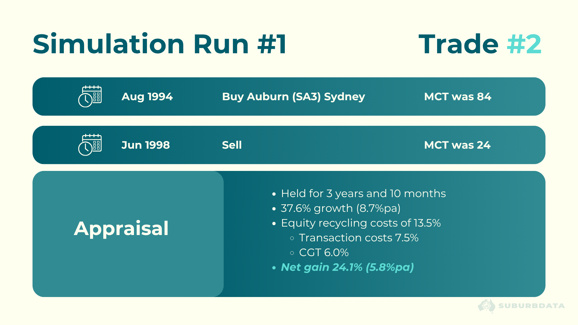
Trade 2: Auburn SA3, Sydney
- Buy: August 1994. MCT was 84.
- Sell: June 1998. MCT dropped to 24.
- Growth: 37.6%. Net gain: 24.1% or 5.8% per annum.
Still an ordinary result. The appraisal card below shows the full breakdown for Trade 2.
The remaining trades:
- Frankston, Melbourne: net gain 216%
- Mount Druitt, Sydney: net gain 58%
- Brighton, Hobart and Bayswater-Bassendean, Perth followed
Total 35-year growth: 1,800% or 8.9% per annum. National growth over the same period: 712% or 6.3% per annum.
Trading more than doubled the national rate.
The chart below shows all six trades across the full 35 years. Each coloured segment is a different market. The dark tags show the net gain after costs for each trade. The total in the bottom right is what matters.
Running It 20 Times
One run is not enough to draw a conclusion. The simulator ran 20 times in total. Each run was forced to start with a different market, taking the next best MCT score each time. Each successive run starts with a progressively less appealing market.
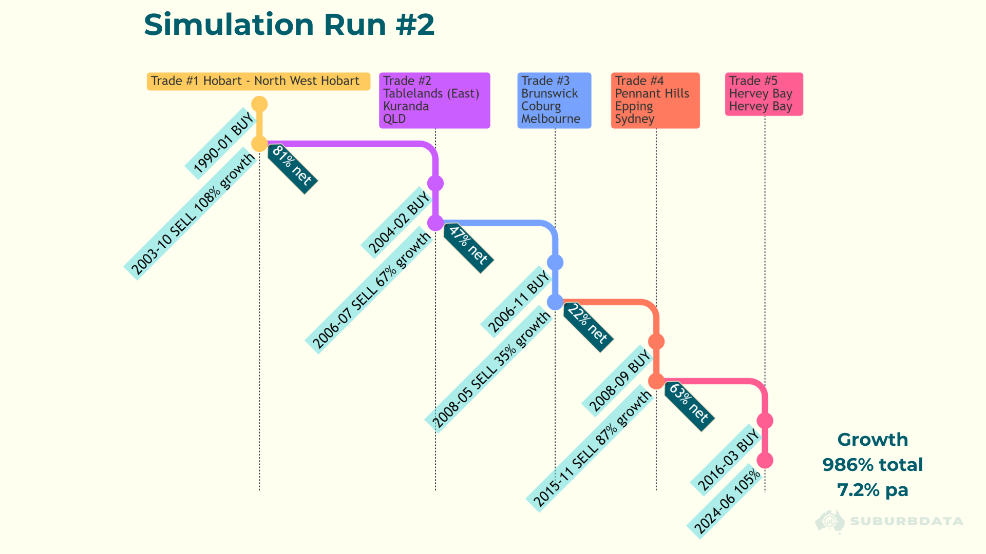
Run 2 started with Hobart North-West. It was held for over a decade before selling in October 2003. Net gain: 81%. Total 35-year growth: 986% or 7.2% per annum. Still well above the national rate.
The chart below shows all five trades in Run 2. Trade 1 held for over a decade before the MCT triggered. Trade 2 recovered quickly with 47% net in just over two years. The total in the bottom right is what matters.
Across all 20 runs of the 35-year simulation:
- Trading average growth: 1,167% or 7.7% per annum
- National growth for comparison was: 712% or 6.3% per annum
- Trading success rate (compared to nation): 90%
- State capitals growth for comparison: 834% or 6.7% per annum
- SA3s within 10km of CBD for comparison: 970% or 7.7% per annum
- Top 5 SA3s within state capitals: 1,618% or 8.6% per annum
- Best single SA3 (Lower Hunter NSW): 4,689% or 11.9% per annum
Trading beat the national rate in 90% of cases. It beat state capitals. It beat CBD-adjacent suburbs.
The only benchmarks that beat trading required perfect hindsight to identify in advance.
The Best Long-Term Markets Are Not What They Seem
The best performing SA3 over 35 years was Lower Hunter NSW. 4,689% growth or 11.9% per annum.
Before using this to argue for long-term holding, look at the chart below. The data shows a jump from $30,000 to $50,000 in a single month in 1991 in the bottom left corner.
The chart below shows Lower Hunter SA3 growth against the national rate across 35 years. Look at the bottom left. The two lines separate in 1991 and never cross again. That separation was caused by a single month.
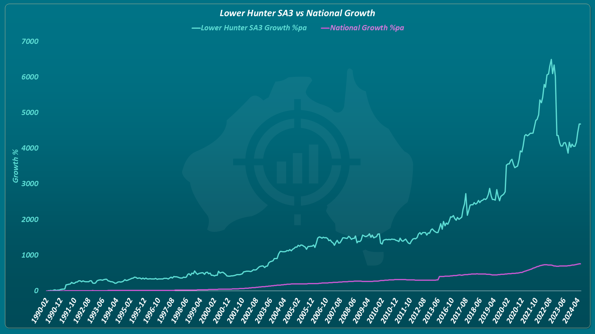
That is 67% growth in one month. It is a data anomaly, not real capital growth.
Long-term hold advocates would never recommend Lower Hunter. It is not within a significant urban area. It is not close to a CBD. It is not the blue-chip suburb they point clients toward.
The same applies to Goulburn-Mulwaree NSW, the 30-year best performer. Another location outside a significant urban area. Another result driven by short-term recent growth.
The chart below shows why. Most of the history is flat or missing. The spike above 1,000% happened in just a few years. Nobody picking a long-term hold in 1995 was picking this market.
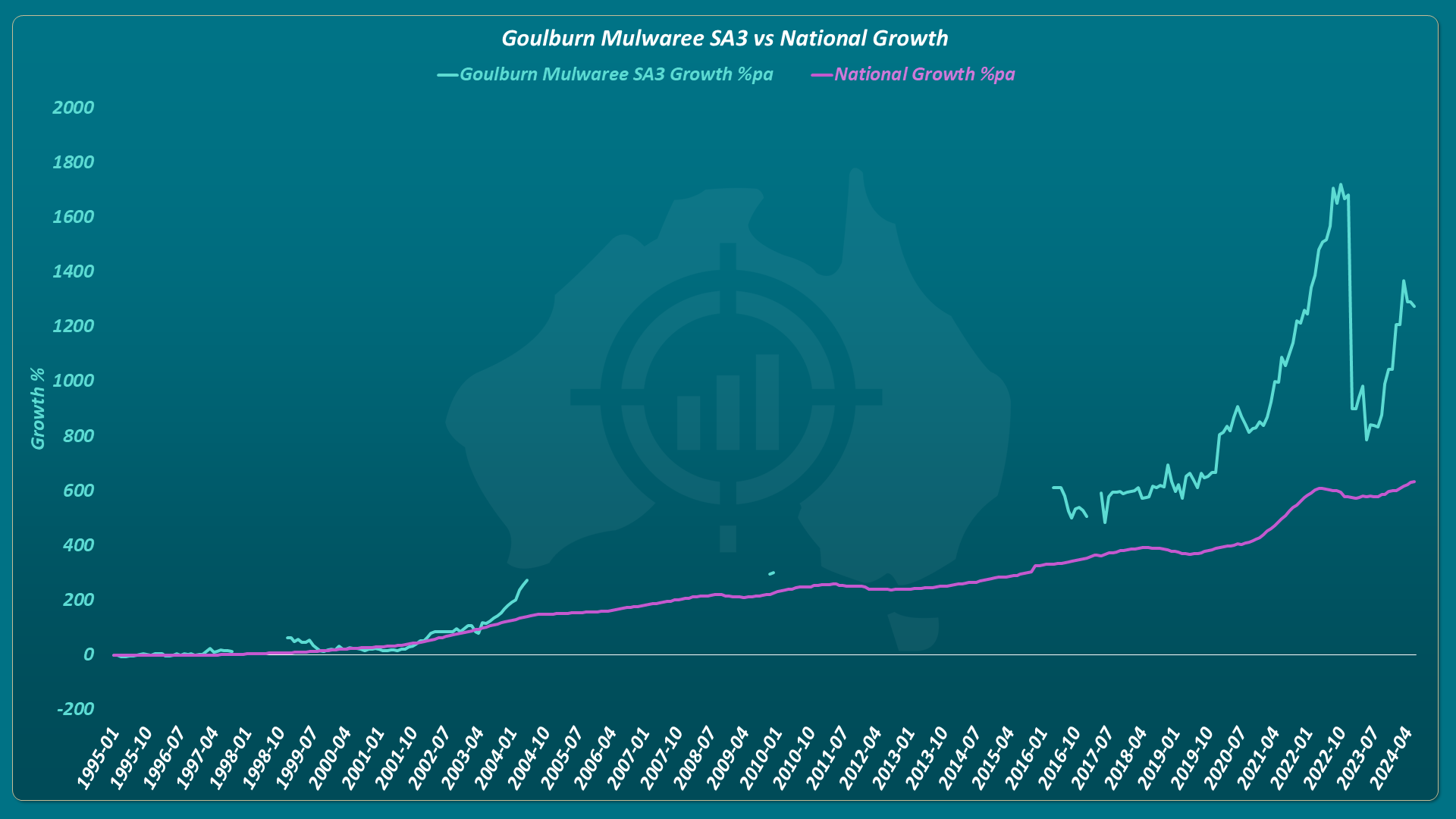
What looks like long-term outperformance is short-term outperformance in locations nobody recommends for long-term holding.
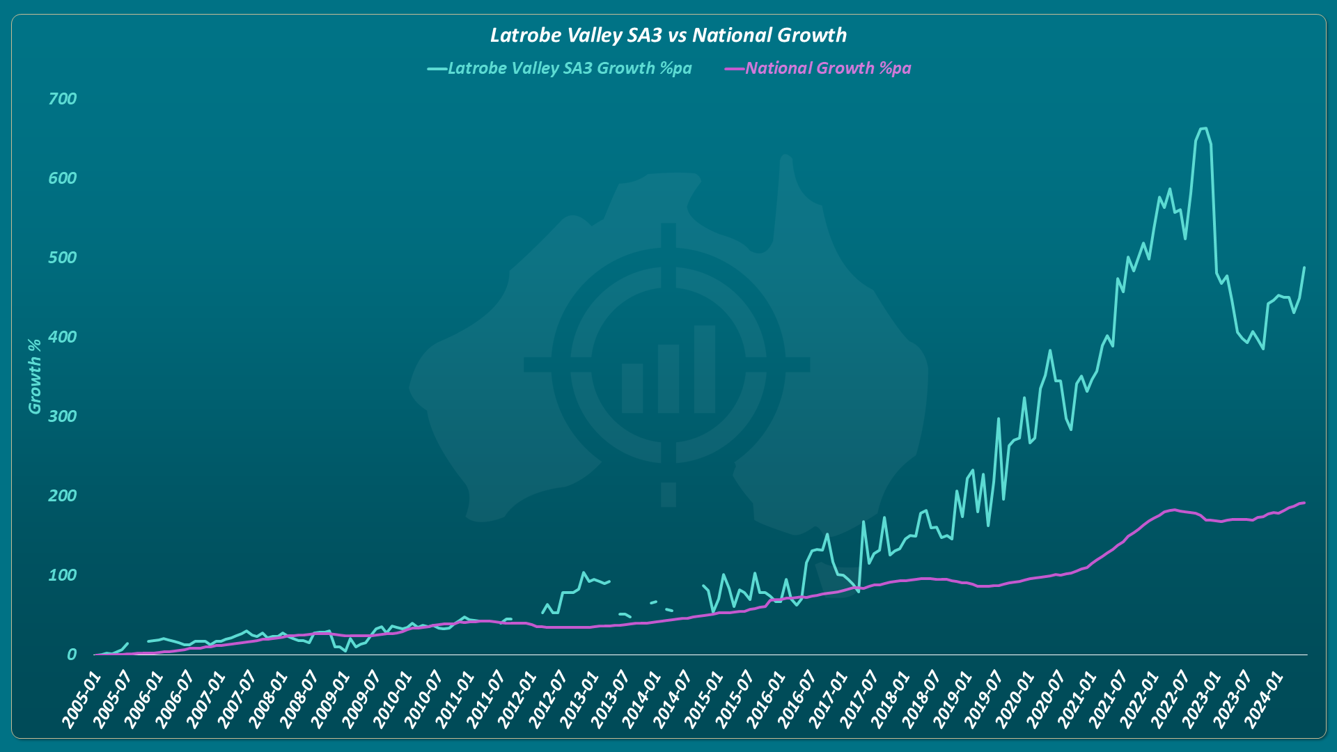
Latrobe Valley tells the same story. The first decade tracked the national rate. The outperformance happened in a five-year window between 2017 and 2022. You did not need to hold from 2005. You needed to be there for five years.
The Same Result Across Every Time Period
The simulator was tested across five different time periods. Trading beat the national growth rate every time.
35-year period:
- Trading: 7.7% per annum. National: 6.3% per annum. Success rate: 90%
30-year period:
- Trading: 8.5% per annum. National: 7.0% per annum. Success rate: 80%
25-year period:
- Trading: 9.6% per annum. National: 7.8% per annum. Success rate: 95%
20-year period:
- Trading: 8.5% per annum. National: 5.7% per annum. Success rate: 95%
15-year period:
- Trading: 8.0% per annum. National: 5.4% per annum. Success rate: 95%
Trading beat state capitals in every period. It beat CBD-adjacent suburbs in every period.
The only consistent exception was the top 5 SA3s within state capitals. Picking those in advance requires a true hindsight-like crystal ball. The trading “algorithm” used only a single metric and a couple of unrefined simple rules.
What This Actually Means
The case for long-term holding rests on one assumption. You cannot predict future growth. If that is true, holding is rational. You accept average returns because you have no better information.
But a single-metric algorithm with simple rules beats long-term holding in 90% of cases. No hindsight. No complex modelling. Decisions based only on information available at the time of each trade.
If a trivial algorithm does this, modern algorithms with dozens of variables are likely to do much better.
Recommending long-term holding is not conservative advice. It is an admission of an inability to predict short-term future growth. But the data shows this is not only possible, but easy.
Conclusion
Trading beats holding long-term. The evidence across 35 years, 20 simulation runs, and five time periods is consistent.
A single-metric algorithm beat the national growth rate in 90% of cases. It beat state capitals. It beat blue-chip CBD suburbs.
All property markets tend toward the same long-term growth rate. Holding long-term accepts that average. Trading moves between growth spurts before mean reversion sets in.
The longer you hold, the more average your returns become.
Stop waiting for the market. Start timing it.