

Fake experts use the term "investment grade" to describe suburbs and properties they say are destined to outperform over the long term. Cafes nearby. Privacy. Views. Affluent owners. Above-average historical growth. Buy these, the story goes, and the market will do the rest.
Historical data has something different to say.
The Fake Expert Definition
Some of the features fake experts use to define investment grade:
- Special
- Lifestyle location
- Safe and friendly
- Appeals to a wide range
- Affluent owners
- Short walk to amenities
- Cafes, parks
- Street appeal
- Views
- Natural light
- Privacy
- Attractive style
- Sound structure
- Above-average historical growth
These are all features. Features do not dictate price growth. We covered the reason in EBS 19: features set the current price, and price plus features set the current demand. What drives growth is whether demand exceeds supply going forward, not the features themselves.
A feature already priced in does not drive future growth.
What an Investor Actually Wants
An investor looking at a property wants three things:
- Higher growth
- Higher yield
- Lower risk
That is the real investment-grade test. Not cafes. Not views. Growth, yield, or risk.
The fake experts assume this will come if they pursue the list of features.
The Investment Grade Aesthetic
The kind of area fake experts have in mind looks like this.
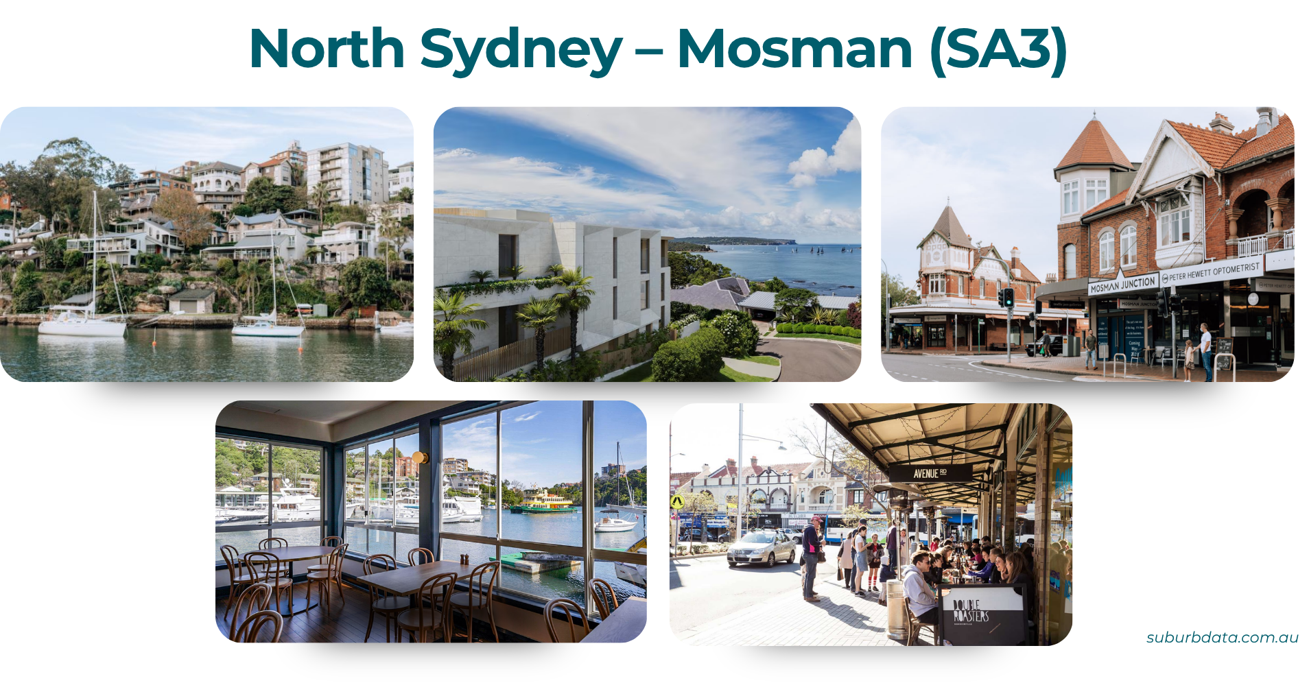
North Sydney Mosman is an SA3 in Sydney's affluent lower north shore. Harbour frontage, heritage shopfronts, established cafe culture, expensive houses. By the fake expert definition, this is the investment grade ideal.
SA3 stands for Statistical Area Level 3, an ABS-defined region a little larger than a local government area. There are about 300 SA3s across Australia. We aggregated data to the SA3 level because larger areas smooth out the anomalies that distort single-suburb medians.
For contrast, the opposite end of the Sydney market sits about an hour west.
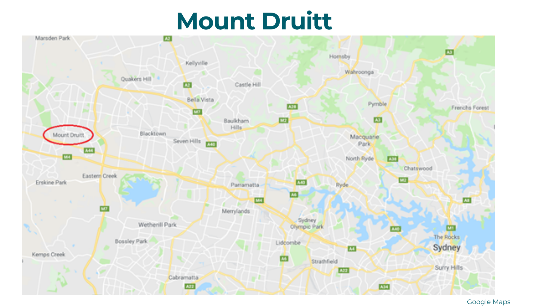
Mount Druitt is an SA3 about an hour west of the Sydney CBD. Lower-income, fewer amenities, no harbour views. By the fake expert definition, the opposite of investment grade.
If investment grade meant anything, the difference should show up in 35 years of growth data.
Growth: Affluent Areas Do Not Outperform Over the Long Term
If "investment grade" suburbs outperformed lower socio-economic ones, the gap would show up in 35 years of growth data. Four comparisons across three cities.
The chart below compares North Sydney Mosman against Mount Druitt over 35 years.
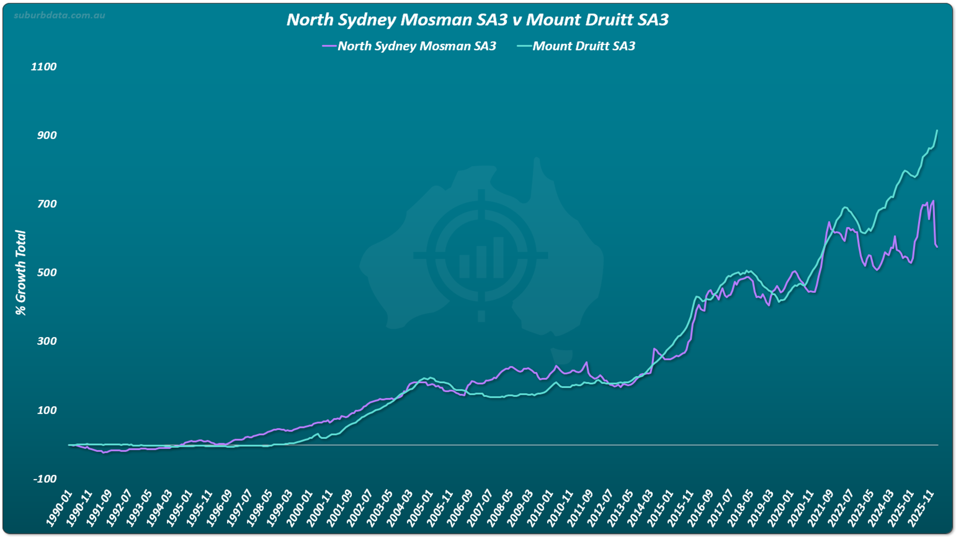
- Period: January 1990 to November 2025
- Duration: 35 years
- Result: Mount Druitt outperformed North Sydney Mosman
35 years is more than enough time for opposite ends of the spectrum to show a meaningful difference. The chart shows it was the lower socio-economic area that came out ahead.
To be fair, the next comparison shows a case where the affluent area did win.
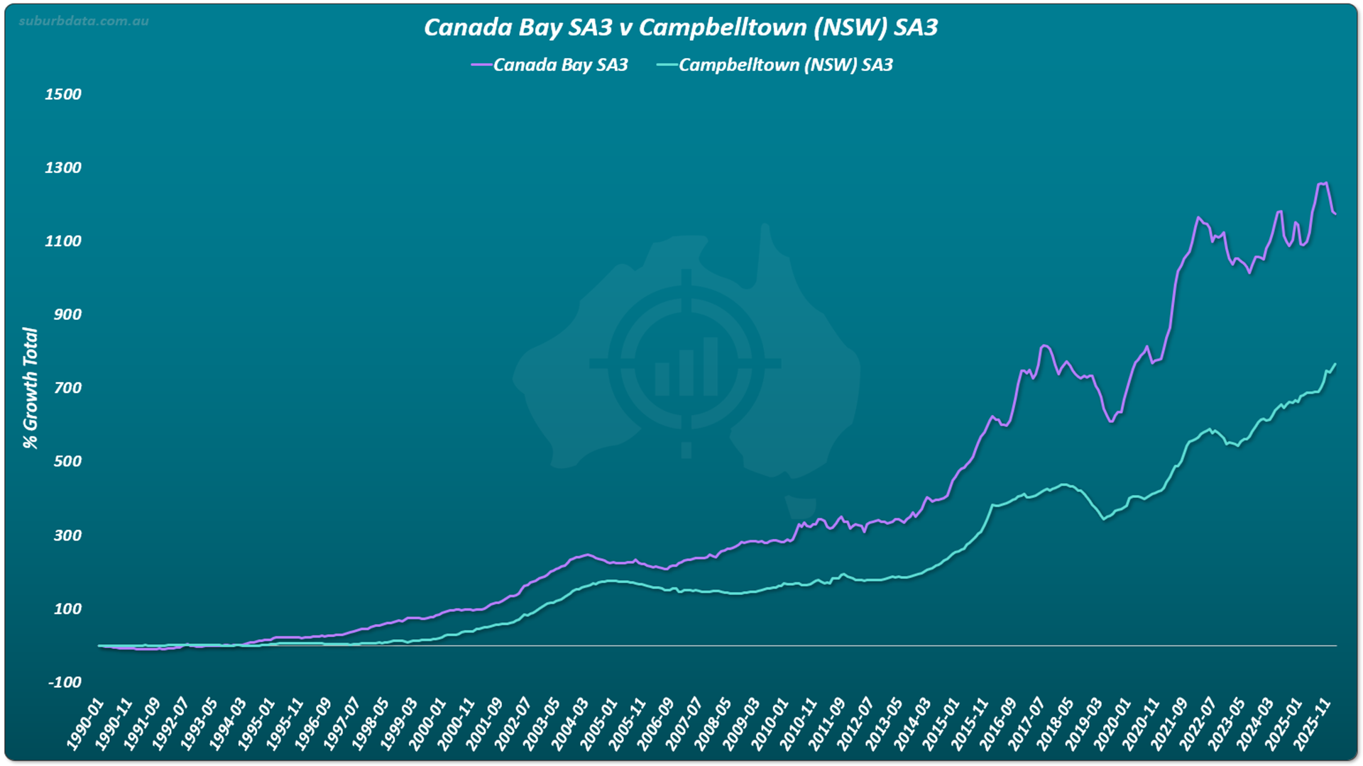
- Period: January 1990 to November 2025
- Duration: 35 years
- Result: Canada Bay outperformed Campbelltown, but watch the gap
Canada Bay outperformed for almost the entire period. But the gap widens and shrinks repeatedly. Add another decade and the chart might tell a different story. Two more examples follow the same pattern.
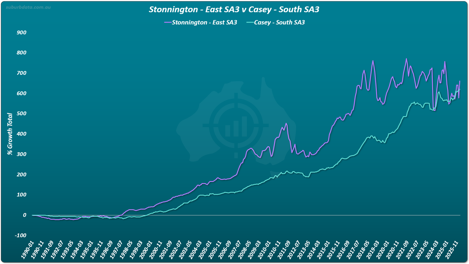
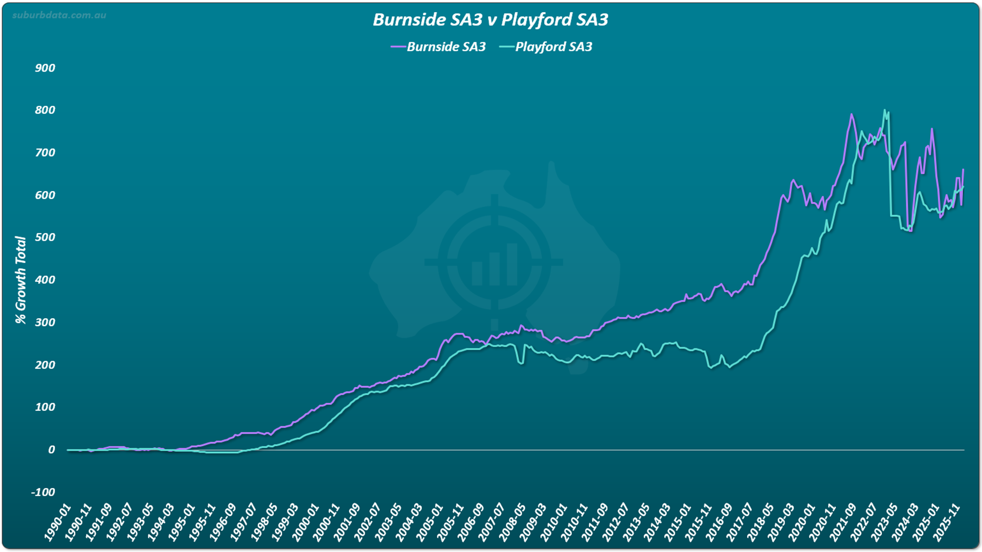
The pattern across all four charts is the same. The gap between affluent and non-affluent areas widens and shrinks. This pattern appears in almost every long-term growth chart.
Sometimes the affluent area is ahead. Sometimes it is behind. The longer the timeframe, the closer the growth rates converge.
Properties, streets, suburbs, areas, regions, even state capitals have a tendency to grow at roughly the same rate over the long term. The lead swaps. The gap widens and shrinks.
The winner of a long-term growth race is determined more by when you set the start and finish months rather than which markets you choose.
This phenomenon was explained in EBS 11 (Apples and Oranges), EBS 12 (Long-Term Growth) and EBS 13 (Time-in versus Timing).
Over 35 years, on the growth measure, there is no such thing as investment grade.
Risk: Affluent Areas Are More Volatile, Not Less
If "investment grade" suburbs were lower risk, their growth rates would be steadier than the cheap end of the market. The chart below compares the top 10% (purple) and bottom 10% (turquoise) of suburbs by price.
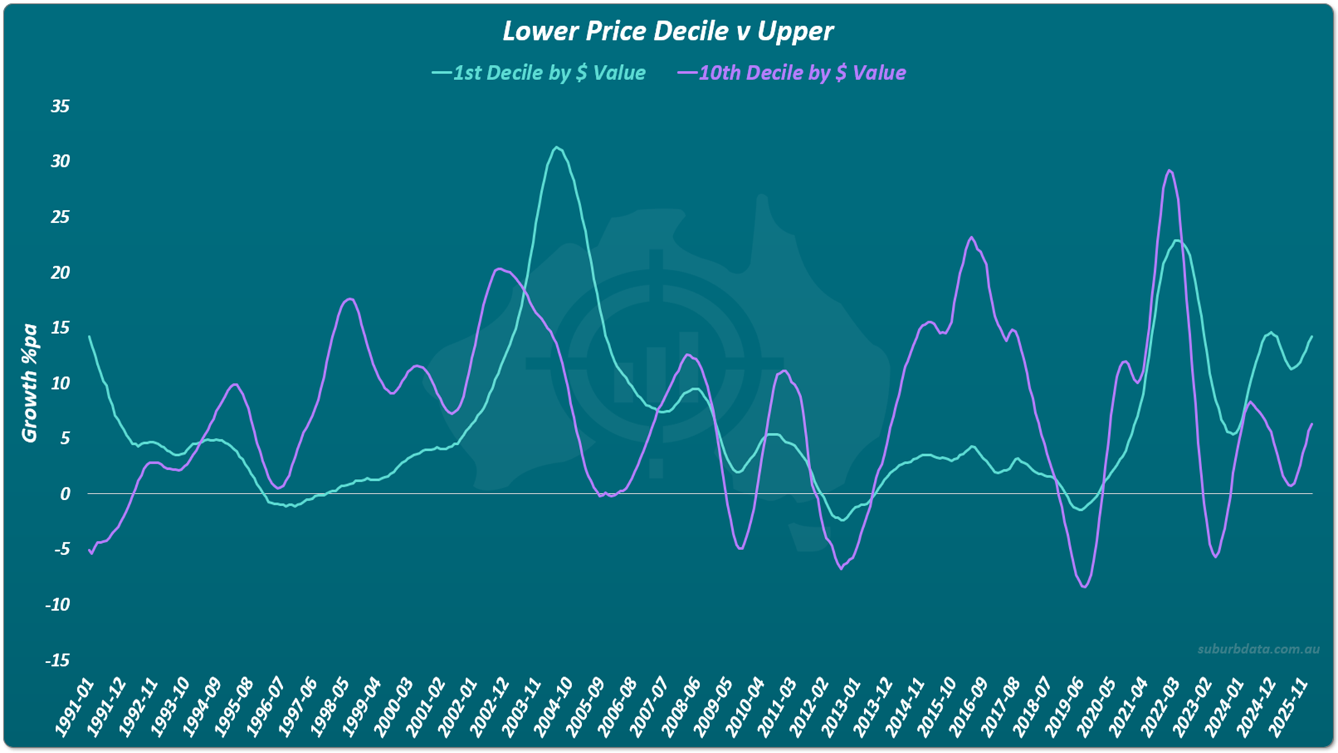
The turquoise line (cheaper markets) is relatively stable apart from two spikes. The purple line (expensive markets) swings more often and goes negative more often. By the volatility measure, the upper end of the market is riskier than the lower.
Volatility is one measure of risk. Another is concentration. An investor with $1 million can buy one expensive property in one market, or two $500,000 properties in two different markets. The more expensive the property, the harder it is to diversify. By the diversification measure, investment grade is also worse.
Two measures of risk. Both point the same way.
Yield: Affluent Areas Pay Less
The cheapest 10% of suburbs has a median gross rental yield of 4.9%. The most expensive 10% has a median of 2.6%. A gap of 2.3 percentage points.
EBS 25 covered the wealth implications of yield in detail. The point here is narrower: by the yield measure, the affluent end of the market is worse, not better.
Growth: no clear advantage. Risk: worse. Yield: worse.
The fake expert definition fails on every test.
No Investment Grade Properties Within a Suburb Either
So far the analysis has covered suburbs and areas. The investment-grade claim also operates at the property level. Certain streets and certain properties within a suburb, the experts say, will outperform the average.
If that were true, the price gap between the best property in a suburb and the average property would widen over time. The best property would become disproportionately more expensive. We measured it.
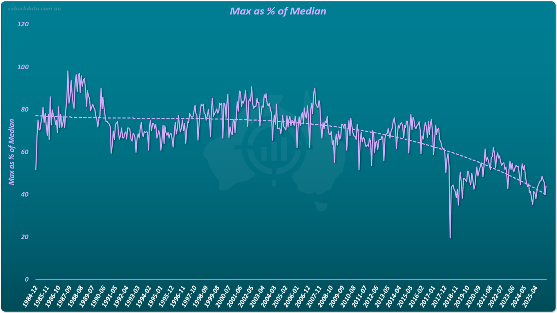
- Period: 1984 to 2025
- Duration: 40 years
- Trend: maximum-to-median gap shrinking, not growing
- Result: ordinary properties are catching up to extraordinary ones
If investment grade properties existed, this gap would widen. It has narrowed. Premium properties within a suburb have underperformed the average, not outperformed.
A different way to measure the same phenomenon is price variability. The standard deviation of prices in a suburb as a percentage of the average. If investment-grade properties were pulling ahead of the rest, variability would rise. It has fallen.
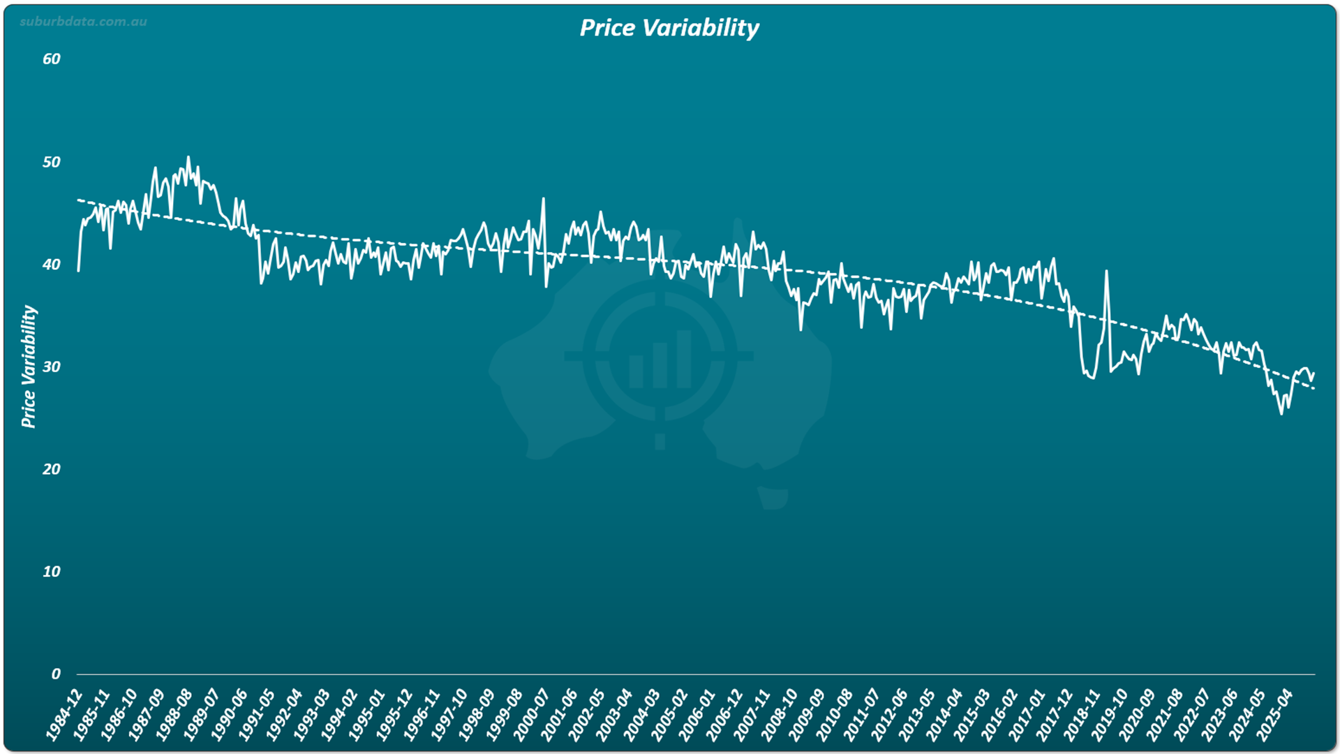
Two charts. Two different measurements. Both trending the same way. Within suburbs, the price gap is narrowing, not widening.
The same convergence we saw between suburbs is happening between properties within them.
Why "Investment Grade" Fails as a Concept
Why is the investment-grade concept so ineffective? Because it assumes features drive demand, when supply and demand drive prices.
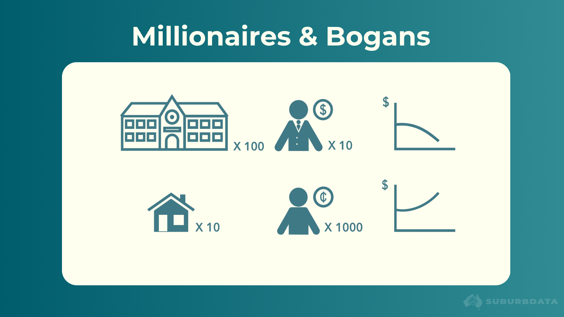
Imagine 100 mansions in an exclusive suburb everyone wishes they could live in, but only 10 millionaires looking to buy. Prices would tumble. Massive oversupply.
Now imagine 1000 lower-income buyers competing for 10 small homes, the only properties they can afford. Demand exceeds supply by 100-fold. Prices skyrocket.
Features have not changed. Supply and demand have. Prices follow supply and demand, not features. Features & price influence demand, and price changes far faster than features do. The features of a suburb often stay similar from decade to decade. The prices change dramatically. Nothing subdues demand like sky-high prices.
This is why the affluent-area claim breaks down. The features stay the same. The prices keep rising. Eventually demand for the expensive suburb cools and shifts to its neighbour. Growth ripples outward. The lead swaps. The gap shrinks.
Conclusion
Over the long term, there is no such thing as an investment grade property, an investment grade suburb, or an investment grade area.
35 years of growth data across three cities show the gap between affluent and non-affluent areas widens and shrinks. The lead swaps repeatedly. Over enough time, the growth rates converge.
The upper end of the market is more volatile than the lower end. The affluent end yields less. Within suburbs, premium properties have been losing their lead on the average, not extending it.
The features fake experts list do not drive growth. Supply and demand do.
There is no support in historical data for investment grade properties or suburbs.